Category Archives: Work

Awards

IDEA Silver Award

What we did

Experience Essence™

Insights

Industrial Design

Materiality

Design for Engineering

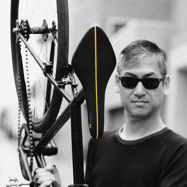
The new fi’zi:k Arione bike seat uniquely integrates the DNA of the original Arione with cutting-edge technology for an unparalleled riding experience.

The Arione is one of the most popular bike saddles in the world – for weekend warriors and Tour de France winners alike. Any serious cyclist will pay attention to the weight of the bike saddle, and how the rider’s position on the saddle can maximize speed and power. While critical to the performance, these represent just the tangible aspects of the saddle. The intangible aspects are even more important. Every rider wants to feel fast and powerful on the bike, and the Arione more than delivers. But what is often forgotten is that the saddle influences how you feel even before you get on. As you approach the bike, Arione exudes speed. It’s like an arrow shooting forward, streamlined and fierce in its simplicity.

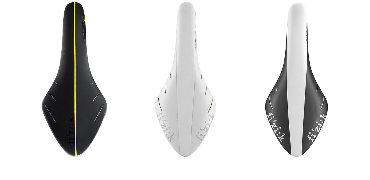
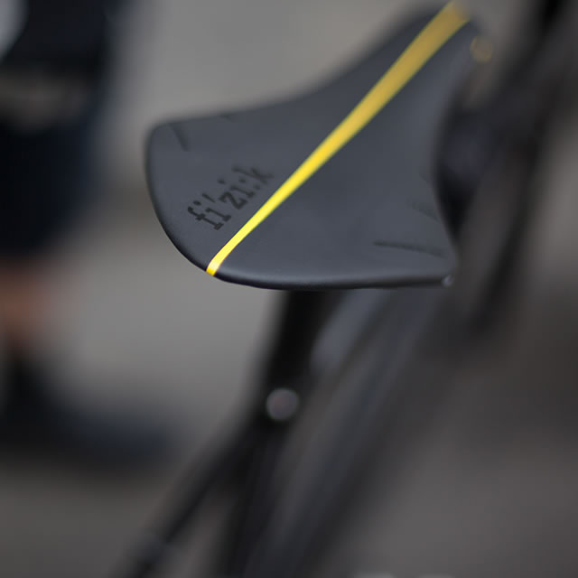
black fi'zi:k arione bike seat with yellow line

Like an arrow shooting forward, streamlined and fierce in its simplicity.

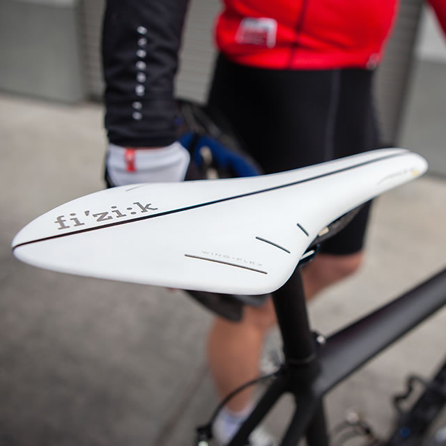
white fi'zi:k arione bike seat with black lineblack fi'zi:k arione bike seat lifted

Maintaining the magic

When the Arione was first released over ten years ago, Branko’s design of the saddle was the talk of the biking world. The saddle was longer than any racing saddle ever seen. And the diamond shape was unusual. The design of the Arione is unique in that the saddle gives slightly so that the rider can achieve a strong, full-range motion when pedaling. With the saddle flexing in just the right places, rather than being locked into a prescribed riding position, the rider is freed to move back and forth along the saddle to find the most comfortable spot yielding the most power. In essence, the saddle is conforming to the rider rather than the other way around.

pro cyclist in the mountains with fi'zi:k arione bike seat

Almost a decade after the first Arione became a market success, fi’zi:k wanted to develop the next generation of the famous saddle. Designing the next generation of something that has been successful is always difficult. While fi’zi:k recognized that market forces make it imperative to constantly innovate, there was an understandable fear of losing the magic that contributed to the popularity of the original product.

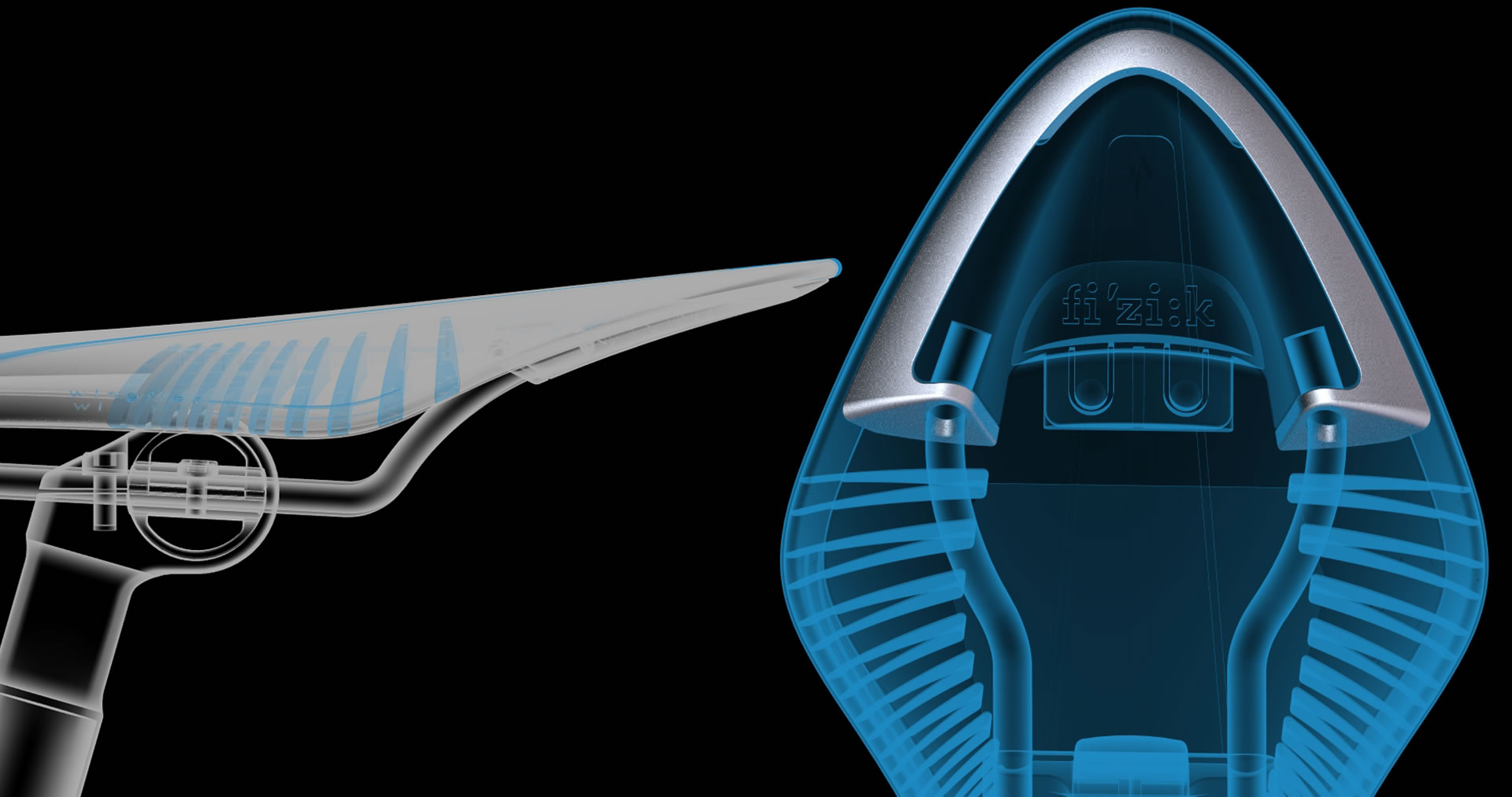
fi'zi:k arione bike seat CAD

white fi'zi:k arione bike seat

Staying true to the essence

By staying true to the essence of the Arione but pushing on the technical constraints and using cutting-edge materials such as composite carbon, NONOBJECT was able develop a new saddle that improved the flexibility and lightness beyond what many thought possible.

And, in a sport where every gram matters an important part of fi’zi:k’s design brief was to shave off as much weight as possible. The new design was able to remove an additional 15 grams off the weight compared to the original Arione, without losing any strength and flexibility in the process.

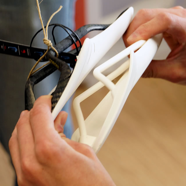
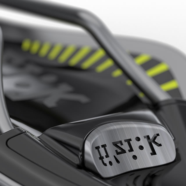
fi'zi:k arione bike seat 3D printed modelfi'zi:k arione bike seat ics badge with logo

15 grams removed compared to the original Arione

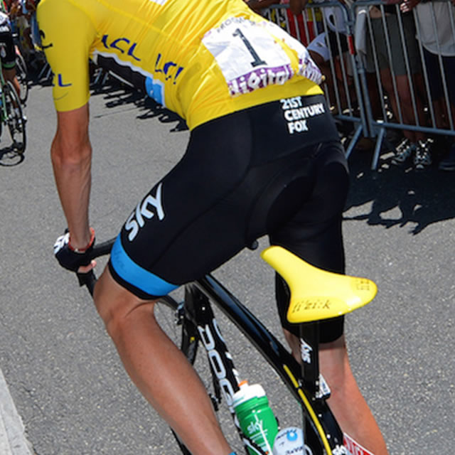
Tour de France cyclist with yellow fi'zi:k arione bike seat

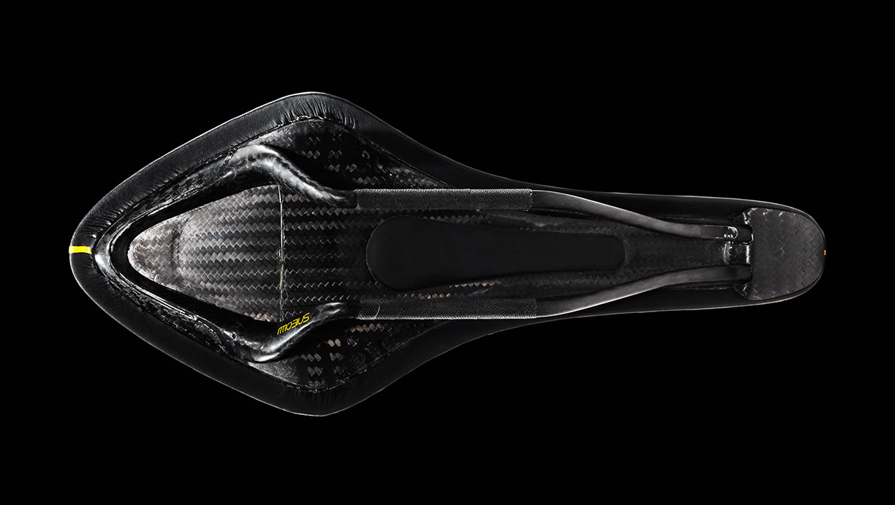
fi'zi:k arione bike seat bottom view

With fi’zi:k’s commitment to excellence, NONOBJECT’s objective with the new Arione was to ensure a complete 360 design. That is, when viewed from any angle, including when turned upside down to see the saddle “insides”, every single detail communicates the quality, care and craftsmanship involved in the design, materials and manufacturing.

In the end, the tangible and intangible aspects of the Arione combine to create an amazing seat that is one of the most popular racing and performance saddles in the world. It all stems from the emotional relevance of feeling fast, of inspiring speed and confidence.

fi'zi:k arione bike seat in different colors

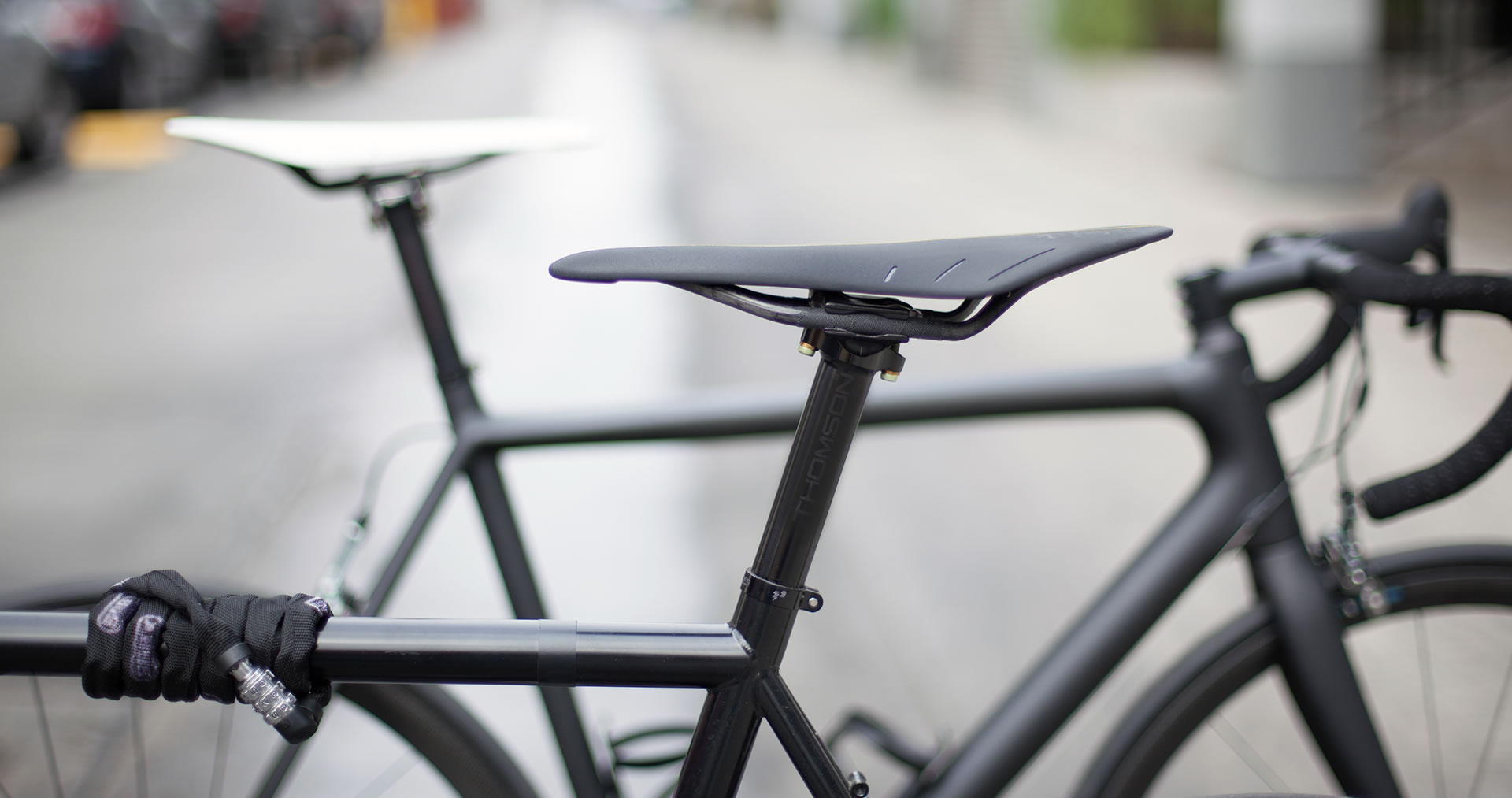
fi'zi:k arione bike seats on two bikes


What we did

Experience Essence™

Insights

Industrial

Materiality

Industrial Design

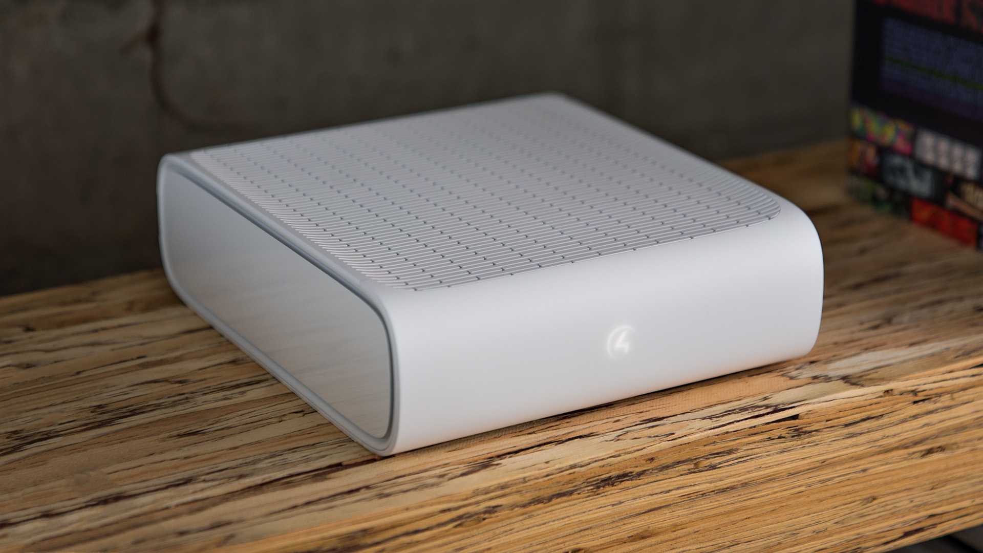
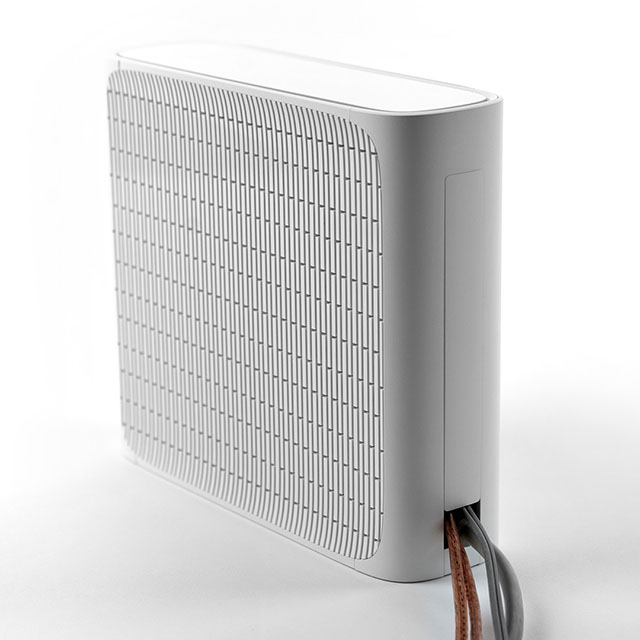
The Triad One Amplifier provides a powerful music experience anywhere in your home. Versatile in abilities and minimal in style, it can seamlessly go from a natural extension of your interior design to being installed in your AV rack.

Triad One is a single-zone, high-resolution, wired and wireless streaming amplifier, that gives customers the flexibility to use their existing speakers and boosting them with powerful amplification for amazing sound in any room.

Capable of being used as a standalone product, the Triad One can also be integrated into Control4’s complete in-home systems.

The Triad One had extremely stringent engineering and feature requirements. These constraints were tackled in parallel, and the end result is a true chameleon object where every detail feels intentional and unconstrained for an amazing user experience.

The overarching design challenge was to create an amplifier that is powerful, capable of serious output, while being versatile enough to be suitable in any environment, from rack to room. And the Triad One had to be minimal, in the sense of not taking up too much physical space or mind space. In addition, a competitive price point was an important consideration in the design.

An object that is never out of place, no matter where it’s placed.

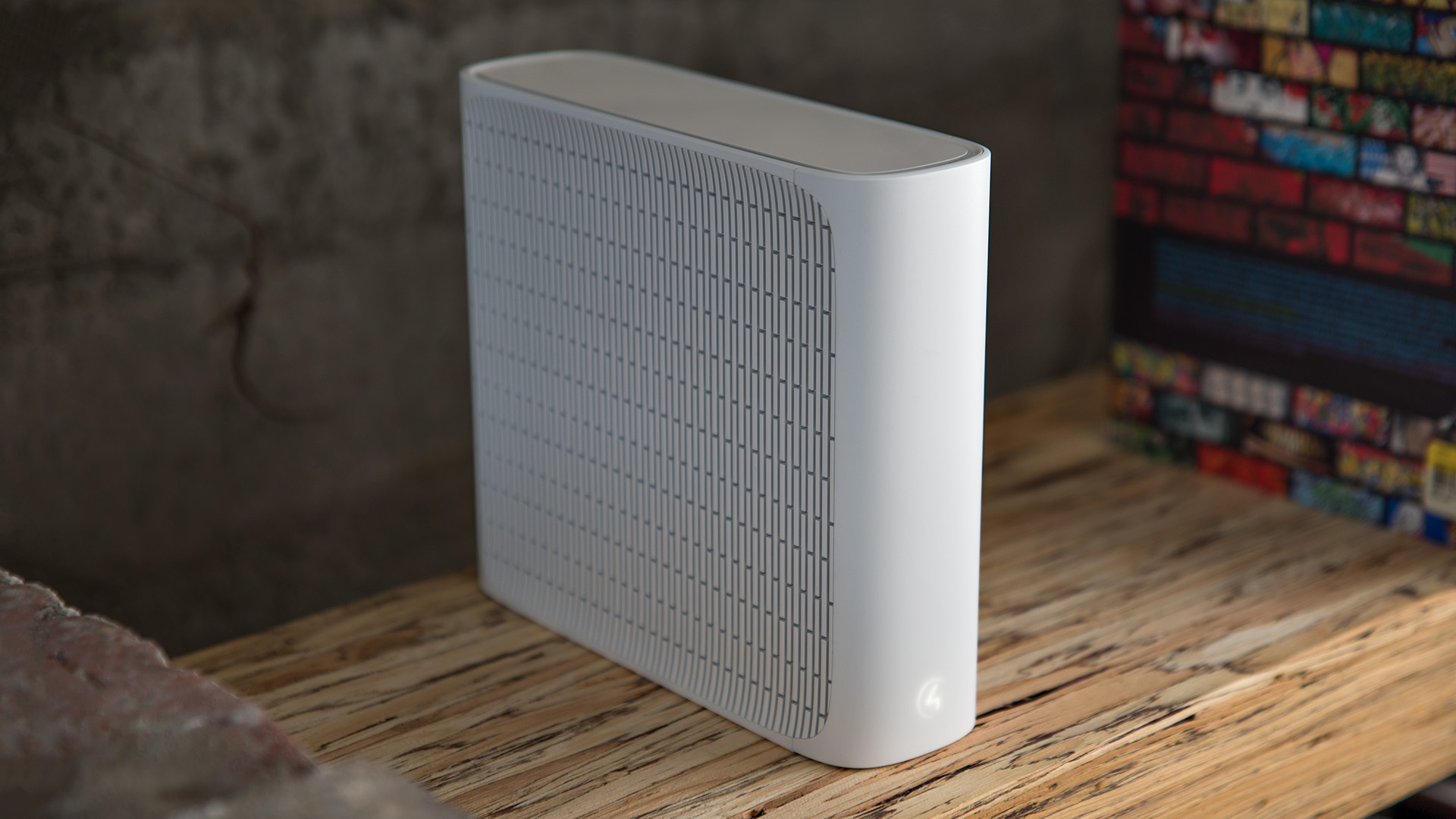
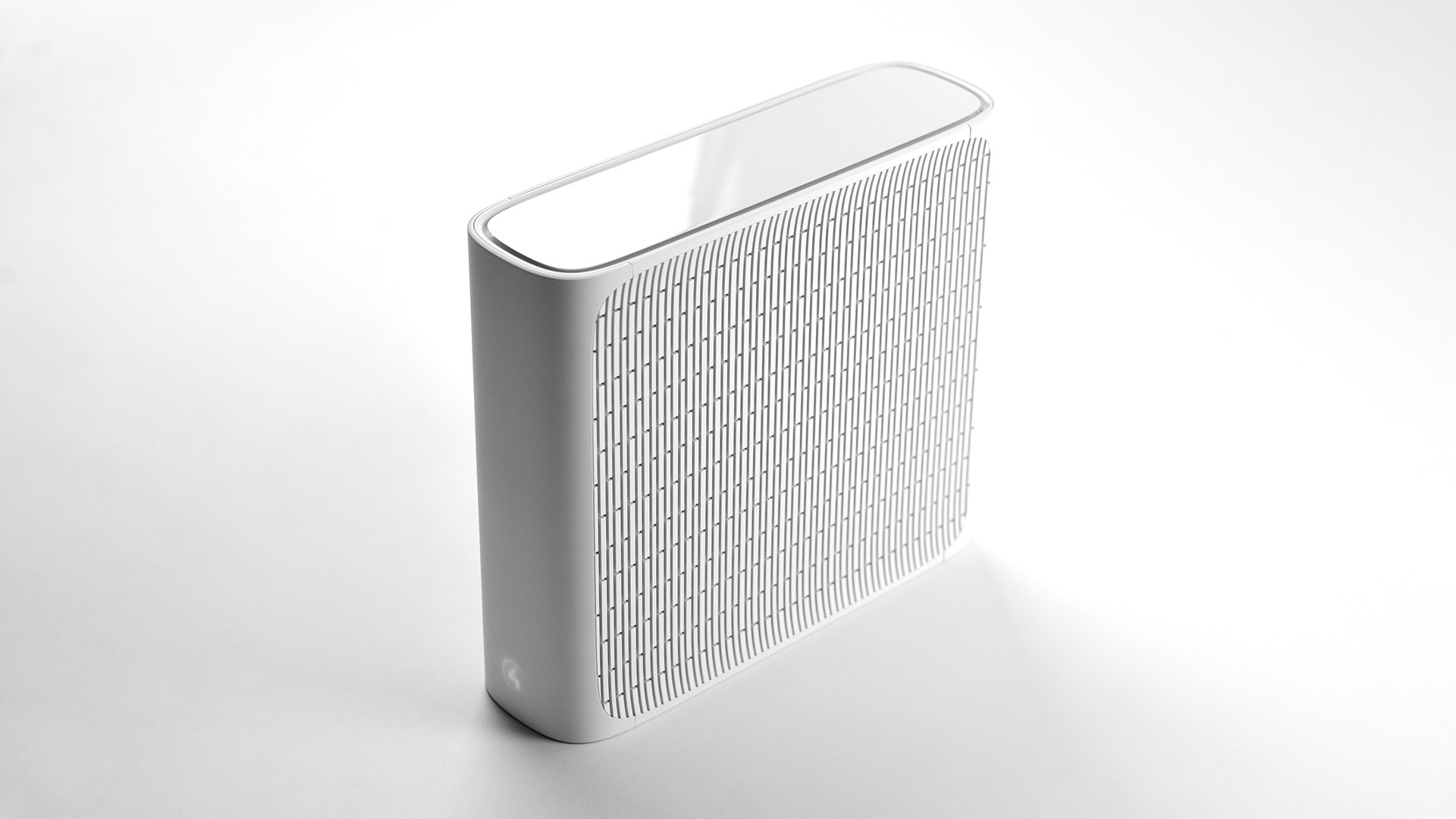
With 100 watts per channel in the power amp, heat dissipation was the most critical issue. The Triad One is intended both for behind-the-scenes installations; in AV racks and behind TVs, and out front use; on shelves and as part of a room decor. In either installation, the product might be placed vertically or horizontally, upping the stakes on providing adequate ventilation. The serif I shape provides stability and enough air flow in either scenario, while creating an elegant silhouette for the Triad One.

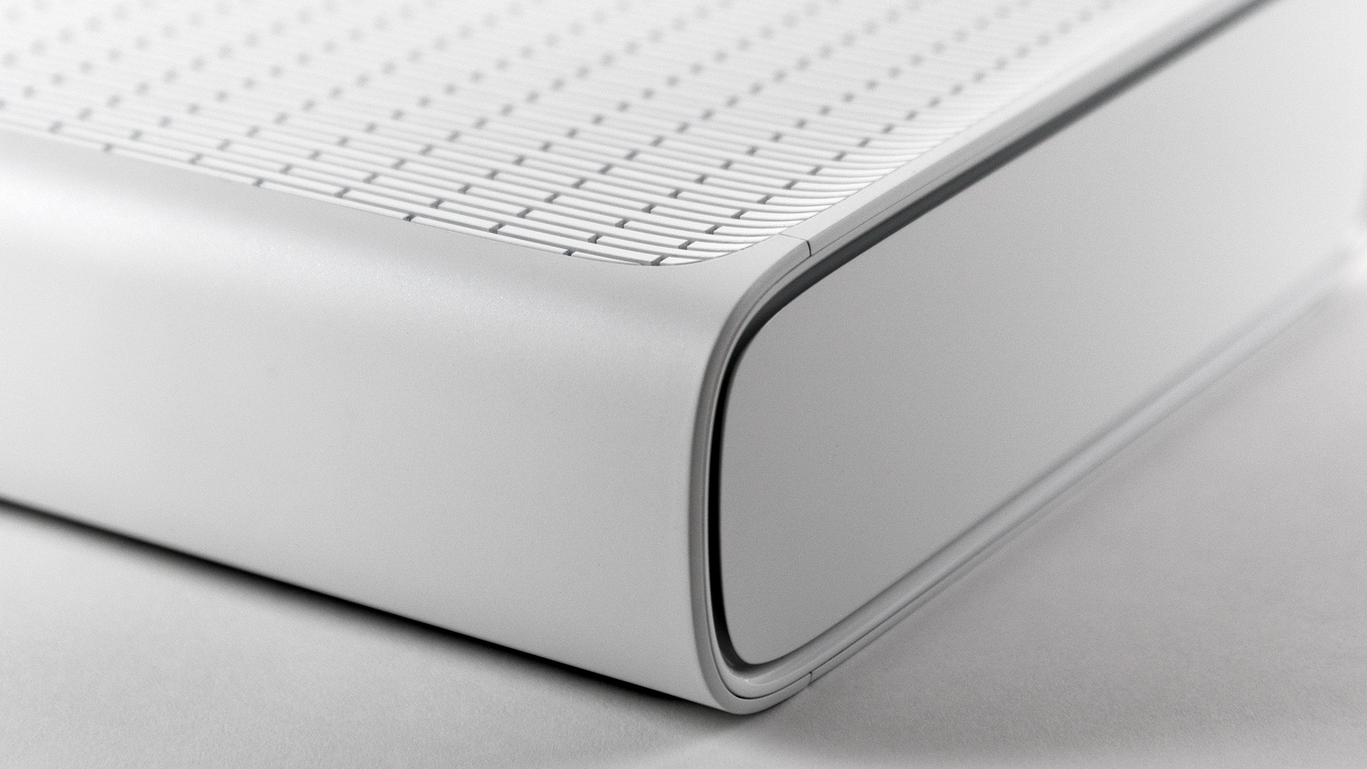
The exploration of venting patterns yielded very different expressions, positively pushing the boundaries of the more stereotypical rack designs so common in in-home entertainment systems.

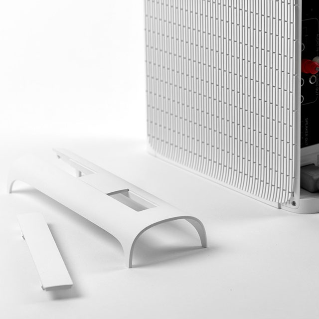
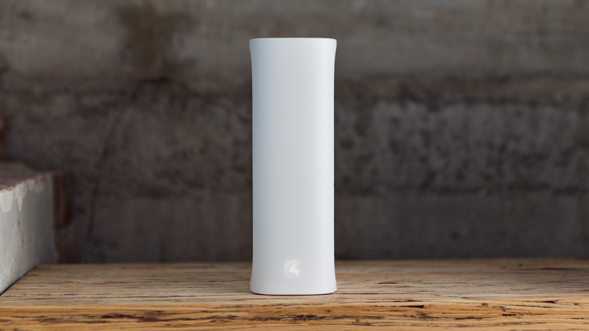
The simple shape of the Triad One with subtle texture differences for the venting areas creates a product that feels understated yet powerful. The illuminated logo changes with the orientation of the product. Two different size removable back-covers ensure that the Triad One is presentable from any view if placed in a room.

Its deft mix of simplicity of versatility make it the perfect solution to all sorts of problems.

Dennis Burger, Residential Systems

Upon its release, the Triad One was met with glowing reviews, citing the incredible versatility and performance of the product.


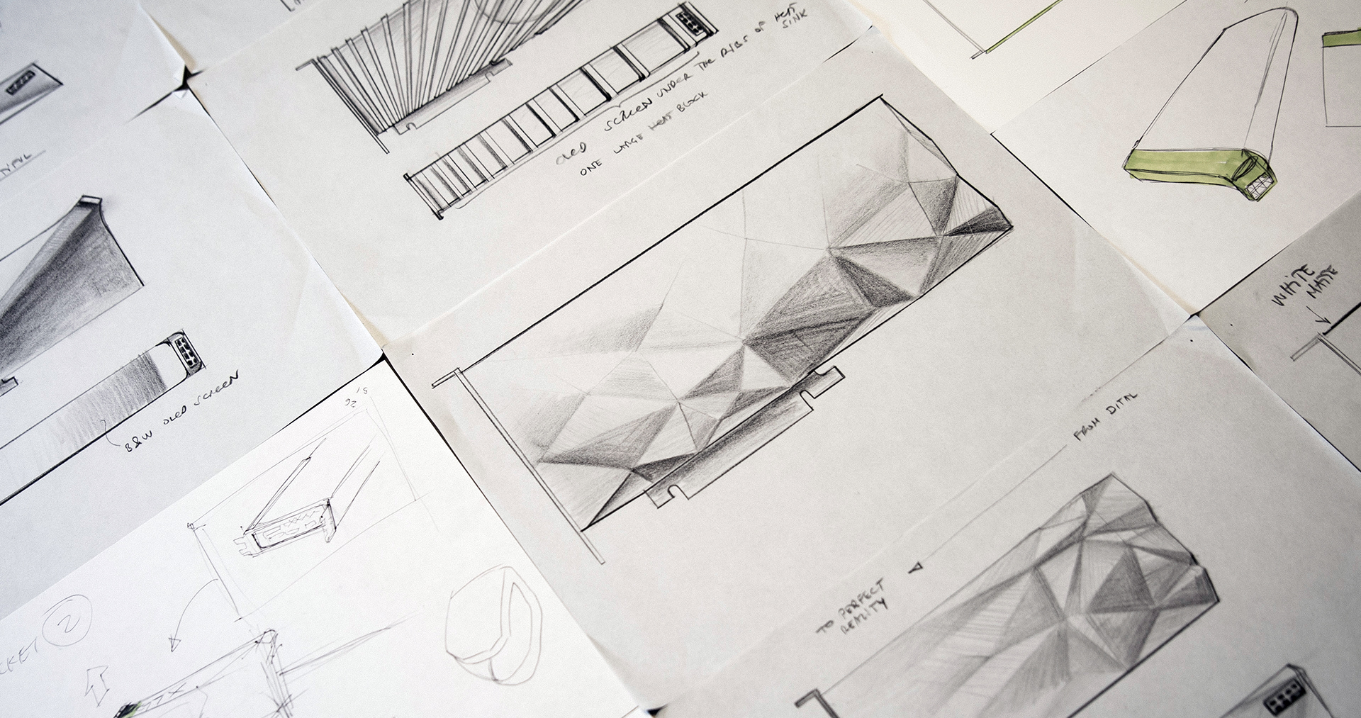
The VISION Alpha concept frees gamers and manufacturers to focus on innovation and performance where they want it.

NVIDIA and AMD broke amazing new ground with the GTX 1080 and RX 480 in 2016, but the relationship between the GPU and gamers has always been somewhat bittersweet. No matter the revolutionary performance contained within the GPU, gamers know that the thrill is short-lived. The expensive cuboid component – painfully archaic in its installation no matter its performance specs – will soon be obsolete and join its predecessors in the e-waste pile.

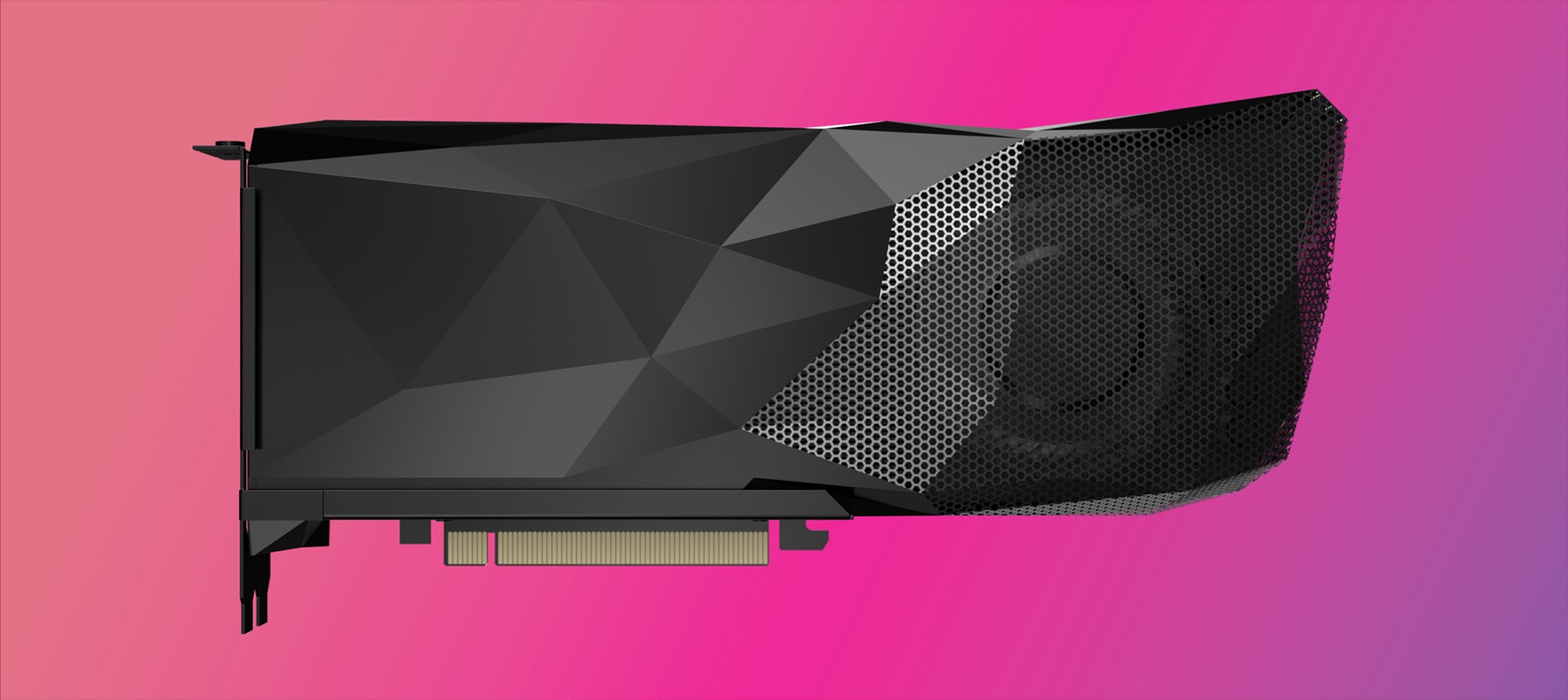
In a sea of similar, aggressively-styled graphics cards with little difference in value proposition, VISION Alpha is different. Its physical form immediately conveys the connection between gamers and the virtual, and underneath its backwards-compatible form factor rests the innovation-proof CORE system architecture.

VISION Alpha GPU on pinkVISION Alpha GPU side view

Extending from the core

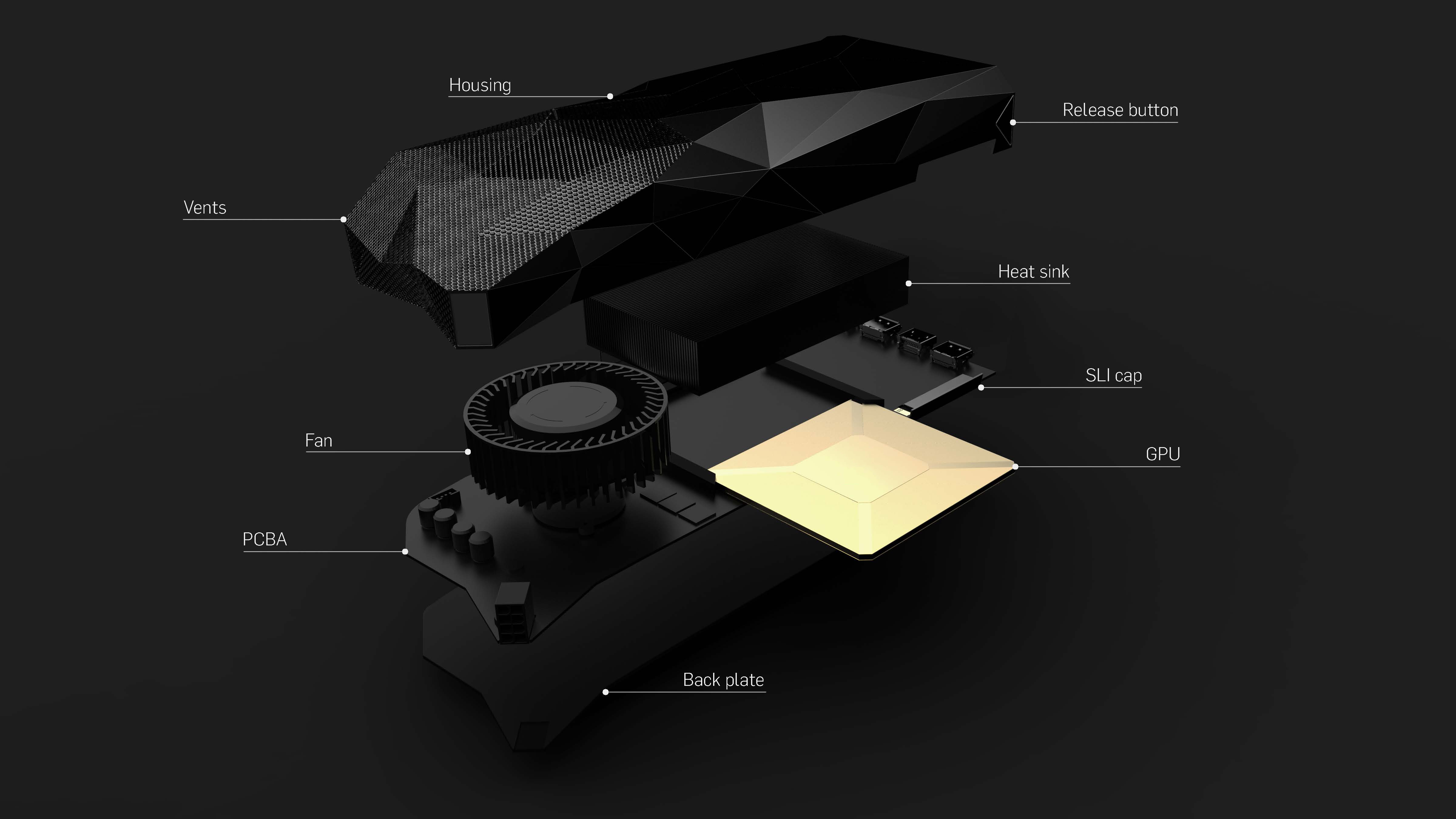
CORE enables OEM manufacturers and gamers to decide their own upgrade paths. Easily switch cooling options for better system stability, or upgrade just your chipset while retaining your favorite chassis.

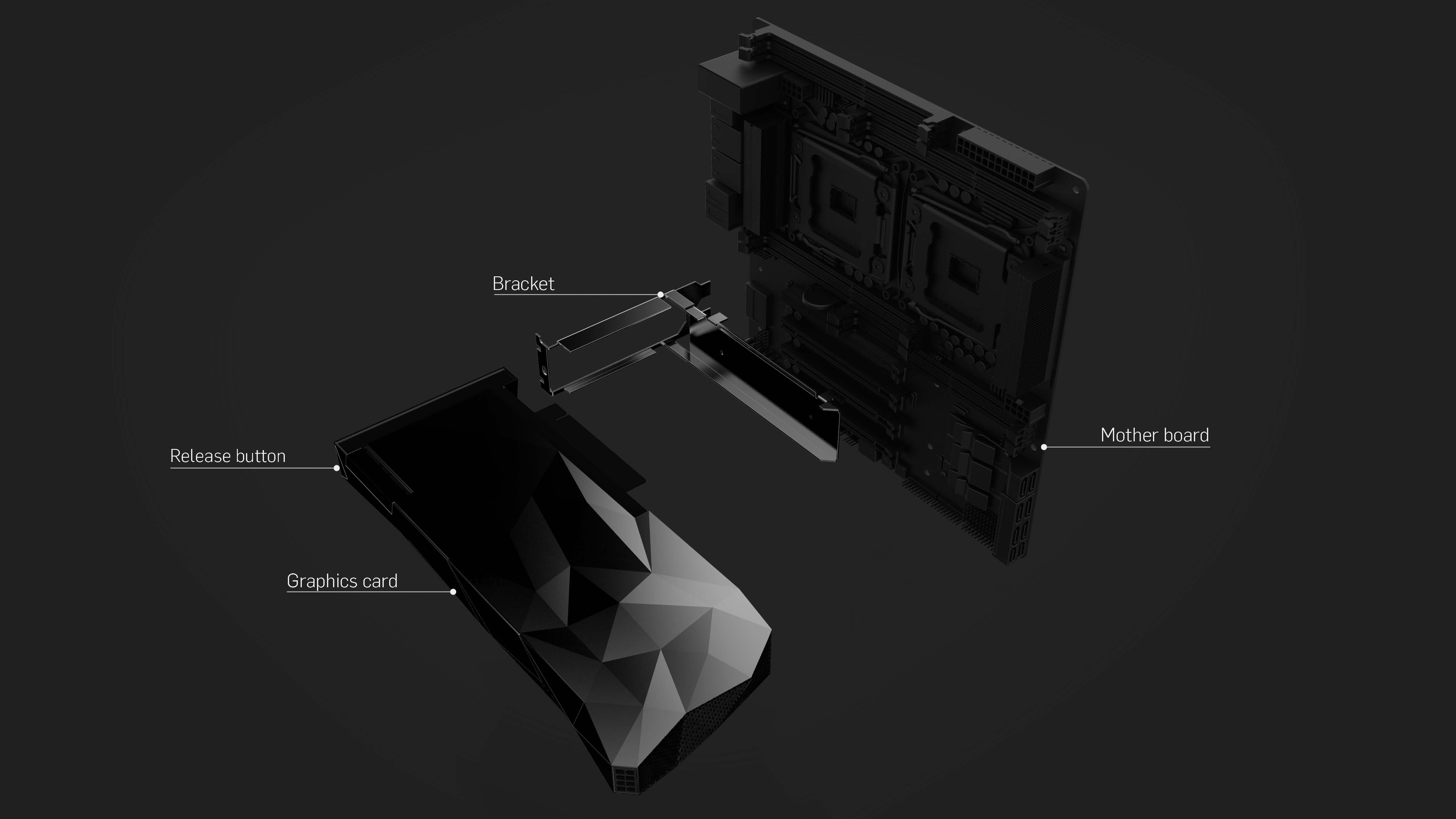
VISION Alpha GPU componentsVISION Alpha GPU quick release bracket

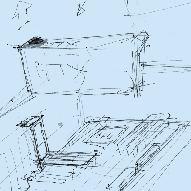
The innovative design of the quick release bracket adapts existing clumsy PCIe latches to an intuitive, ergonomic rail mounting system that makes it easy to swap graphic cards.

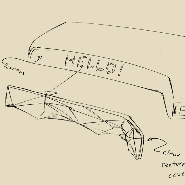
VISION Alpha’s finishing move is hidden in plain view. In an ode to our favourite video games, once VISION Alpha is installed and powered on, a 10”AMOLED display comes to life. Offering gamers another medium for self-expression the display is infinitely customizable – showcase your blazing FPS rates, fly your team colors, or whatever else you imagine. Now that see-through window on your expensive PC case finally makes sense.

The power is in your hands

VISION Alpha’s backwards compatibility allows gamers to future-proof their existing gaming rigs, while its modularity ensures there is constant incentive for gamers to upgrade selectively and often. Such upgrades allow manufacturers to release progressive components that are more efficient at lower cost without creating unnecessary waste. VISION Alpha has the potential to usher in a new era of sustainability that benefits both the users and the industry.

And decoupling the GPU core makes it much more versatile, lowering the barrier for partners to integrate its parallel computing power into new product categories, while adding upgradeability and longevity to future releases such as laptops and game consoles.


Awards

iF Product Design Award

Red Dot Product Design Award

IDA Product Design Award

What we did

Experience Essence™

Insights

Industrial

Materiality

Industrial Design

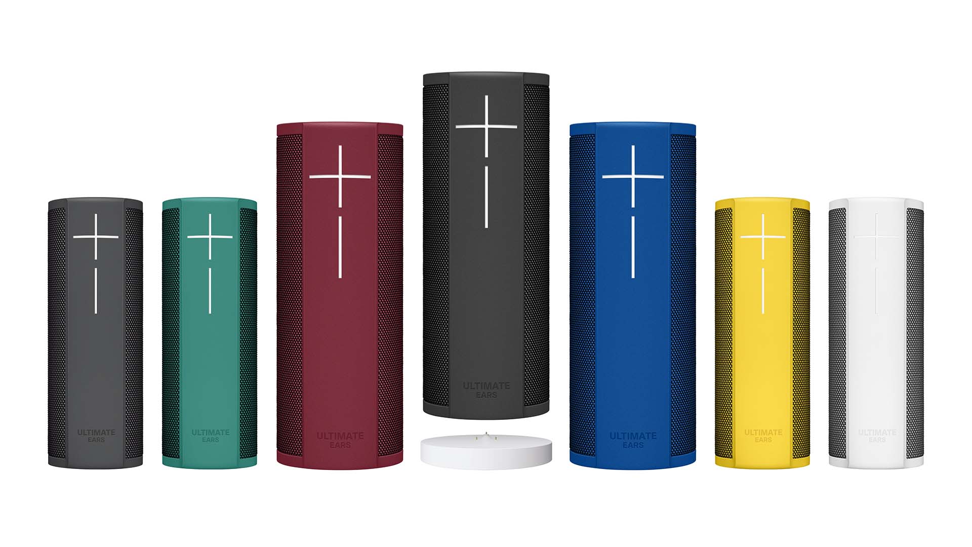
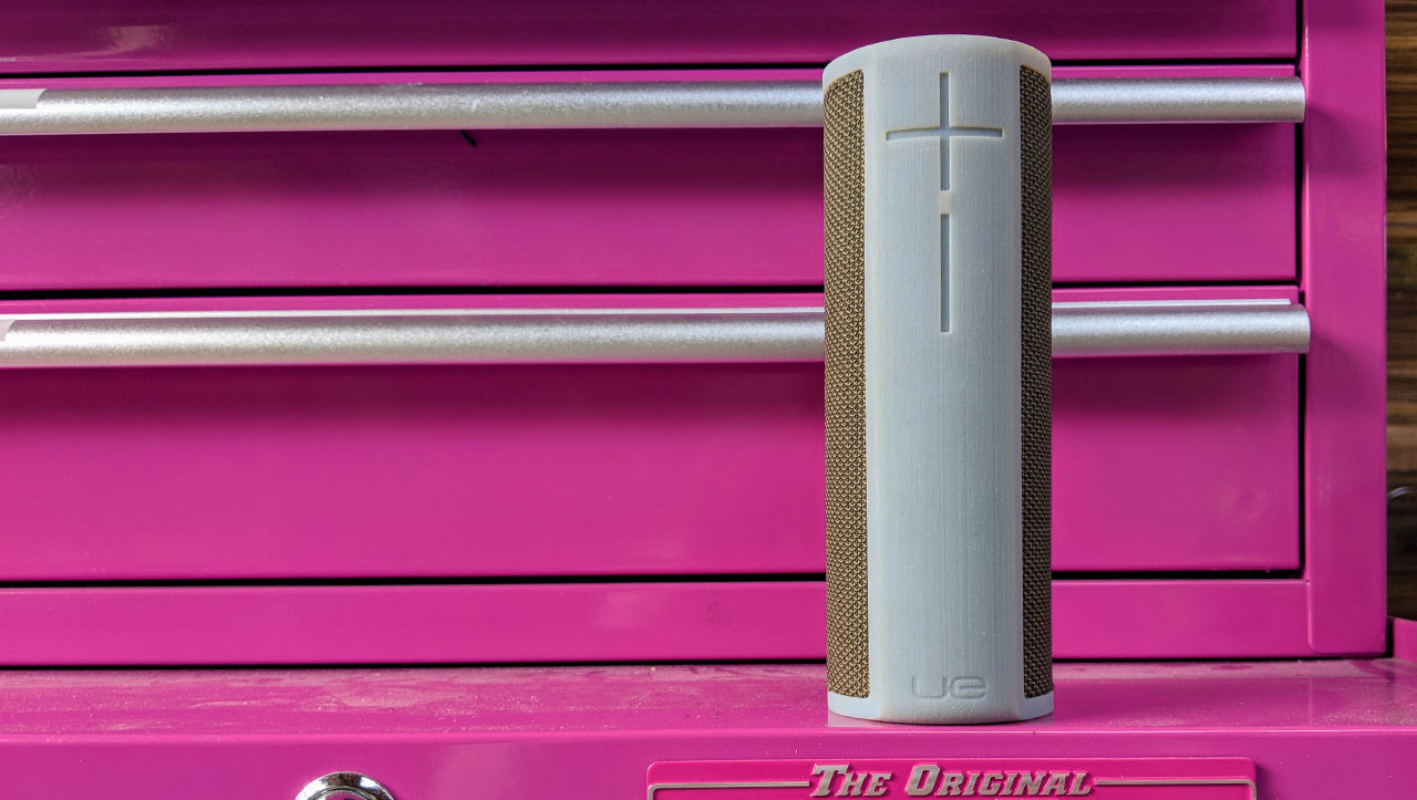
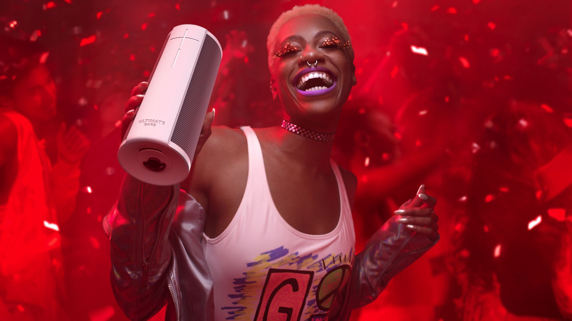
With its iconic design, the Ultimate Ears line of portable Bluetooth speakers brought this Logitech brand from unknown to a top player, with the UE Boom alone surpassing 10 million units. The Blast and the Megablast evolve the design to bring the speakers home.

Strengthening an icon is always a challenge. The balancing act is to keep the essence of the experience intact while carefully crafting the design to create something that feels meaningfully new, yet instantly recognizable.

NONOBJECT has extensive experience in this area, creating the next generation of the massively successful Arione bike saddle and designing around the needs of millions of legacy users with the DirecTV remote control.

Gaining wifi capability, Amazon Alexa voice control and a convenient charging base, Blast and Megablast retain the effortless portability of Bluetooth speakers but are now equally at home in the home as on the go.

The Best Bluetooth Speaker Now Works With Alexa and It’s Amazing

Gizmodo

On the edge

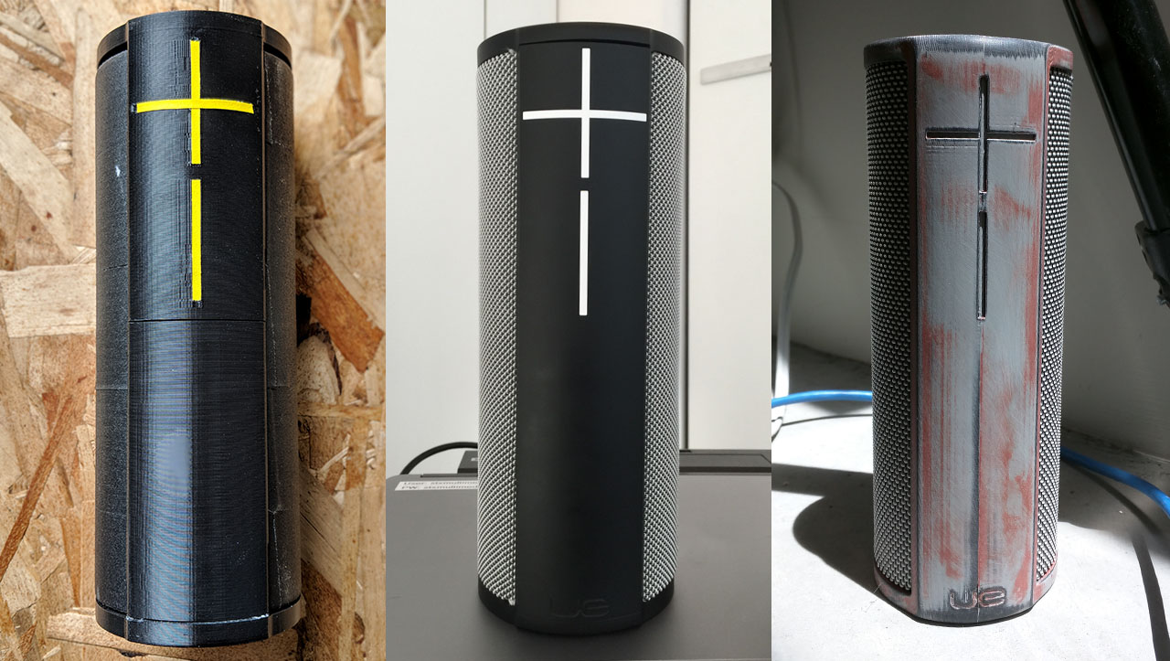
The speakers have been completely redesigned from the inside to allow for more powerful performance. Almost an inch taller than Boom and Megaboom, Blast and Megablast are edgier, literally. The elastomer bordering the lifeproof acoustic skin of the speakers is more substantial, with sharper edges that provide a stronger presence. The power button and the integrated LED is larger, signaling the amplified sound contained within.

The acoustic skin legacy

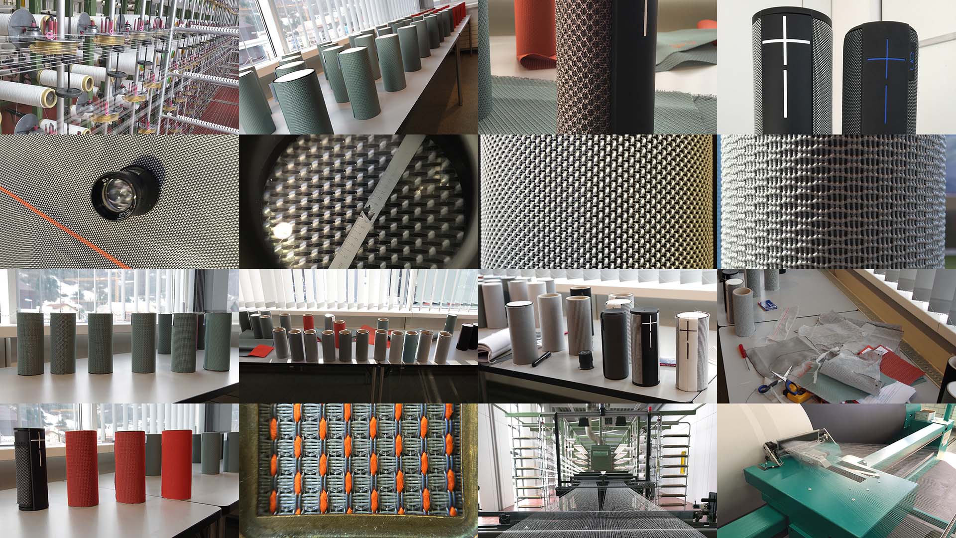
The design of the UE Boom pioneered the use of fabric on portable speakers during a time when plastic and metal still dominated the market. It ushered in a wave of fabric covered consumer electronics products, and is now widely adopted, including by companies such as Google and Apple. The acoustic skin is unique in how it makes the speakers suitable for any environment, whether at home or on-the-go. Blast and Megablast continue the acoustic skin legacy, and are completely waterproof and stain resistant.

Beckoning you to engage

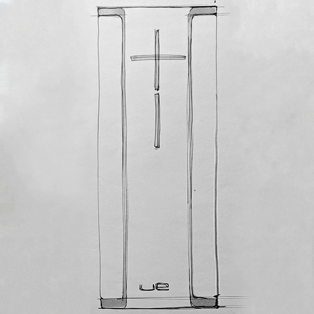
The UI, the iconic plus and minus that makes Ultimate Ears’ speakers immediately recognizable no matter the product or the context, is brought even more into focus with Blast and Megablast. Sharper and more prominent, the UI beckons you to engage with the speaker, whether via touch or voice control.

The design is instantly recognizable as an Ultimate Ears speaker.

Wired

A new charging solution 

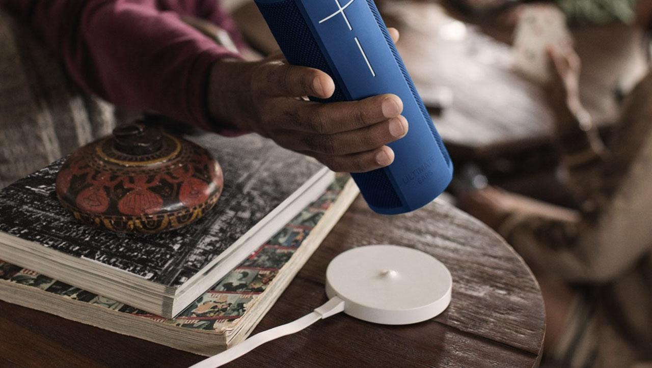
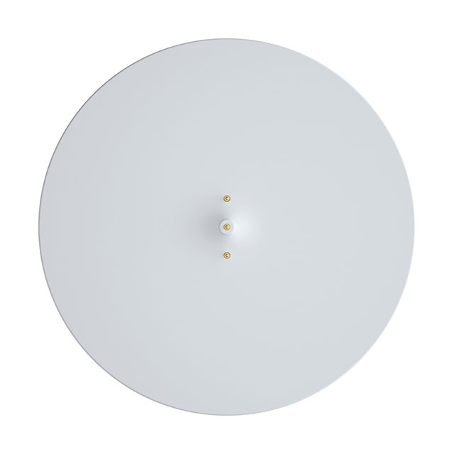
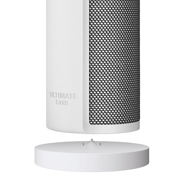
When it was first launched, the UE Boom garnered much attention for its conspicuous charging solution – a neon yellow flat cable that elicited a smile with its vibrant color, and easily rolled up for easy storage. The Power Up charging bases evolves that idea for the home and allows seamless charging so that Blast and Megablast are always ready for the next adventure. Inconspicuous when not in use, the cone in the middle of the base gives subtle but sufficient feedback to allow for easy eyes-free placement of the speaker.

From boom to blast 

When the UE Boom was first launched in 2013, it was an underdog. An unknown speaker brand with the visionary promise of music out loud anywhere you go. Fast forward to today, and the Ultimate Ears line up of speakers has consistently won accolades as the best portable speakers on the market. The experience of Blast and Megablast is no different.


What we did

Experience Essence™

Storytelling

Logo

Wireframes

Visual Design

Brand Identity

With a superior technology compared to the competition, iDefendo nevertheless struggled how to communicate its offering, overwhelming its target group with information in the process.

Through NONOBJECT’s Startup Shop, we helped iDefendo with storytelling, a new logo and a complete website design.

A concise and memorable story

Analyzing the communication across the company website, social media channels, and customer presentations, we distilled the story into a short but cohesive narrative, establishing key points and their relative importance.

With the storytelling in place, it’s easier to make sure that how you present yourself is always concise, convincing and memorable, and consistent across platforms and outlets. And the result was easy for the company to incorporate into everything from new pitches to email signatures.

Linking the logo and the story

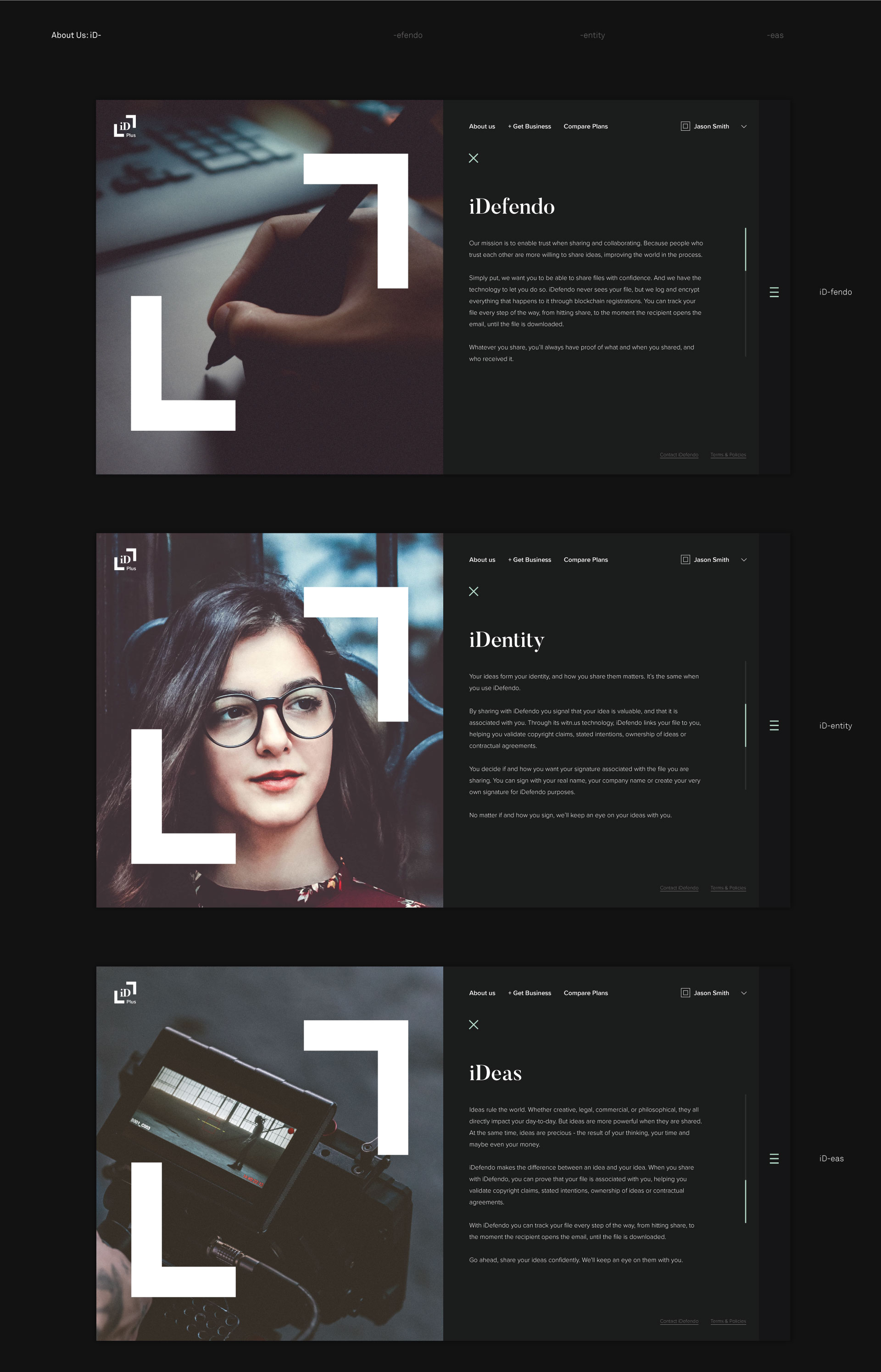
With a clear narrative in place, we designed a new logo that personifies the key pillars of the company’s value proposition of tying your identity to your ideas. The brackets of the logo, that form a block when closed, hints both at security and the company’s use of blockchains.

Designing the experience

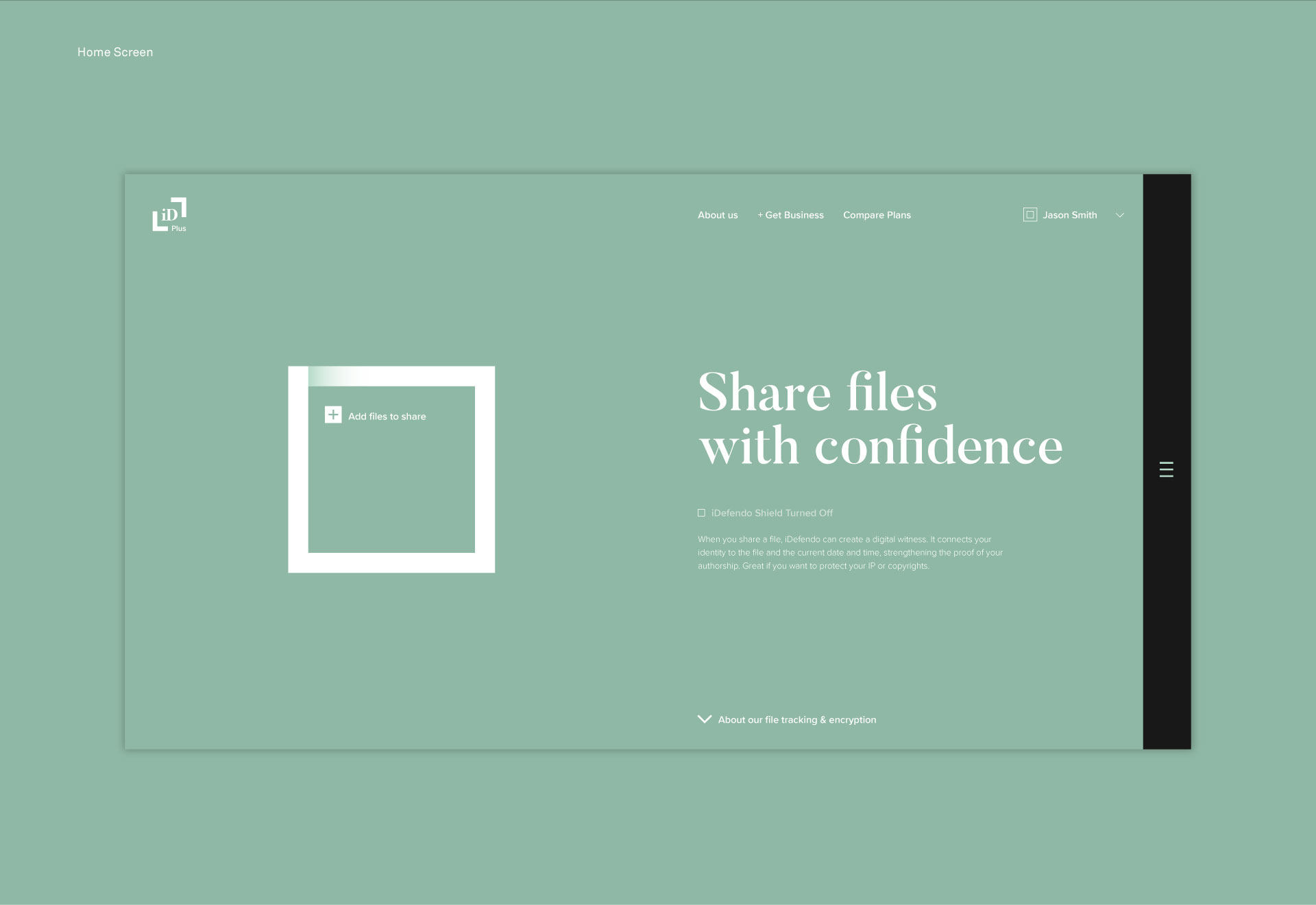
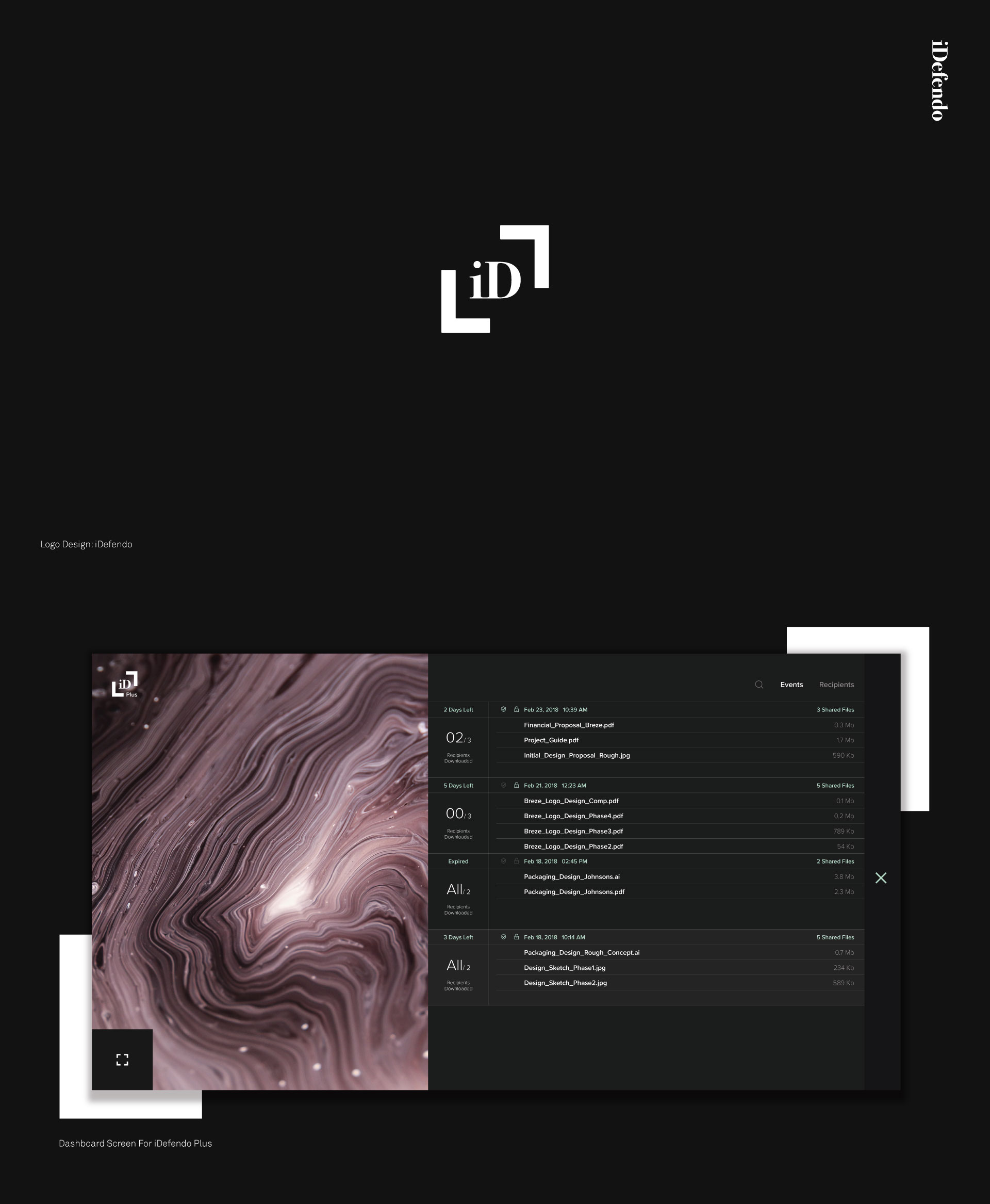
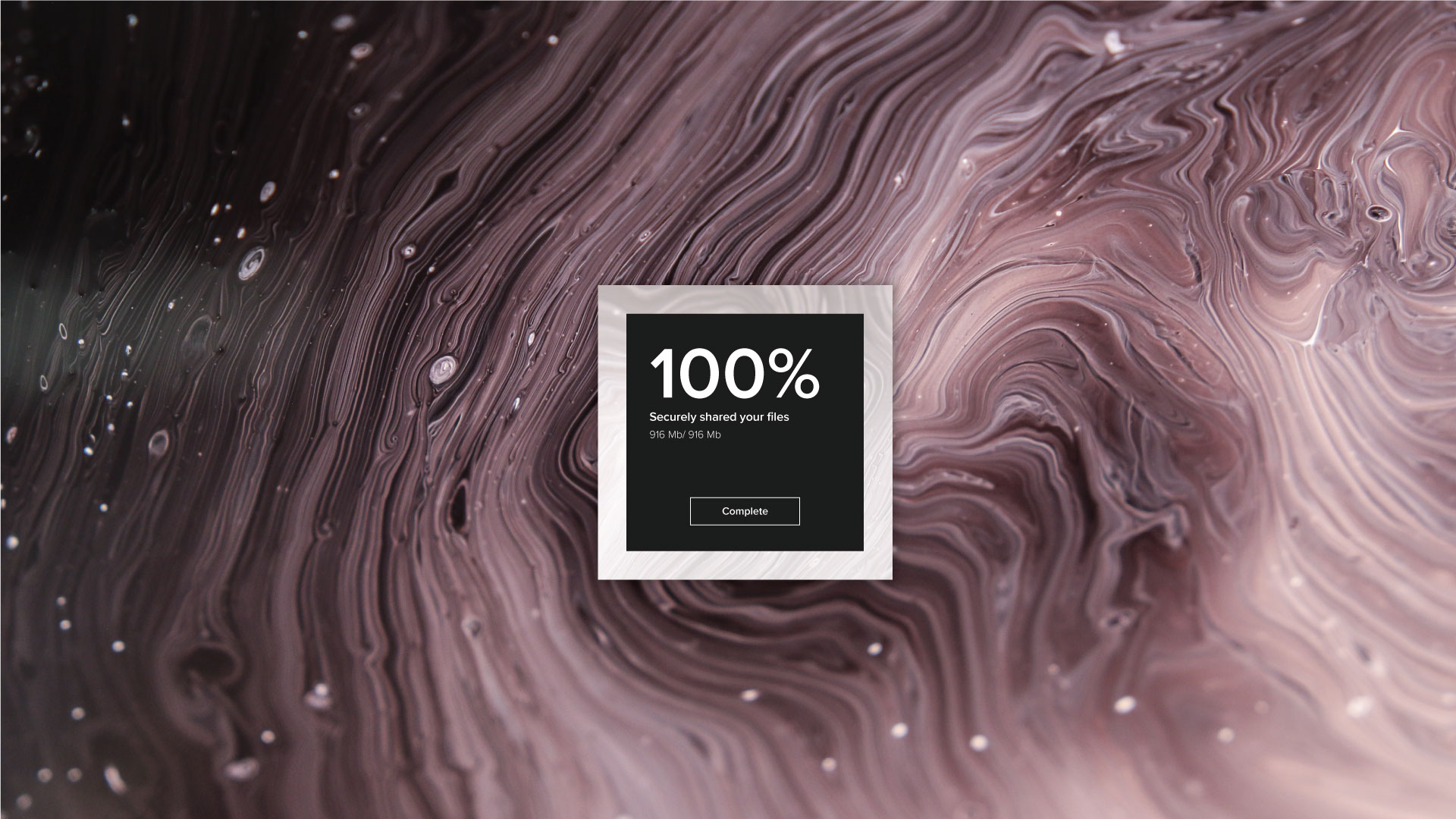
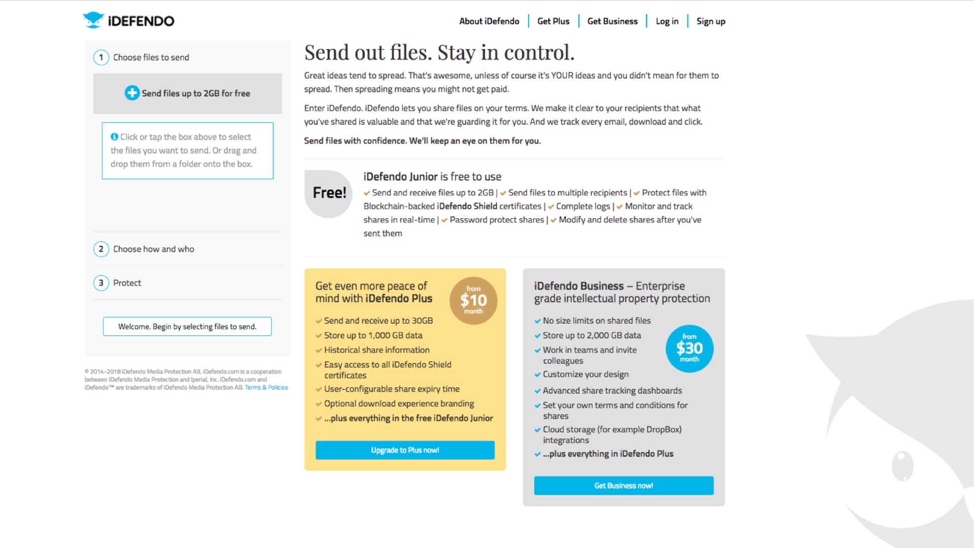
Finally, we created a complete website design for sharing files with confidence. The main element is an iconic block in which to drag files to be shared, a nod to the company’s use of blockchain technology to register sharing events. The block opens with file additions, and closes securely upon completion, anchoring a strong graphical identity that feels confident, professional and approachable.

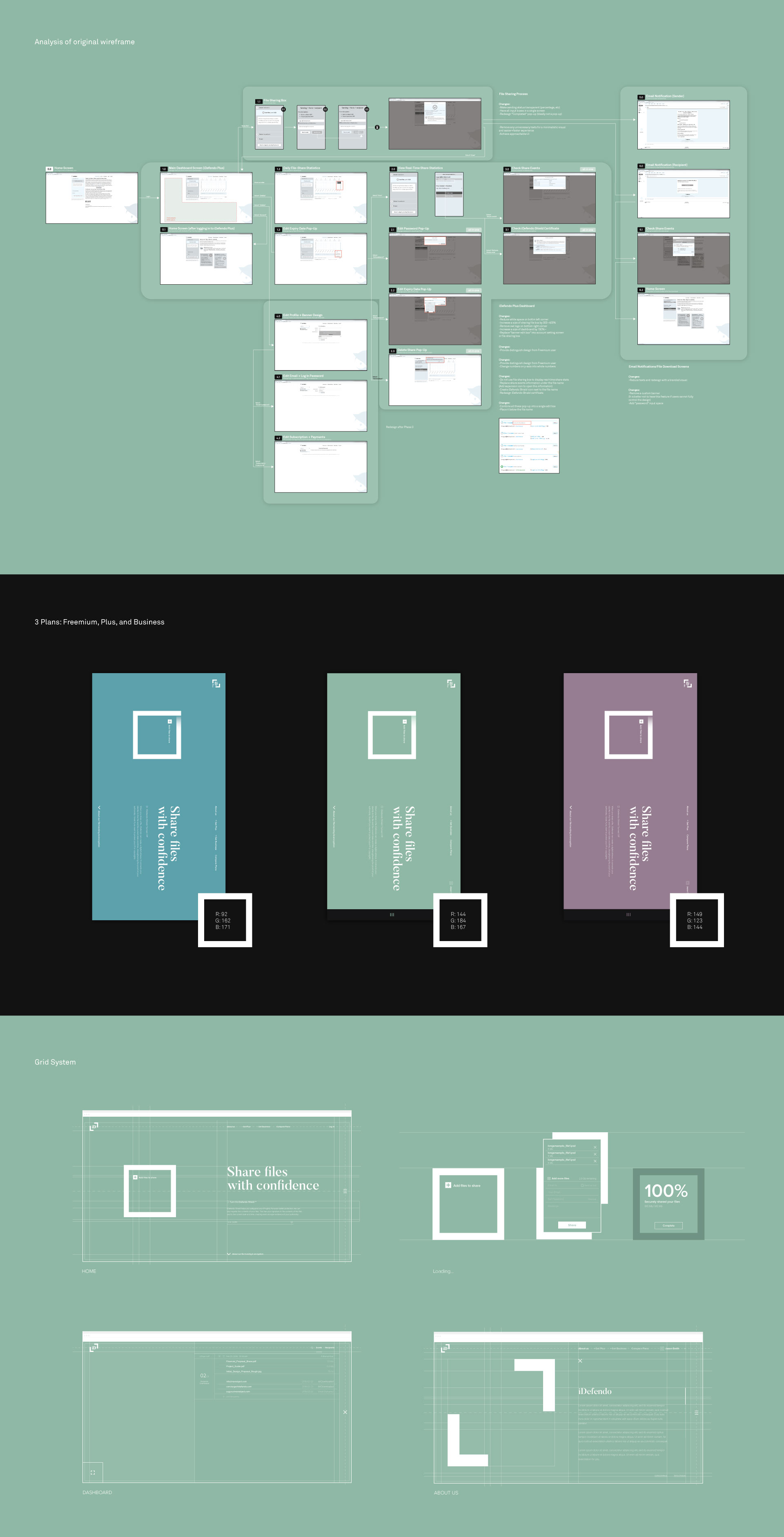
Subtle changes in color palette denote iDefendo’s three different product tiers, ranging from a welcoming green for the freemium version to an elegant purple for the business version.

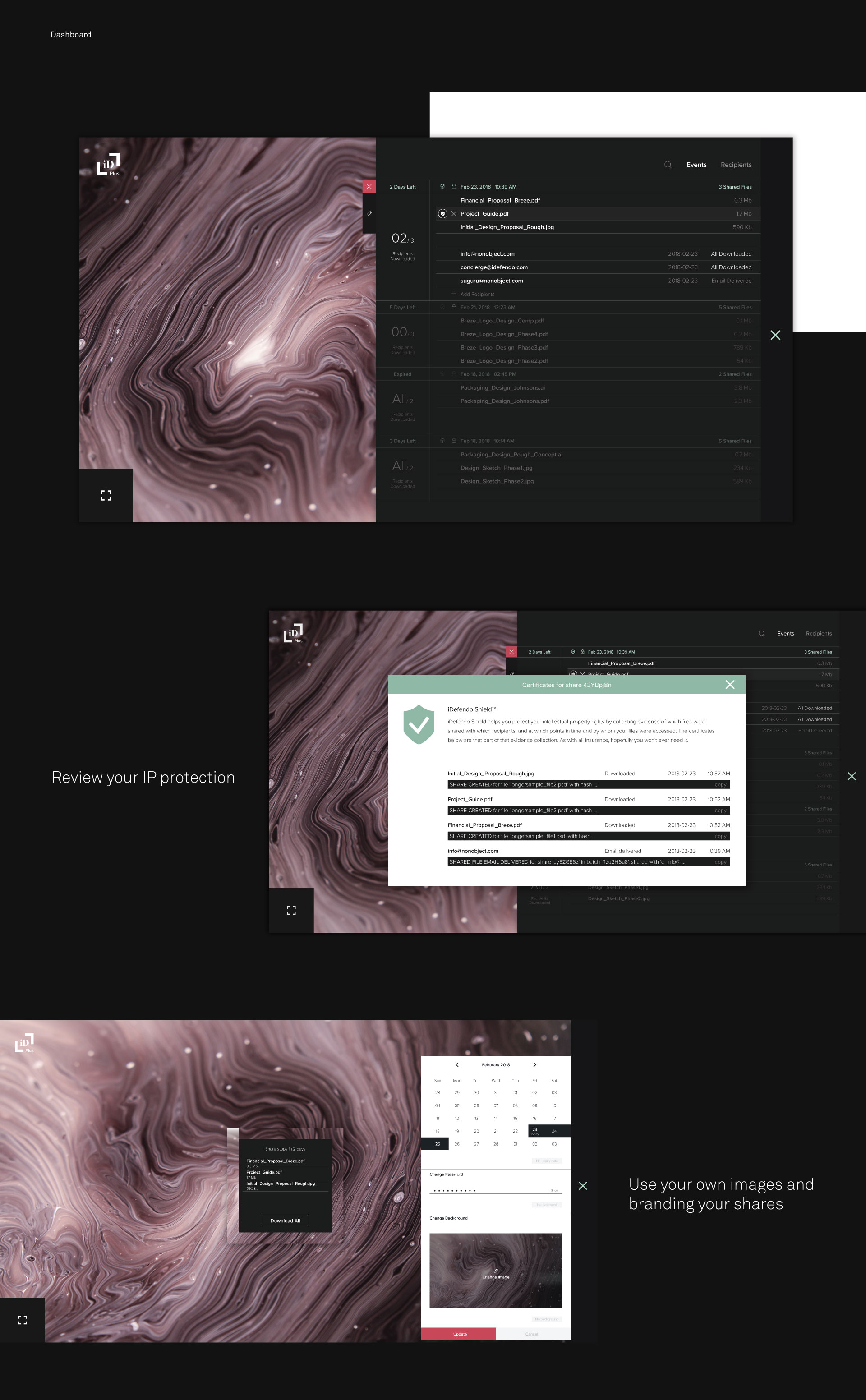
With the dashboard the user can track shared files every step of the way, from hitting share, to the moment the recipient opens the email, until the file is downloaded. And the user has complete control over the files shared, from setting passwords and access dates, to generating a certificate to protect IP rights, to creating a custom branded sharing experience for the recipient.

And the end result is an experience that lets users share files with confidence.


With hardware designs that provoke and inspire, Project Air brings VR hardware from tech gadgets to wearables

The VR experiences of today still has a long way to go to encourage mainstream adoption. Beyond technical constraints, there is a dearth of content that goes beyond meaningless experiences. But even if the technical constraints and lack of content were resolved tomorrow, there would still be issues with the user experience. And that is our focus in Project Air. We set out to create the most comfortable VR experience possible. FastCo deems the result “quietly revolutionary”.

Comfortable, intuitive and easy – and cool too

Just like the name implies, a wearable is something we actually wear. We don’t attach it or strap on, we just intuitively put it on and wear it, without prior knowledge or instructions. No one needs instructions for how to put on ski goggles or a watch. We want to achieve that same level of simplicity.  And because VR is still a shared experience with headsets and controls passed around between family members or friends, we need something that is easy to put on and take off. And if we’re going to wear it, we’d like it to be cool too.

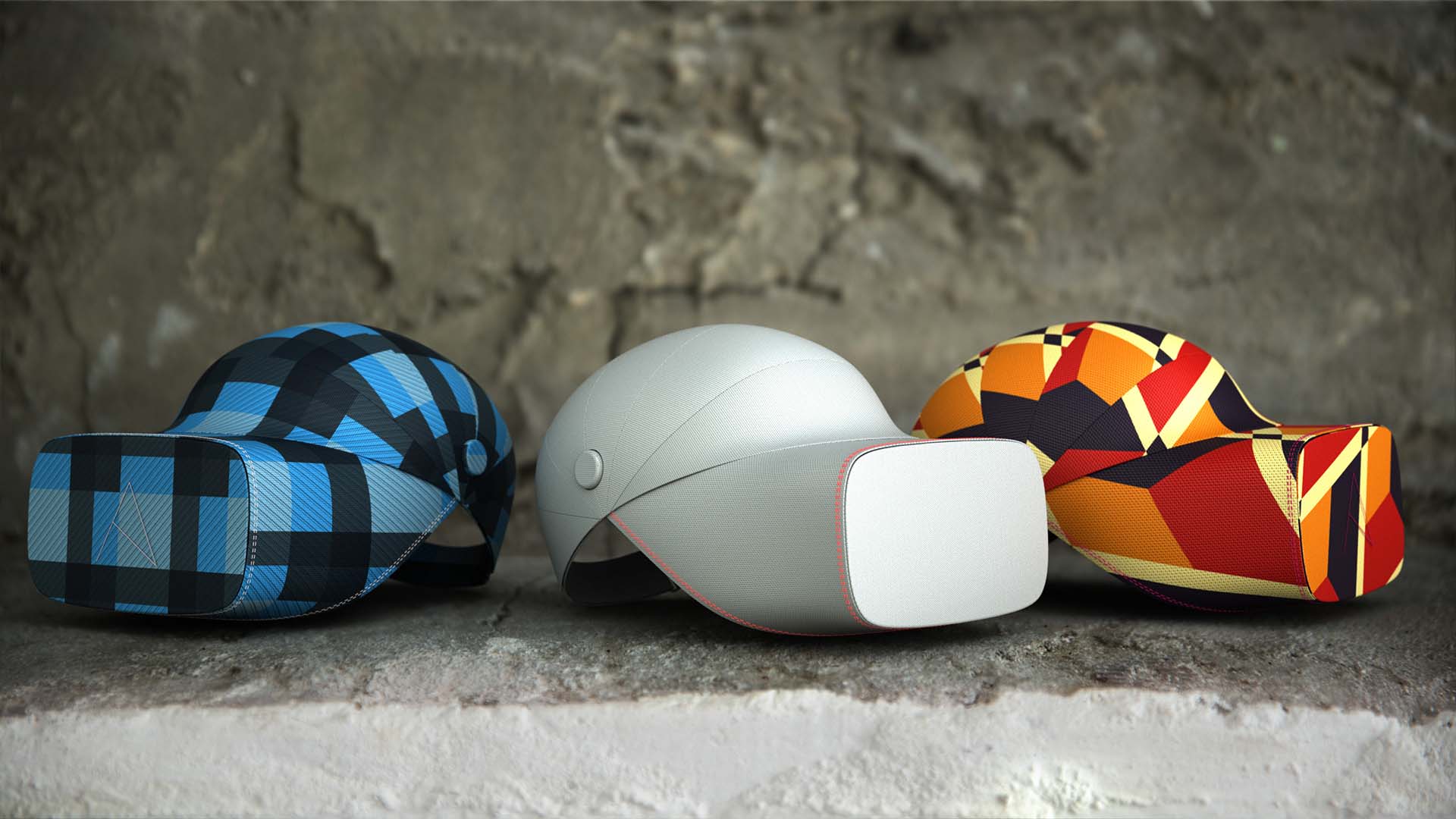
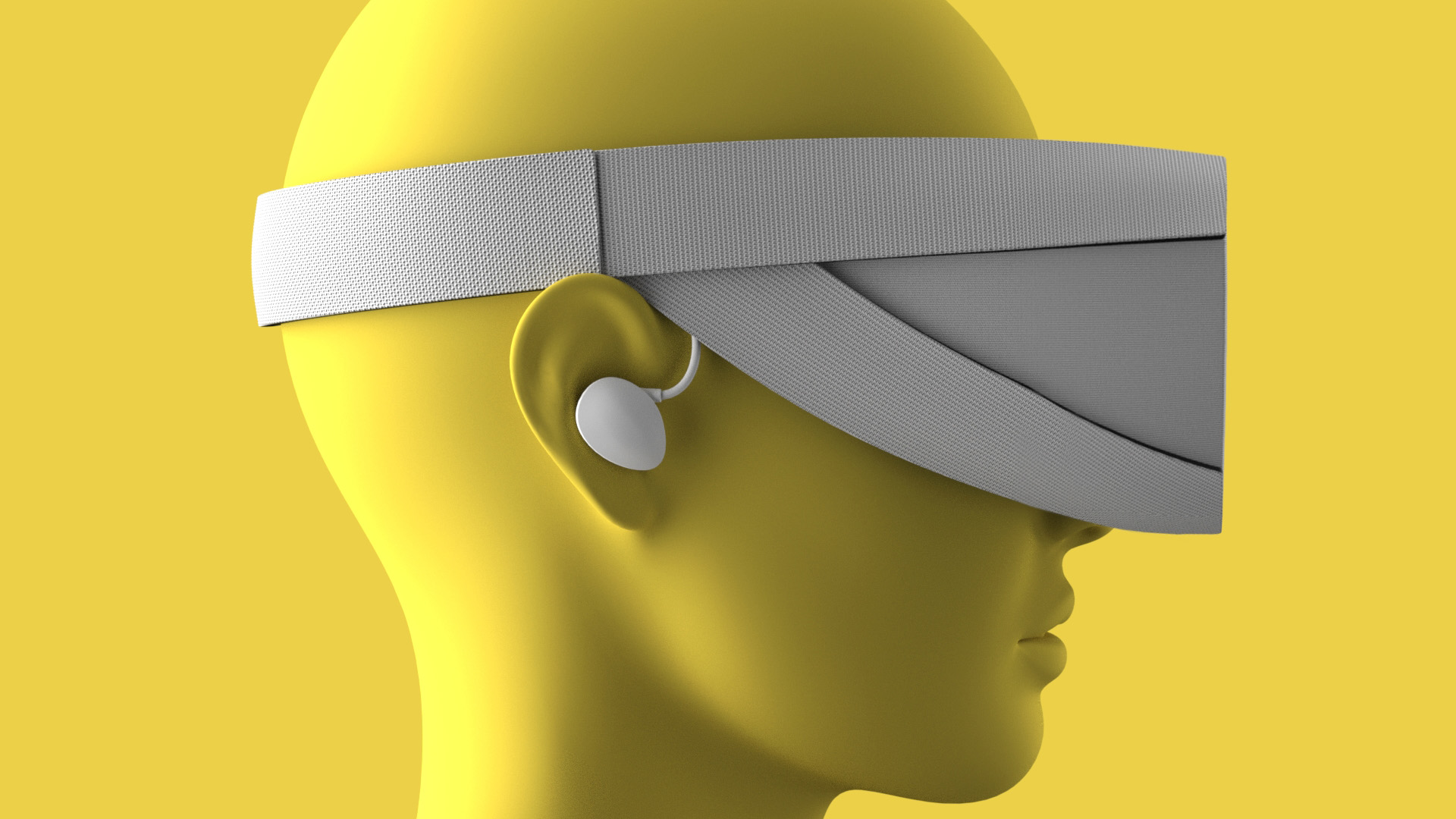
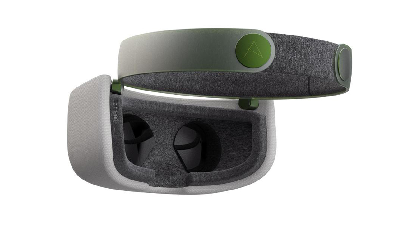
Airhead is a supremely comfortable, intuitive and easy to use VR headset. Wearing it feels cool, not like having something strapped to your face and head. Designed to be platform agnostic, it can be tethered or untethered. And because we don’t wear just one shirt for all uses, or one tool for everything we want to create, this is not one design – it’s four.

Avoiding VR face

If you wear the current VR headsets on the market for an hour, they become very uncomfortable and leave you with VR face. When technology evolves to reduce weight this will be less of an issue, but Project Air uses current technology and weight constraints to see what design can do to alleviate the pressure you feel when you wear a VR headset today.
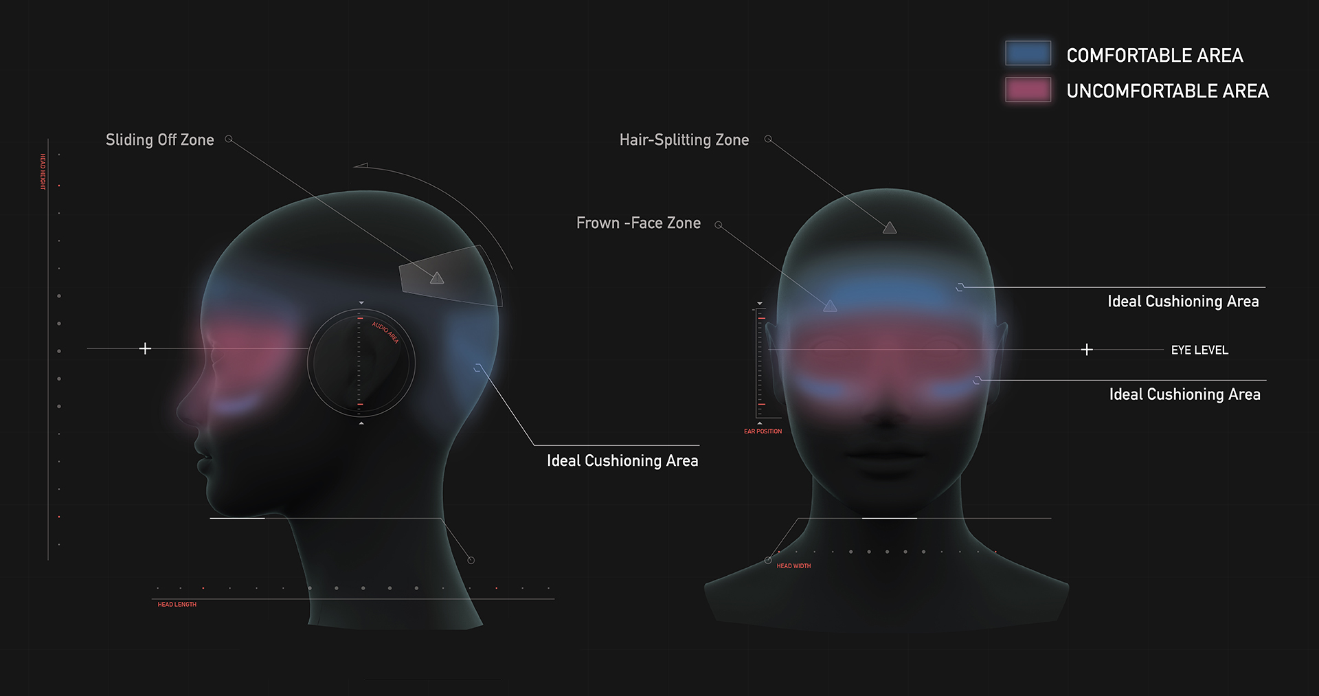
Based on our experiments to understand what can be done, we’ve found that the biggest pain point is around the cheek area. If more of the pressure is distributed on and above the forehead, there is more control over how the weight gets distributed over the areas of contact, and many problems can be alleviated.
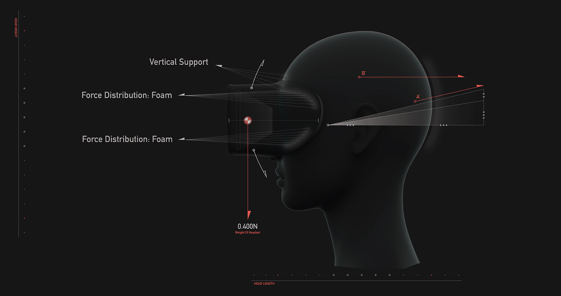
The Airhead designs distribute the forces above the brow by either having a support structure around the crown of the head, or through controls that allows differential adjusting of the top and bottom surface pressures of the headset.

Heading out

When we think about how to push the adoption of VR, it’s really about bringing it out of the living room or home office where it is currently resides, and into places that could really benefit from richer, more meaningful experiences.

Imagine it being used at an office, where VR could allow people to create and explore in new ways, free from distraction. You could also think of opportunities like virtual training, or perhaps demonstrating new products in a meeting. VR could also transform the way we think about going to the gym. What if the arcade of tomorrow is actually us going to a gym? While riding exercise bikes or running on a treadmill you could be transported into another world while getting exercise. You could also think about making completely new experiences; like allowing artists to create digitally and transform spaces into something magical, allowing the rest of us to experience art in entirely new ways.

VR could, of course, always be used at home, but rather than having a device that cuts you off from the world, what if it could be turned into something we experience with family and friends?

The most popular wearable

The most difficult area to tackle is open public places. By creating something that is familiar and approachable, the stigma for wearing virtual or mixed reality devices in public is reduced.

When we think about comfort, we want to think about not only physical comfort, but emotional comfort as well. By creating something familiar, we can introduce VR to the rest of us; people who wouldn’t want to put some techy black box on their face. Using a hat geometry results in something supremely comfortable, it distributes forces far more evenly than a few straps that converge at the back of the head.
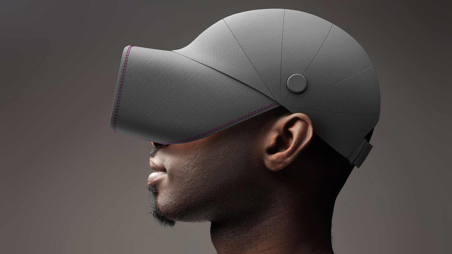
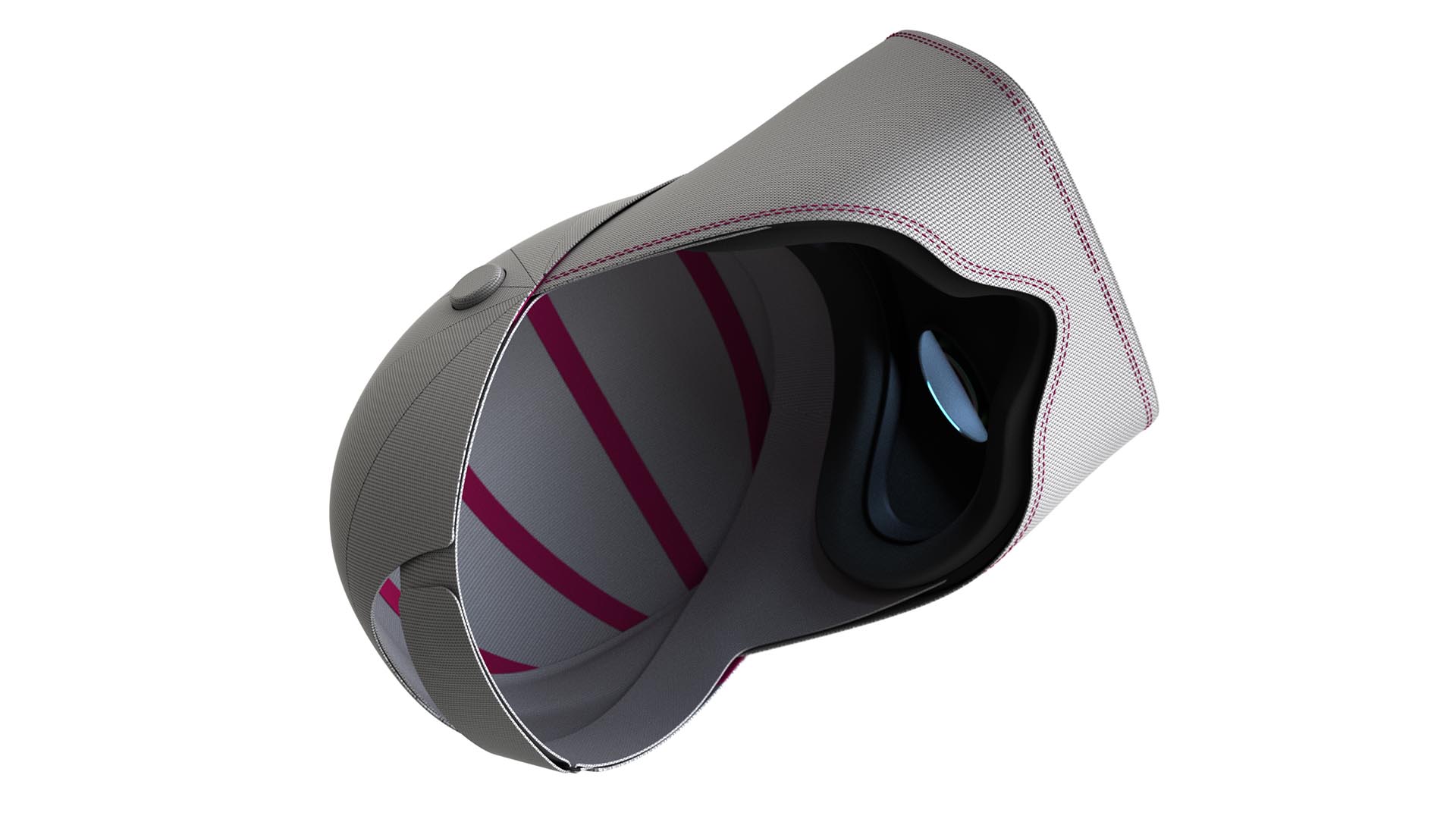
 

One band two adjustment points

When it comes to ease of use, a single band is easier than multiple; the problem is that the current single band headsets only work well for a small set of people. By splitting the band toward the front and allowing people to differentially adjust the top and bottom pressures, you can create a comfortable experience for nearly everyone.

This is about creating an easier experience, something closer to putting on a pair of goggles.

Wear it on or off

VR and hair currently don’t mix, so we wanted to rethink the way we put on and take off these headsets. Having this split in the front allows you to quickly and easily get in and out of the VR world without messing up your hair.

The in and out experience of this is so easy that they become closer to a pair of headphones than anything; you could even rest them around your neck, just like you would with a pair of headphones. As VR becomes a part of our daily lives, perhaps these are the “eyephones” of tomorrow.
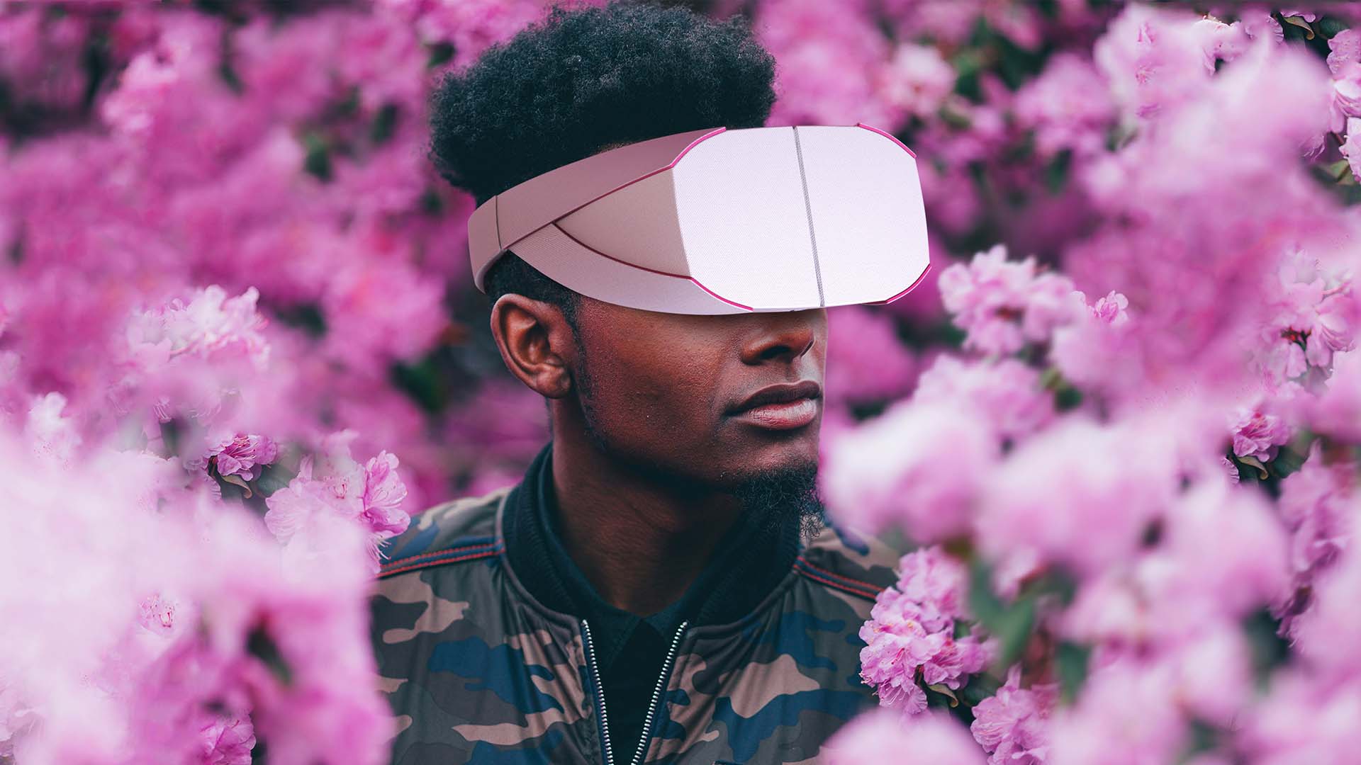
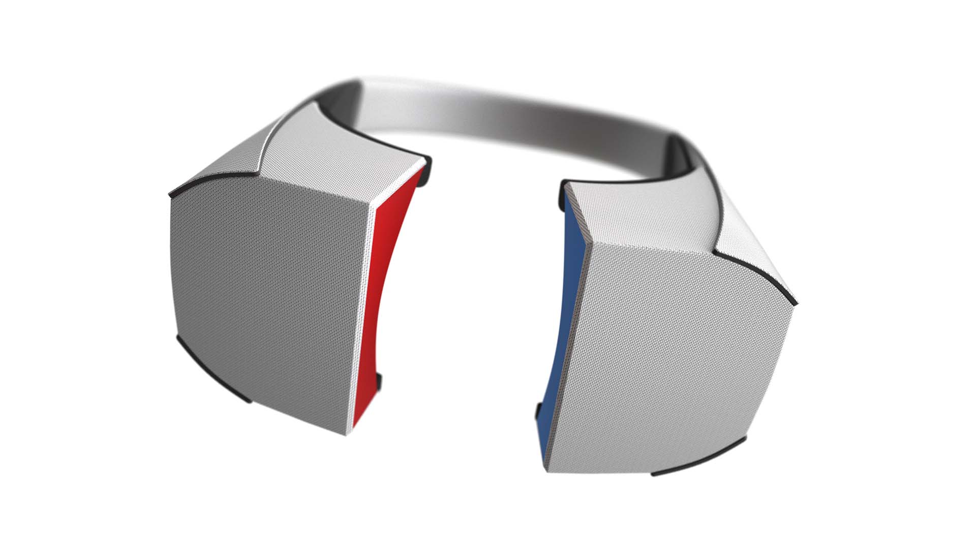
Slipping on your headset

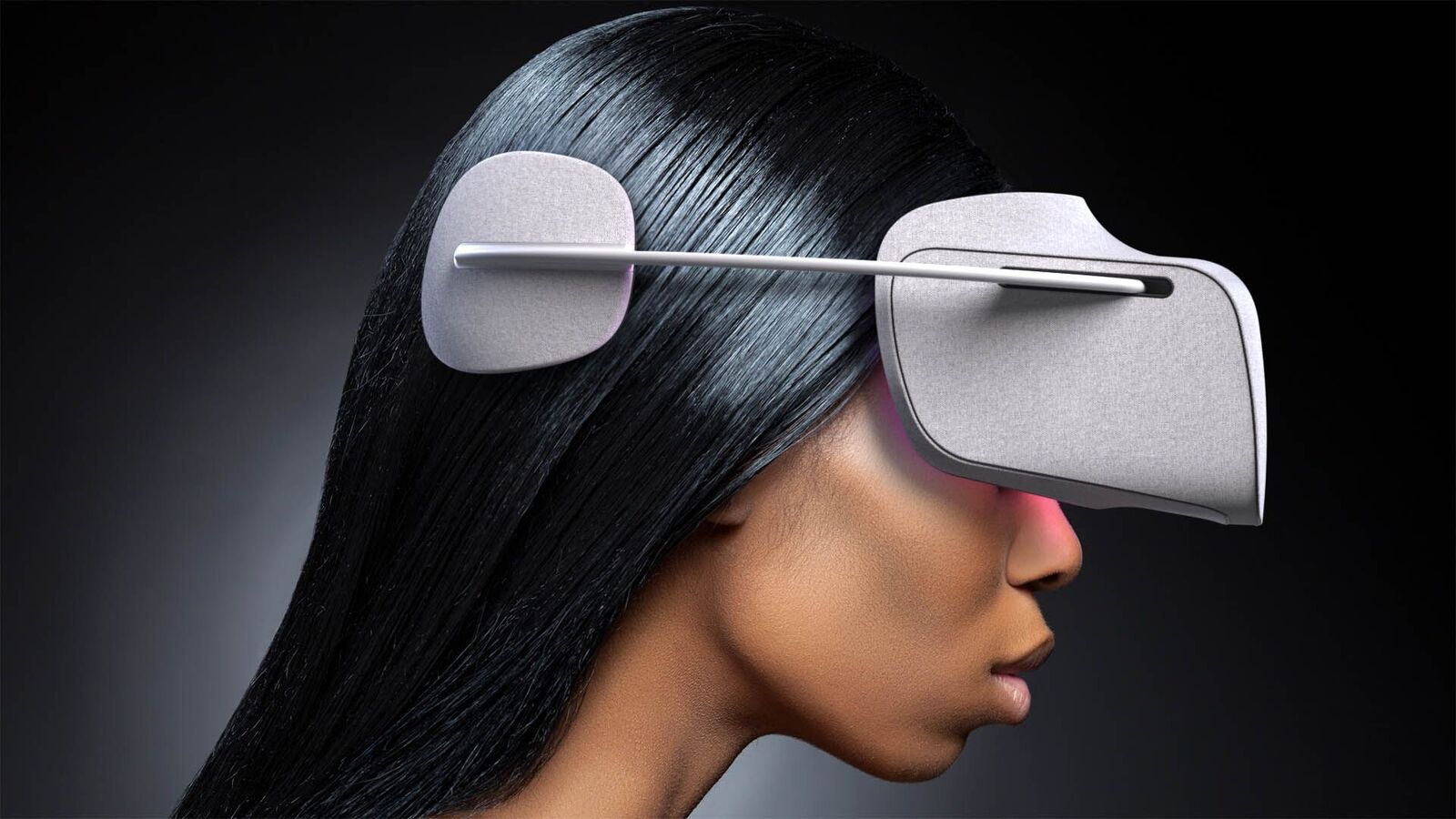
When we think about where we want VR to go in the future, the immediate reaction is to think of a pair of glasses. With Spect, we wanted to see how close we can get to this experience when utilizing today’s technology.

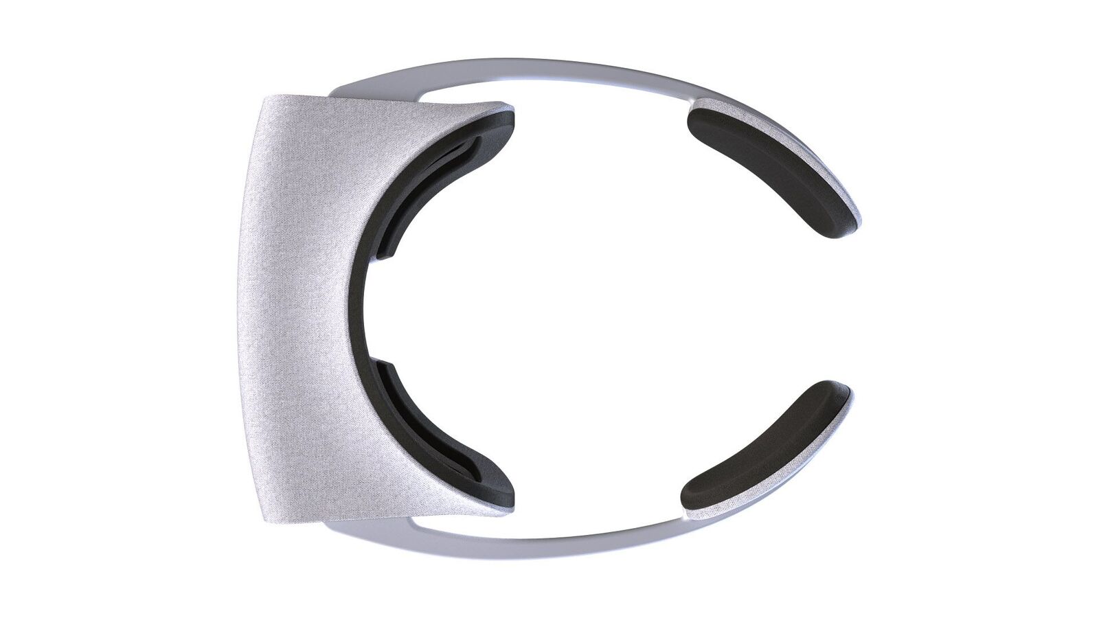
The result is one of the easiest experiences, especially when thinking about passing this around to multiple people. You just put it on like a pair of glasses and the sprung temples will adapt to any size of head automatically, no adjustment necessary. The large pads that grasp the back of the head make for a headset that is very comfortable.

Visually comfortable

Serene is a direct counter to the current paradigm of putting black boxes on the face. We wanted to make something that felt more at home being passed among family members in the living room rather than be locked in one of the back rooms.
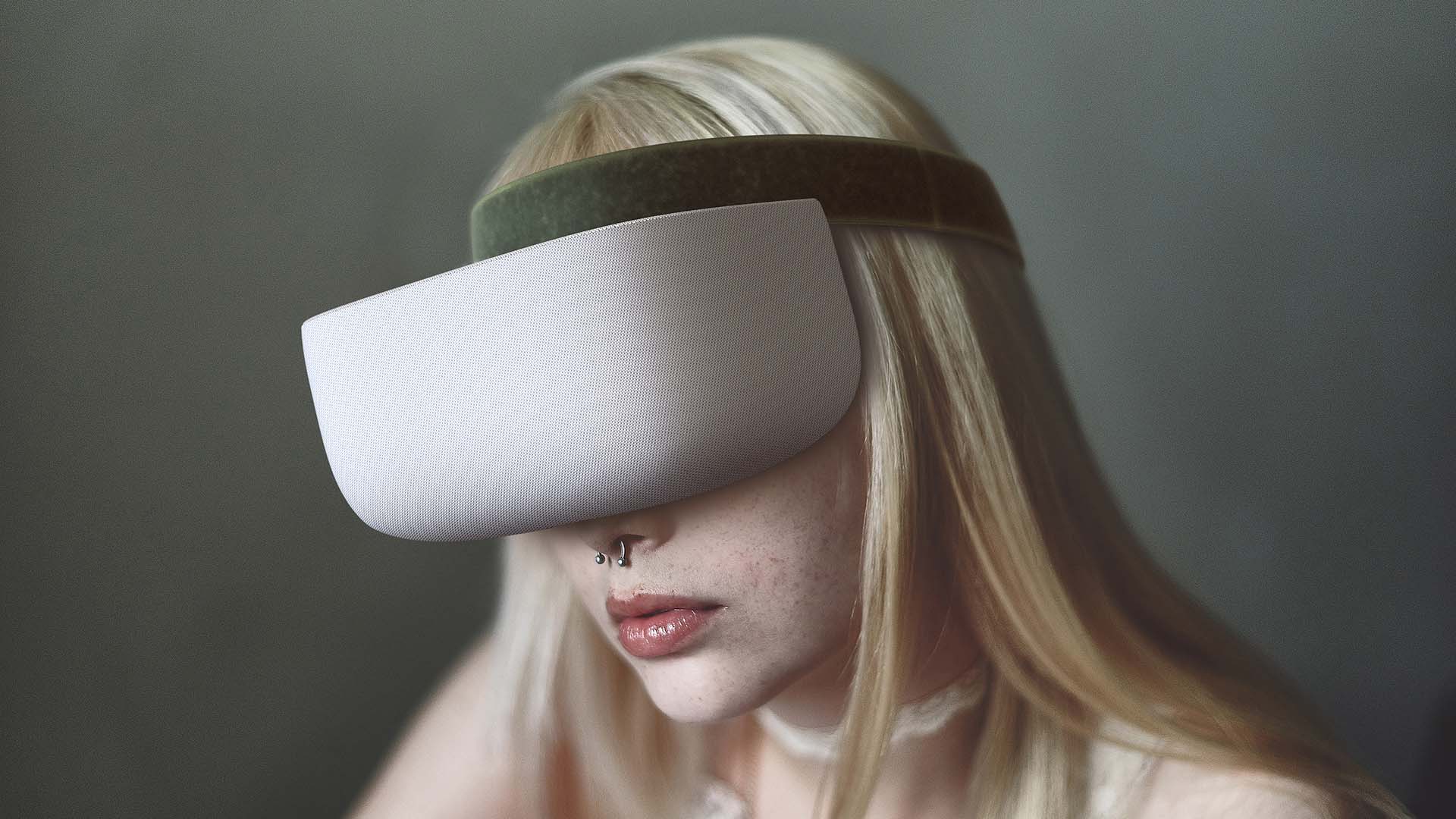
Serene uses a semi-soft band that rests around the crown of the head and the headset is suspended so there is very little pressure on the cheeks.
Rethinking interaction

Ultimately, we don’t just experience VR with our eyes and ears, so Project Air also tackled controllers that enable entirely new possibilities for interaction.

The current VR hardware paradigm borrows what we are familiar with from gaming. The goal of Project Air was to bring what’s familiar from reality into VR. We created two interaction tools for this, one focused on gaming, and one that takes virtual reality beyond the world of gaming.

The frisbee test

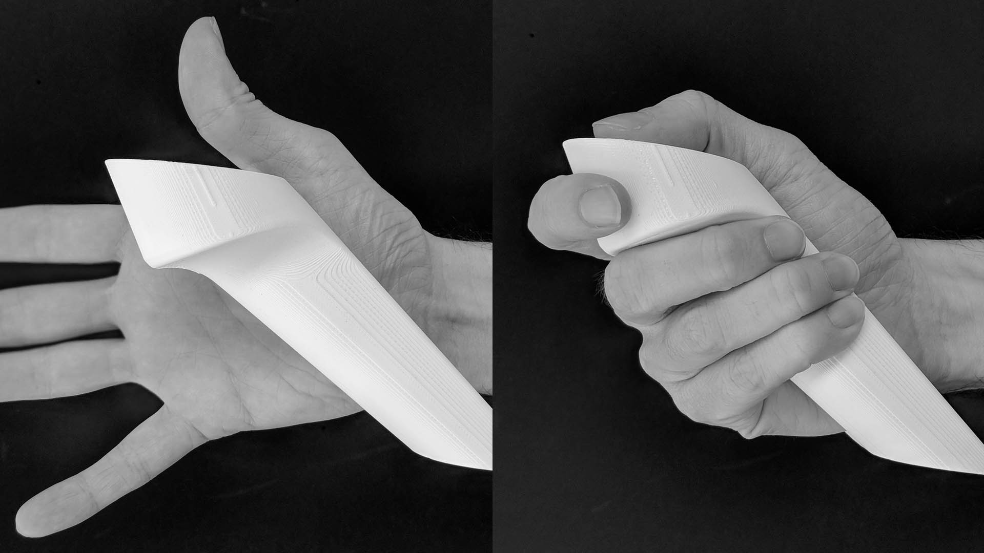
More interactions than we realize involve us being able to open our hands and letting go. This is virtually impossible with today’s controllers. The Project Air controllers were derived from how want to interact and worked backwards. The frisbee test became our go-to, to help us quickly assess a controller’s ultimate usability.

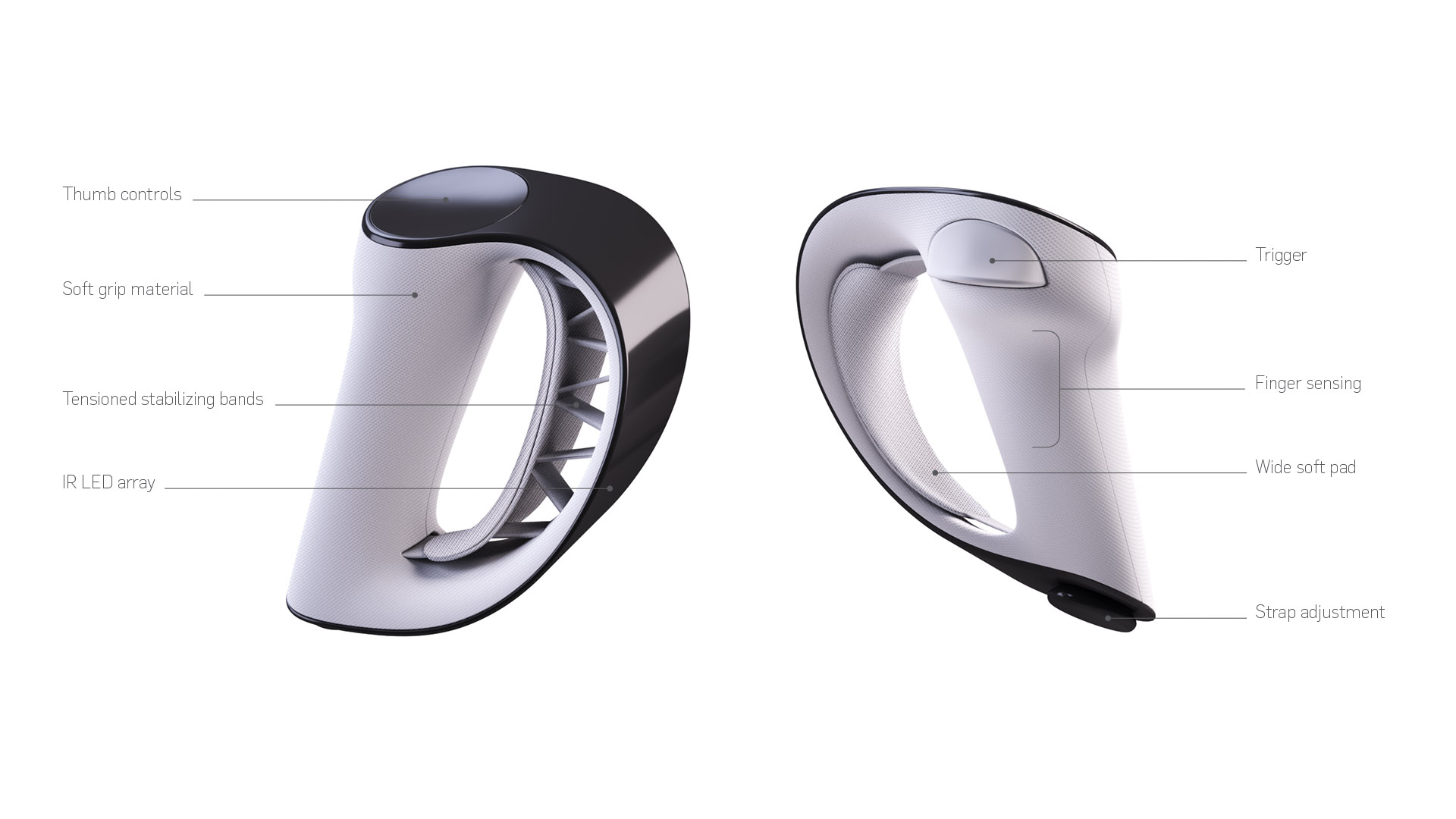
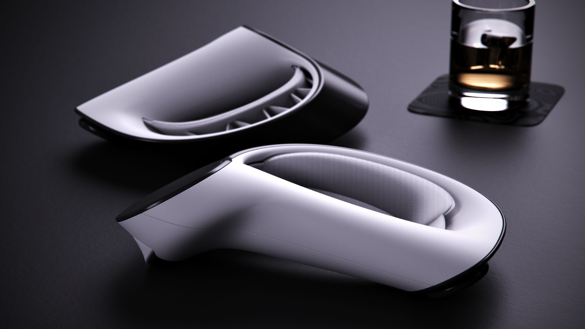
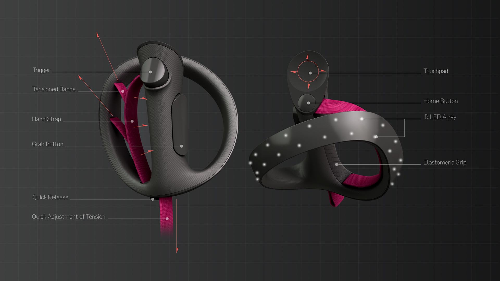
Purposely not a “gun trigger” model like most other controllers, the Project Air controller is focused more on a grasping and holding and allowing open hand interaction. At the core of this concept is a cinchable strap that fully conforms to the hand and is stabilized by tensioned elastic bands to achieve maximum ergonomic comfort.
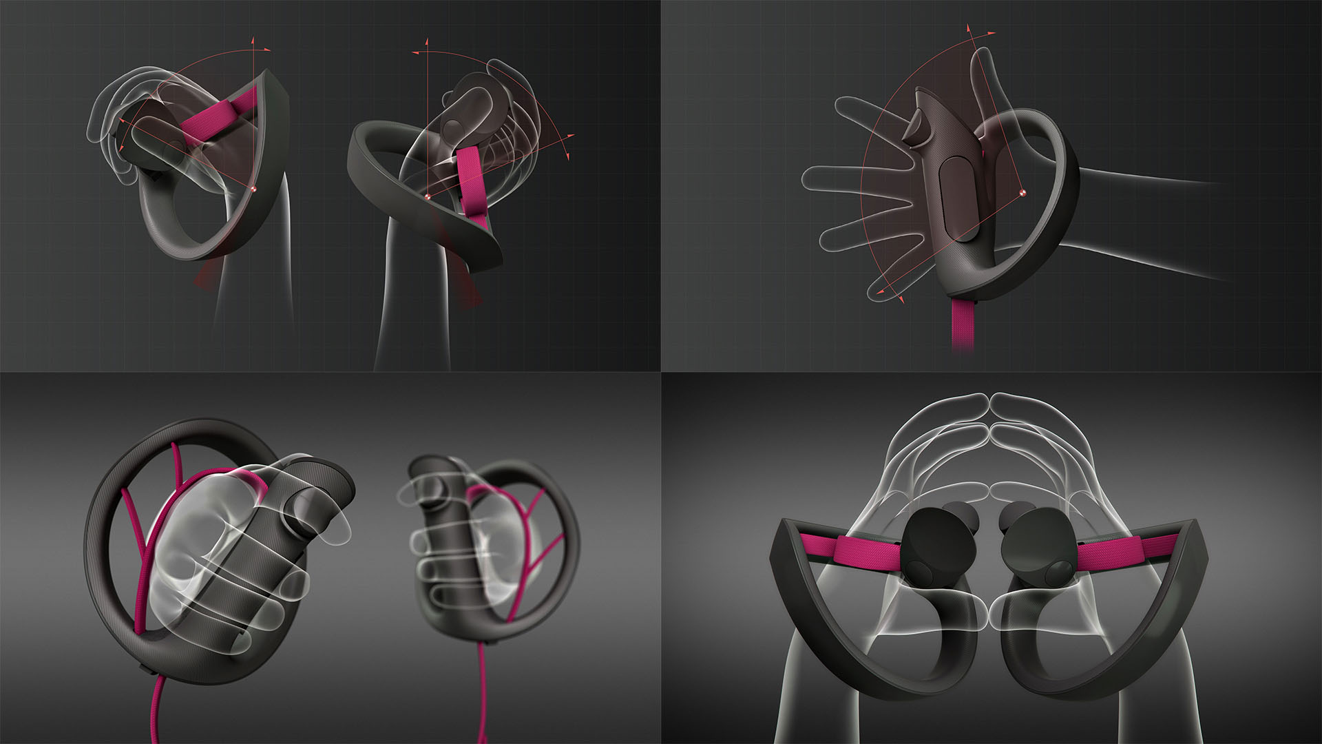
Open-hand interaction opens up a whole new world; because of this, we’re beginning to see controllers that have this as a feature, but they are still prototypes that seem clunky and undesigned.

The orbital revolves around the wrist and utilizes inside-out tracking. The balance is moved around the wrist to reduce fatigue. The tensioned bands not only pull the strap back into place, but also add stability so there is no shaky movements when the hand is open. This greatly expands the types of experiences that can be brought into VR.
The controllers can be put on quickly and leave the hands free to put on the headset. Even simple interactions like opening a door are brought closer to reality.

The future of computing

Virtual and mixed reality is not just the future of gaming, it is the future of all things computing.

We created a set of tools that allow you to perform creative tasks in new ways. One is a take on a trackpad that is meant to take what you are familiar with from interacting with your phone into VR. And then an airbrush tool that can be held like a pen, because again, the gaming interaction of having a gun trigger is not really applicable if you want to sculpt or paint.
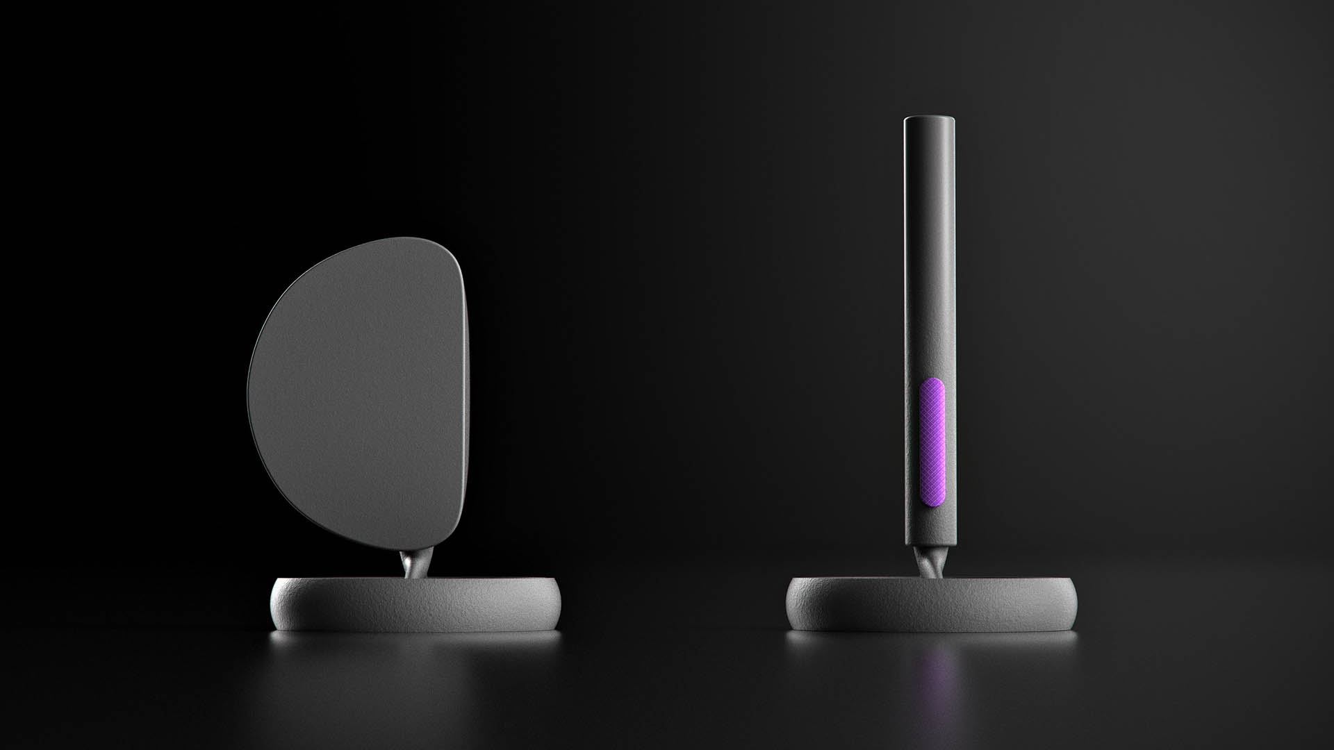
The trackpad is made to feel comfortable and secure in the hand for longer sessions. The sensor array can be moved to either hand for left or right-hand use.

You can use these tools separately, but it’s when they are used together that they reach what they are truly capable of.  
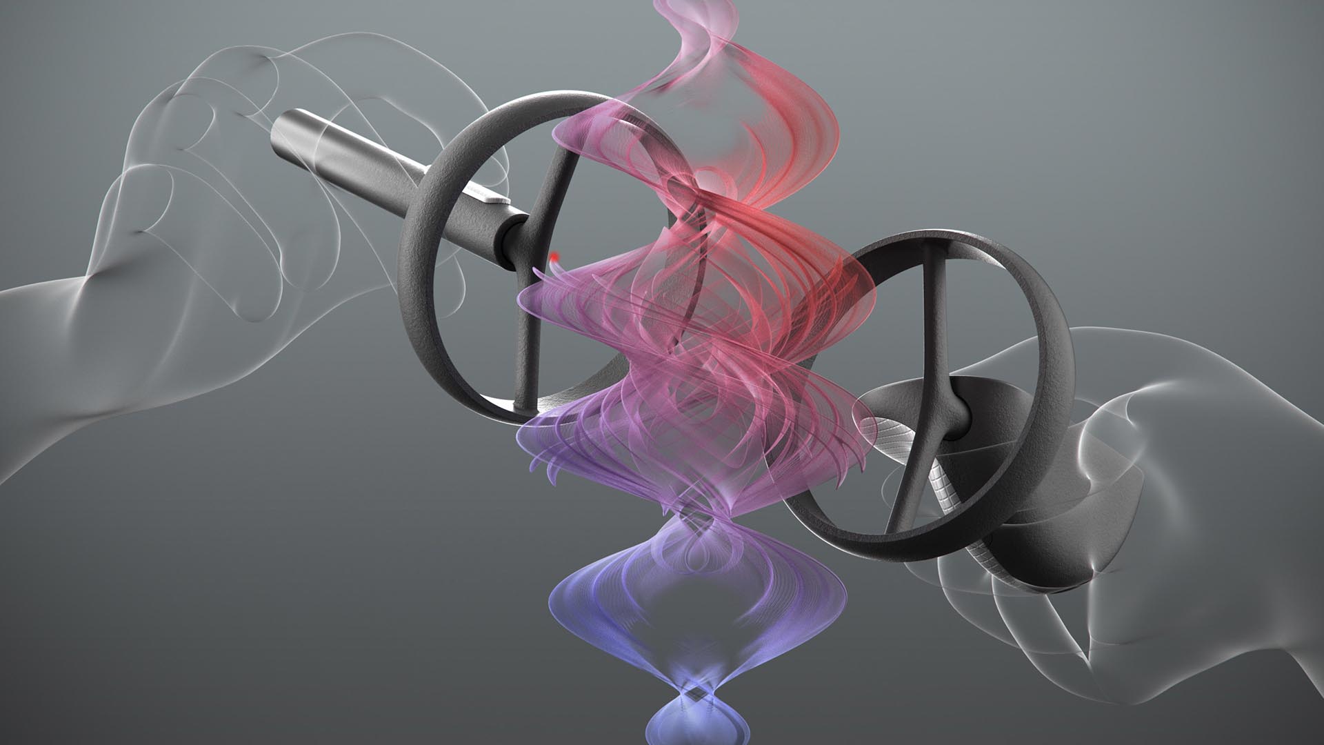
Just as an example, you could have all the controls on the trackpad, like color, brush size, movement of the model leaving the airbrush is free to create. You could also imagine using two trackpads for bringing a plethora of tasks currently constrained to a flat screen into virtual space;  video compositing, animation, even spreadsheets can be brought into VR for entirely new and more productive experiences.
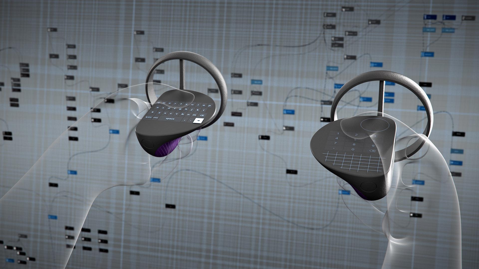
Mapping the controller itself with buttons is one approach, but you could also project finger positions anywhere you want in VR so you’re not constantly looking down – the equivalent of re-enabling touch-typing in VR.

Moving into reality

By creating the right tools, what is currently a niche gaming and media platform can be transformed into something that can truly change the way people create. And beyond that, we see this as a path to help take VR mainstream.
What we did

Experience Essence™

Insights

Wireframes

Visual design

Environments

Libratone is a Danish brand known for its beautifully designed audio products. Relatively new on the American market, the company knew it was important to convey its story equally well.

The seed for the storytelling came from a product feature unveiled by the company a few years earlier, SoundSpace Link. The trademarked term Soundspaces™, a true diamond in the rough, was not used beyond this context.

We all instinctively use sound and music to carve out spaces, whether to bring more vibrancy or calm, whether together with others or just for ourselves. Creating soundspaces formed the basis for a narrative structure that directed the storytelling from the digital to the physical, from the website to the first Libratone store in the United States.

Visualizing soundspaces

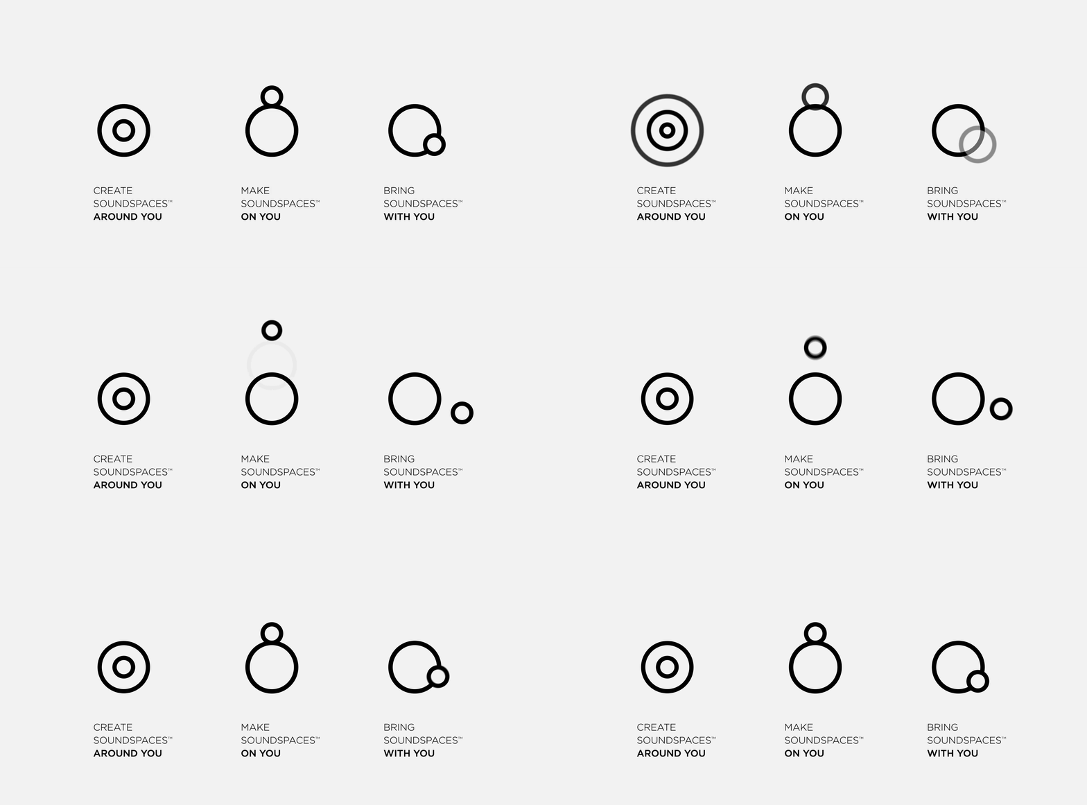
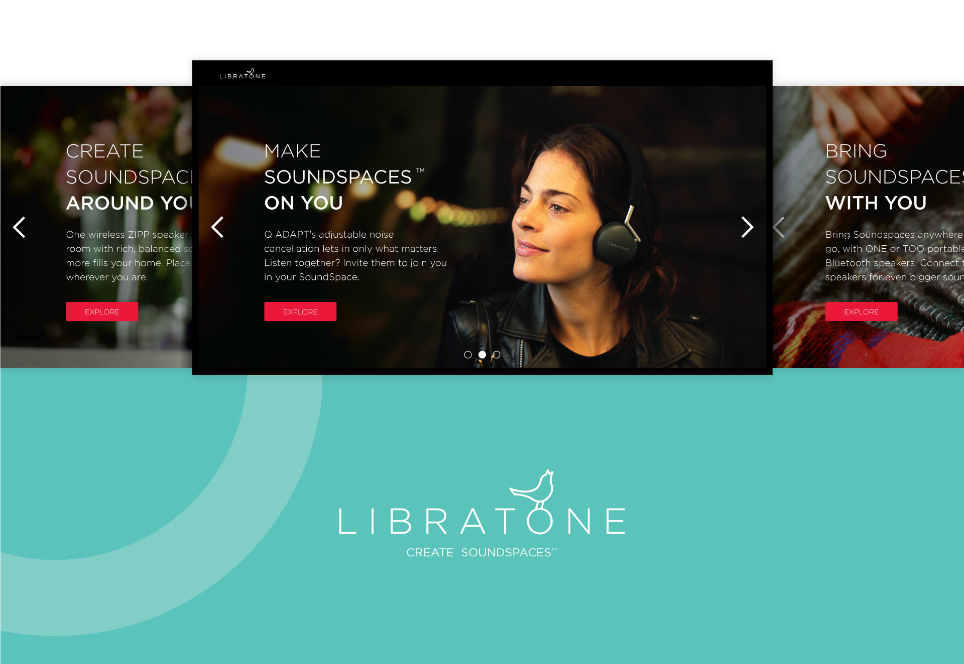
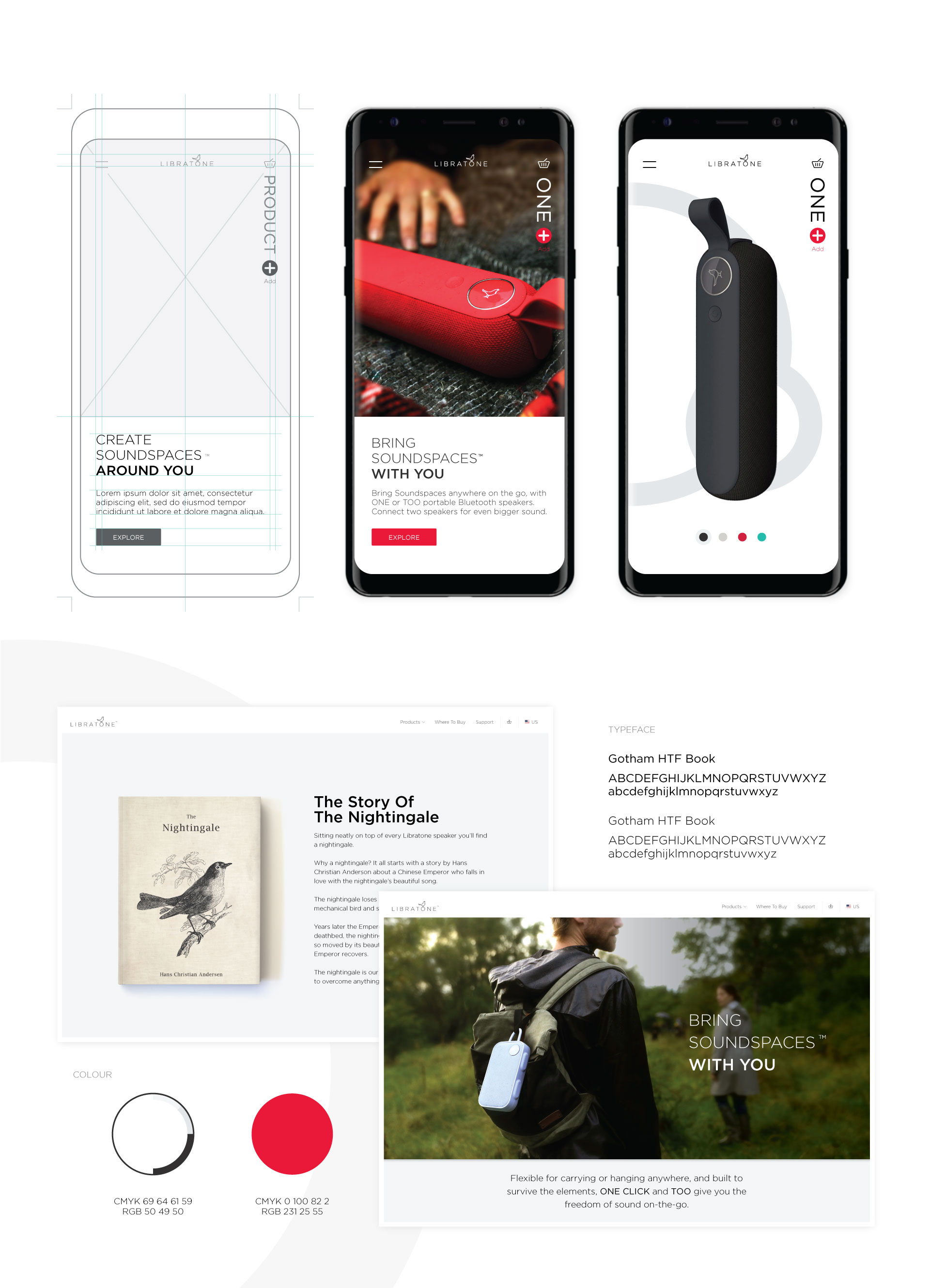
The product portfolio, which previously was shown on the website as a line-up of every single product – overwhelming if you weren’t already familiar with the product line – was now simplified in three simple groupings; soundspaces around you, on you and with you.


Experiencing soundspaces

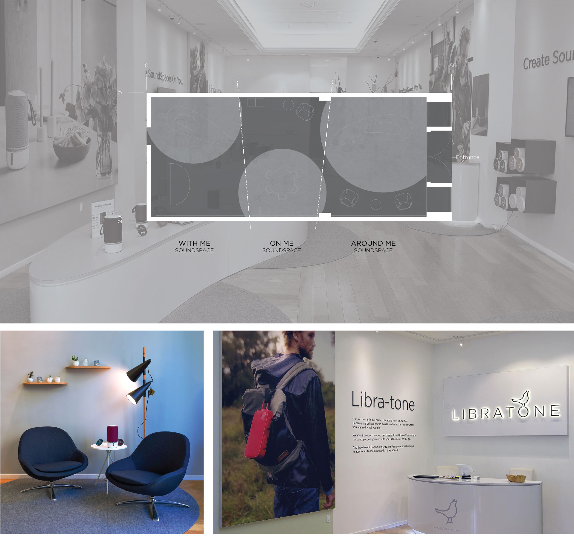
The first Libratone store to open in the United States was an opportunity to let customers experience soundspaces first hand. The deep, rectangular space, with details that betrayed its previous use as clothing store, was quickly transformed into a flagship Libratone store.

Softening the rectangular space are rounded shapes that delineate the store experience into soundspaces. Upon entering the store the customer immerses into the first soundspace, around you, where it is impossible to pinpoint where the music is coming from. The colorful ZIPP speakers can be experienced hands-on, whether on softly curved POS displays or from the comfort of lounge chairs reminiscent of a home environment.
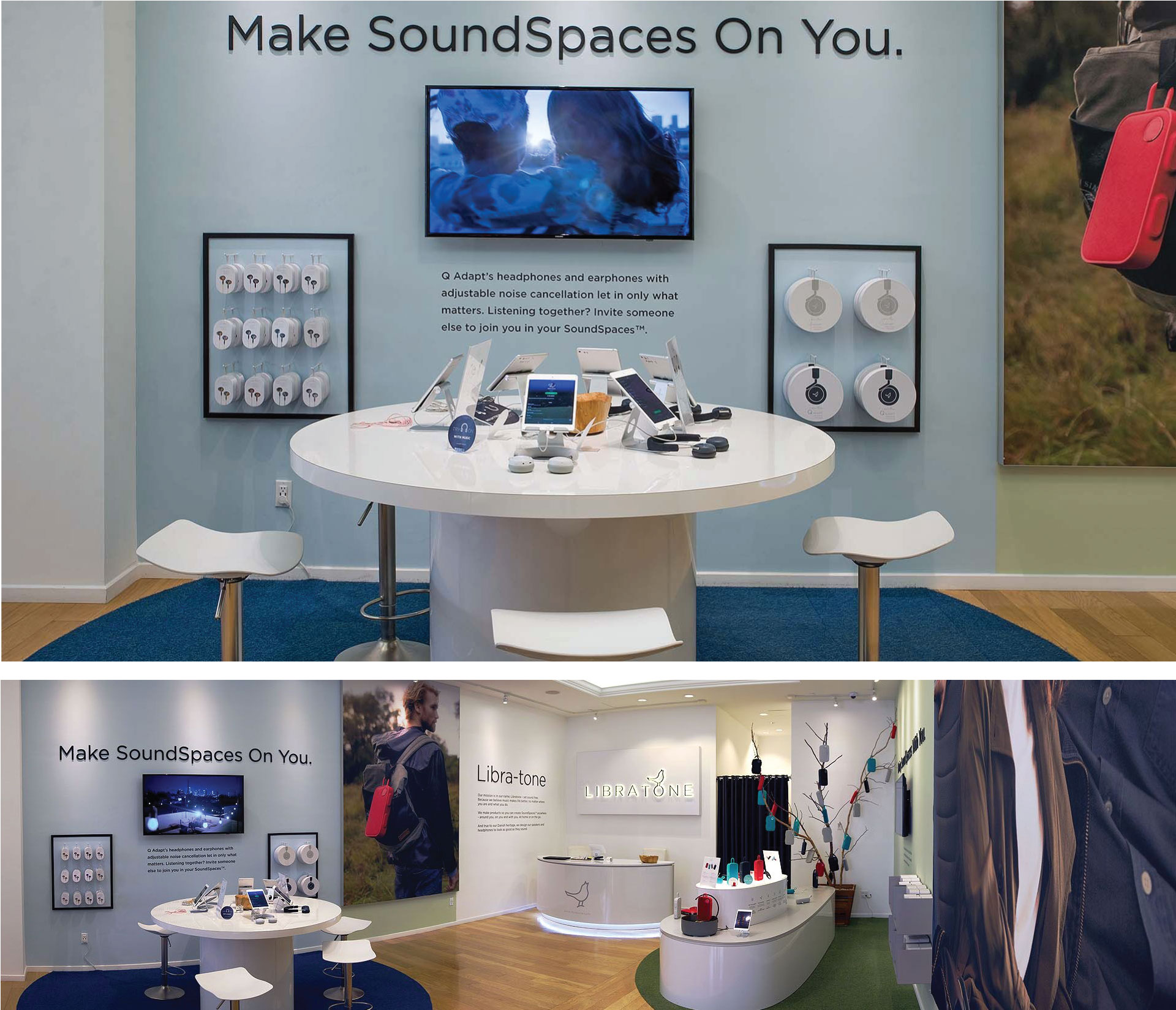
Proceeding further into the store reveals a round table, where it’s easy to pull up a bar stool to try the experience of soundspaces on you with the Q ADAPT headphones and earphones. Seated at the table, surrounded by the conversations of other customers and the music from the ZIPP speakers, customers can get an immediate sense of creating a soundspace on them, through the adjustable noise cancellation of the Q ADAPT earphones and headphones.

In the corner beyond the table, another curved display beckons you to bring soundspaces with you, with ultra-portable Bluetooth speakers.


What we did

Experience Essence™

Storytelling

Logo

Wireframes

Visual Design

Brand Identity

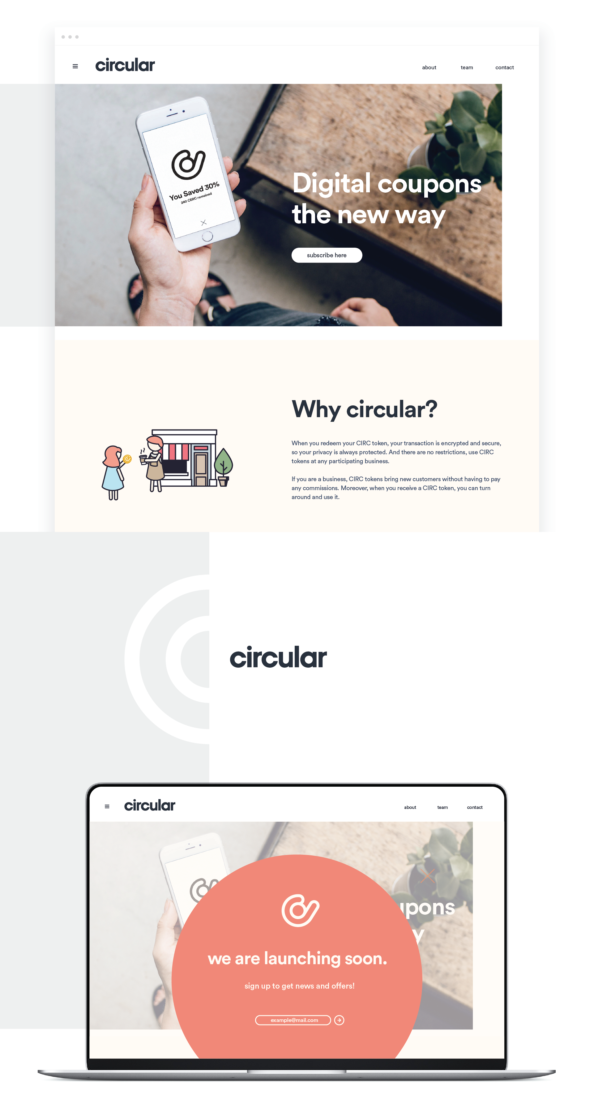
When Circular first approached us, it was an early stage startup with only a strong conviction and an idea – revolutionizing digital coupons with a community based approach. While the idea was compelling, the founder had learned that it was difficult to get others to quickly grasp his vision.

Through NONOBJECT’s startup shop, Circular got a logo and a custom website design within two weeks. But more importantly, the Circular team got a way to tell their story in a simple way, an animation that made the company’s idea tangible and relatable.

Storytelling through animation

The Circular animation was created from scratch for a unique look and feel, and the tone was designed to feel warm and approachable. The finished video can be used to convey the Circular story in presentations, on the company website and on social media, as a whole or in snippets.

A logo for any context

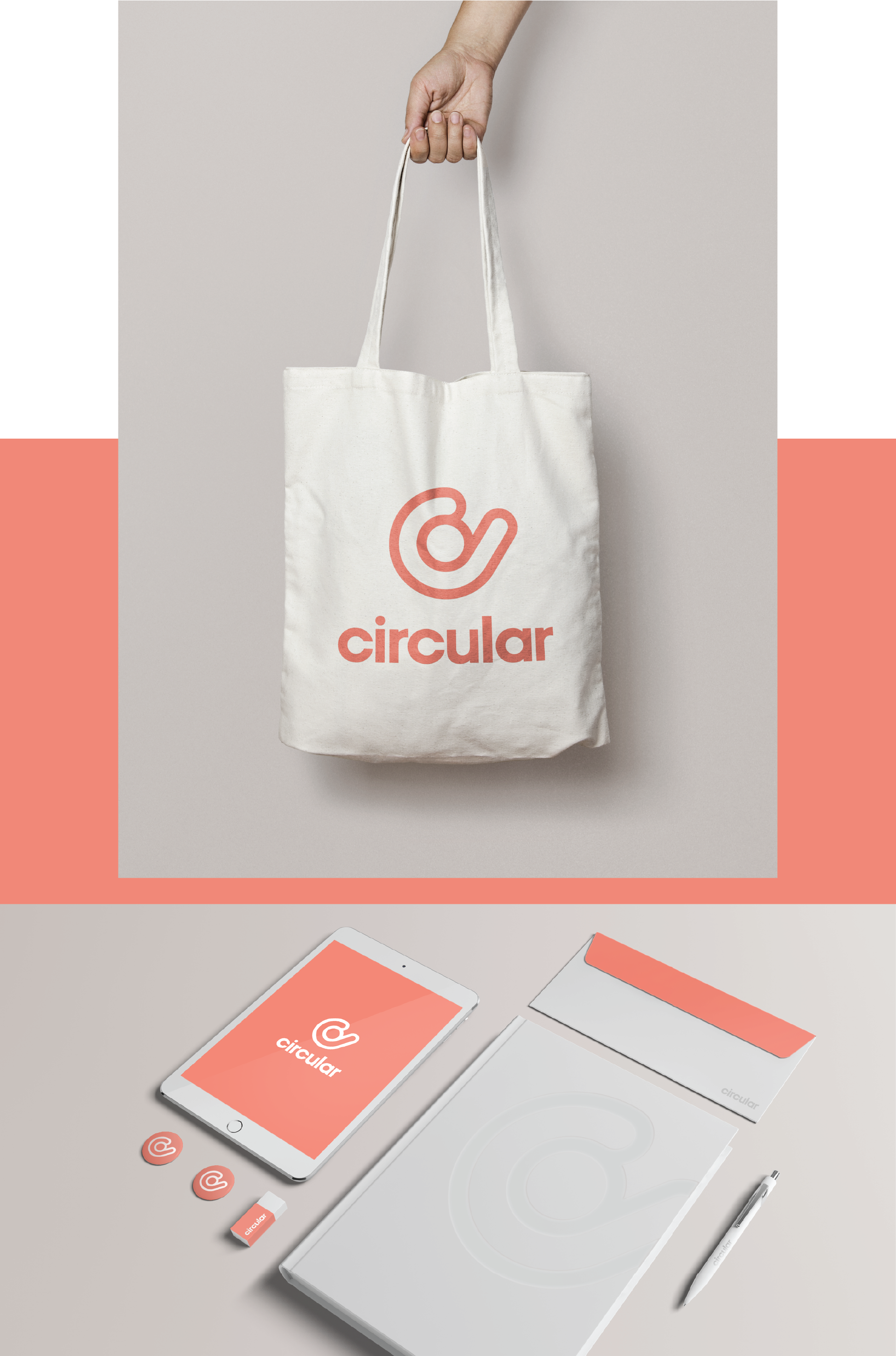
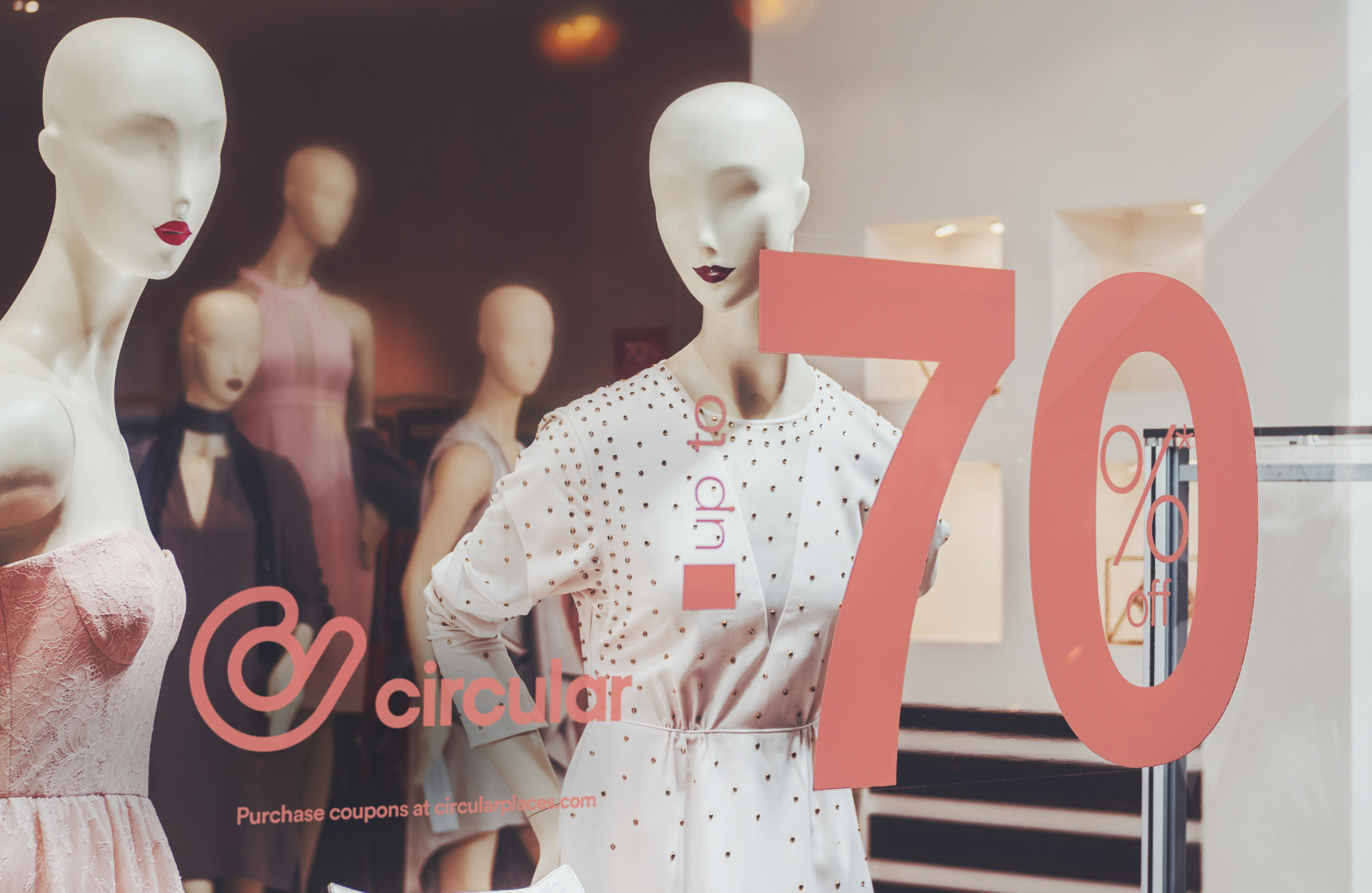
The logo, an iconized person extending a hand, captures the core idea behind Circular and transitions seamlessly between contexts and uses.

Your always-on storyteller

A company website is your always-on dedicated storyteller and advocate. The Circular Places website design was purposefully kept simple, with a focus on the overarching value proposition and a simple popup to collect email address from potential customers.


What we did

Experience Essence™

Insights

Industrial Design

Materiality

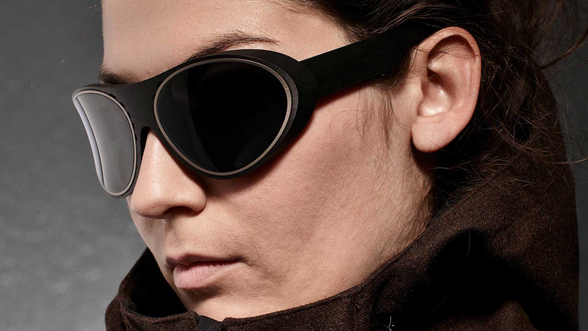
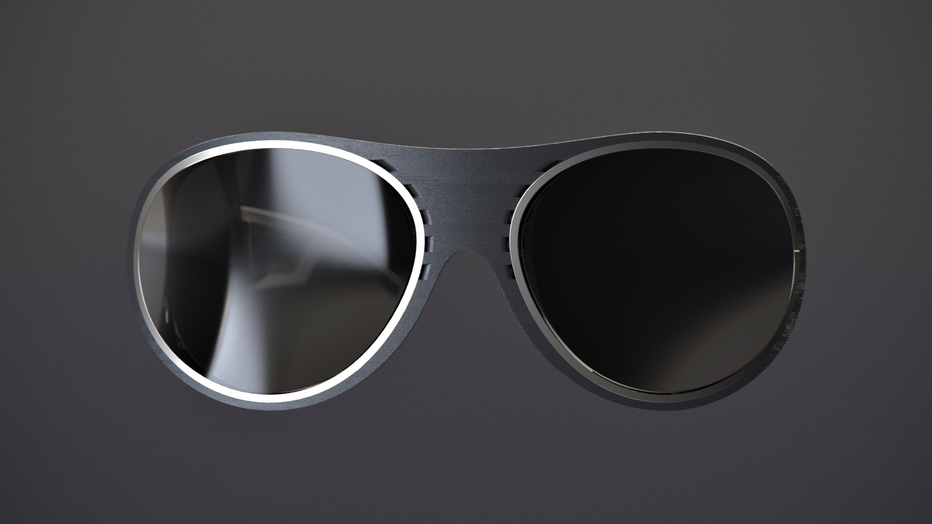
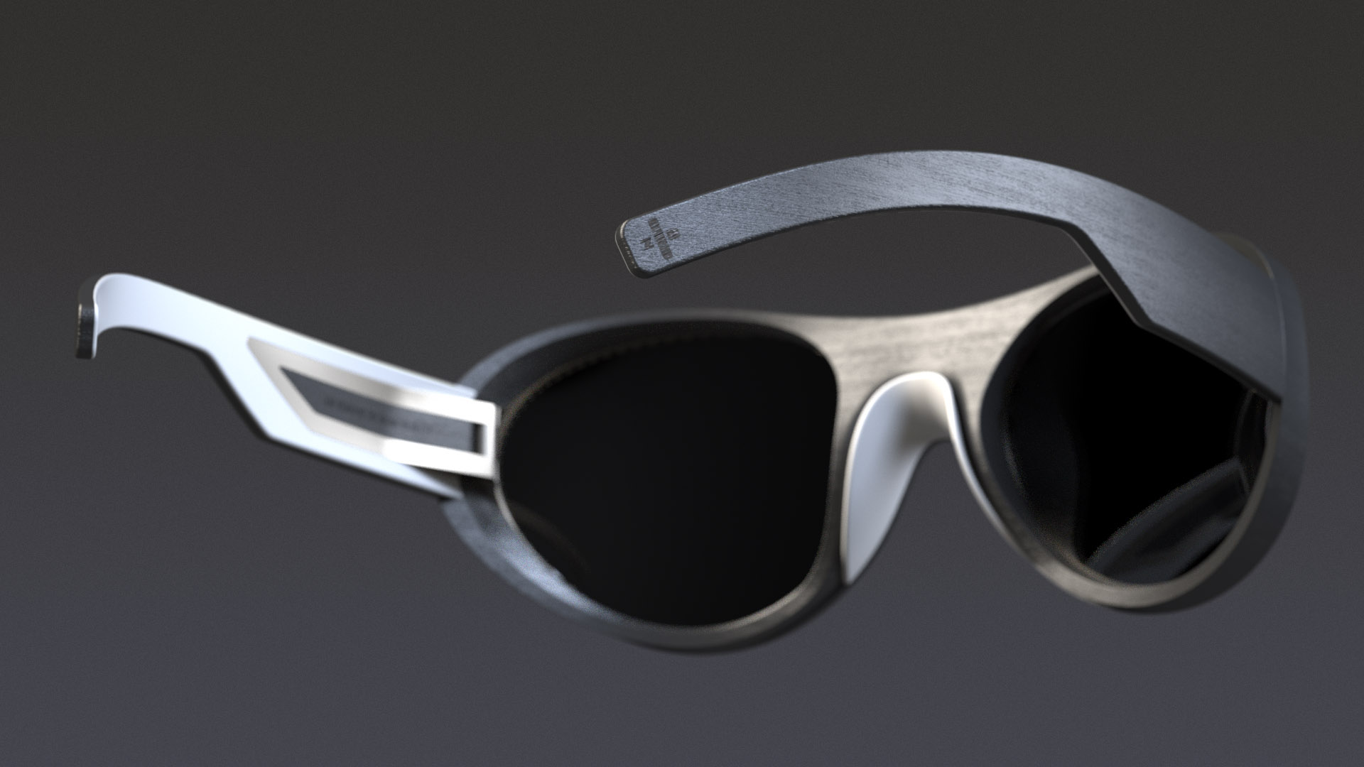
A ski brand that simultaneously breathes luxury and modesty, Zai has been at the forefront of performance since its launch. The use of unorthodox materials in highly technical ways are a signature of the brand. The new eyeglasses are no different.

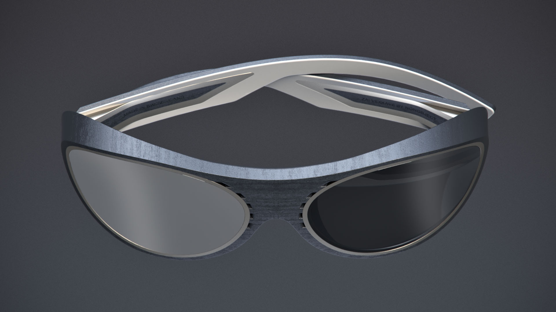
A new take on mountaineering glasses, the innovative lenses transition to concave on the sides. The precisely controlled thickness of the lenses ensures optimal visibility without distortion, and the concave profile allows for controlled airflow in windy mountain conditions.

Unique materials

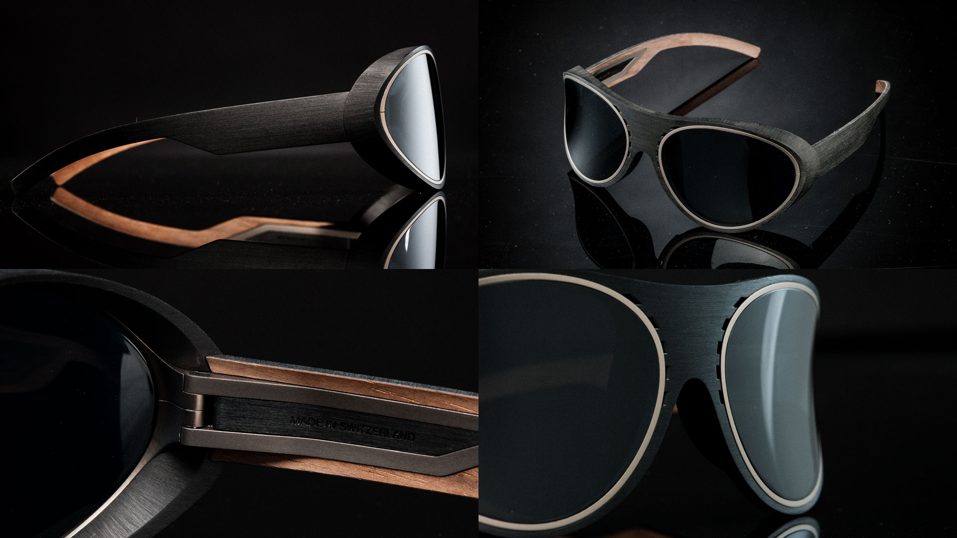
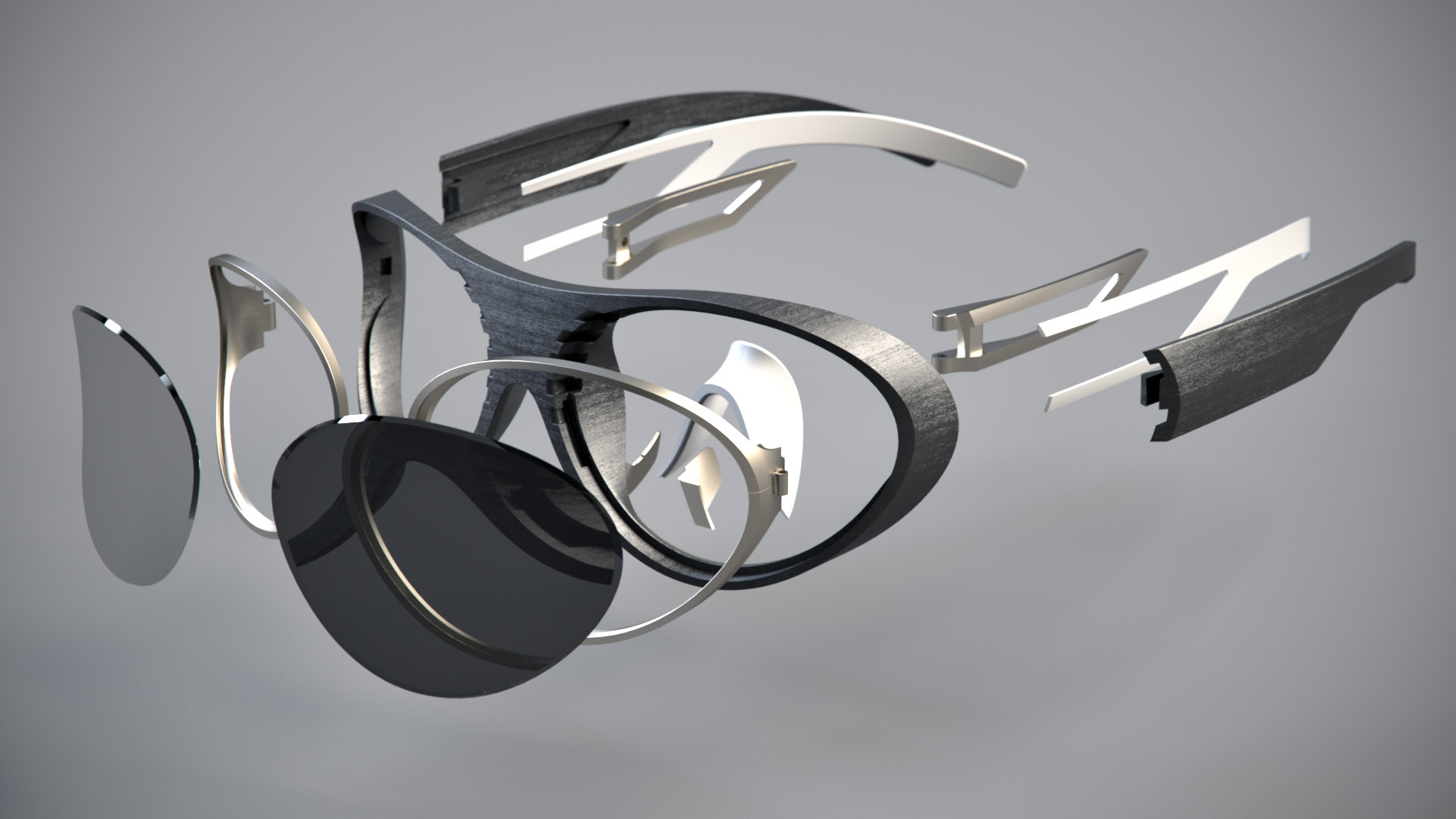
Zai is a leader in taking natural and groundbreaking materials and combining them in ways never before seen to ensure optimal performance and fit. These glasses are constructed from titanium, high-quality vulcanized natural rubber and Zaiira, one of the highest performing composite materials on the planet.


Designed for performance and comfort

The glasses are designed for ultimate performance and comfort in challenging conditions. Controlled ventilation prevents lenses from fogging in cold weather, and the thick depth of the frame reduces glare from the sky and snow. The nose rest is soft and adjustable for a secure and comfortable fit.


The current designs in the world of VR stunts adoption. Design can be beneficial not just through the physical realization of form – that will evolve quickly – but by solving the interaction problems we have with VR.

The goal with the design of Air Hand is not just to create a better controller, but to enable a more meaningful way of interacting with content. VR promises a fully immersive experience that parallels and amplifies our interactions from the real world, so the controllers need to follow that path, anything else guides us away from that potential. As FastCo puts it in their article on this effort: “The Air Hand promises to be everything today’s VR systems aren’t: Sleek, cool and effortlessly usable.

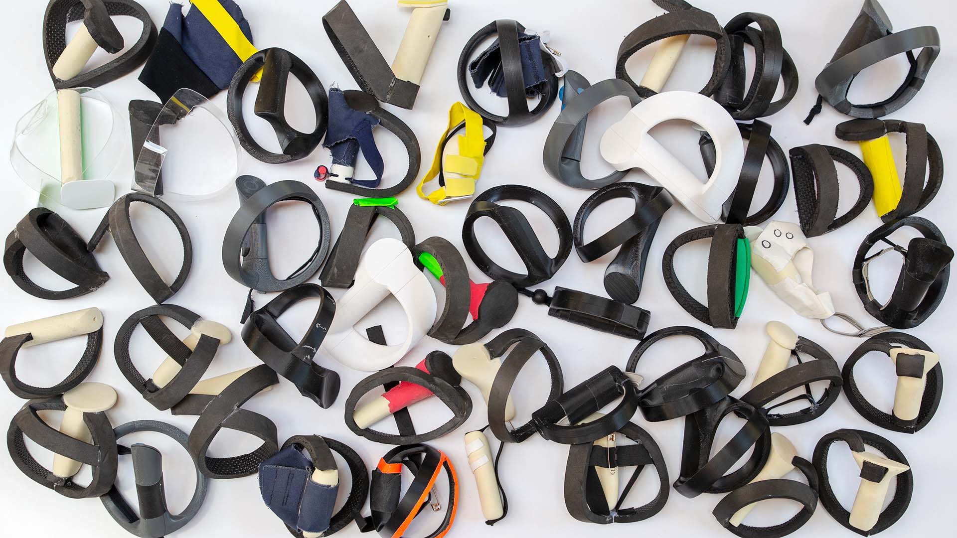
Open-hand interaction will be one of the key steps toward enabling a more natural immersive experience. Through prototyping, we found that a simple strap tightened around the hand was not ideal for the types of interaction we imagine because the weight of the ring that orbits the hand would cause instability. By adding tensioned elastic bands that connect the hand strap and the outer ring, our design allows for truly active open hand movements, like throwing a ball.

Tactility and the ability to make small precise movements are critical aspects of controllers. The challenge is to create a controller that you don’t feel, until the moment you want to feel it.

Being able to more meaningfully interact with content in the VR world is not a matter of waiting for the technology to reach a certain level. Through design, these problems are solvable now, much better experiences are within reach, and VR can get closer to realizing its full potential.