Monthly Archives: October 2016

Awards

iF Product Design Award

What we did

Experience Essence™

Insights

Industrial Design

Materiality

Name

Proof of Concept

Design for Manufacturing

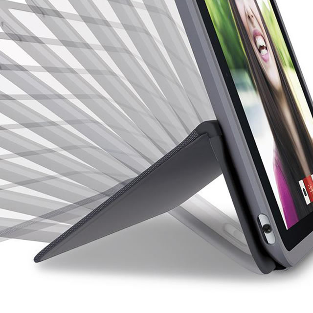
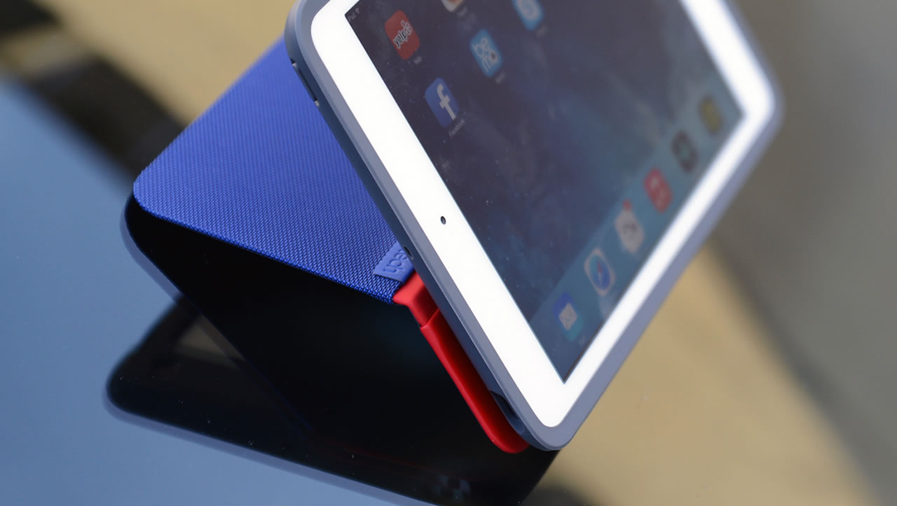
Freeing you from the prescribed viewing angles of typical iPad cases, Logitech’s innovative AnyAngle case seamlessly adjusts so you don’t have to.

Today the iPad transcends traditional market segments and is used by anyone and everyone from toddlers to nonagenarians, in settings ranging from quietly low-key to high-energy high-impact, from focused productivity to casual interaction, and from stationary settings to non-stop motion. No matter our age or our usage pattern, the reason most of us use a case for our iPad is because we’re looking for protection against scratches, bumps and falls. But protection tends to mean bulk, and part of the attraction of the iPad is the lightweight, streamlined design. And users look for cases that can augment the usability of their iPad, whether they use while seated at a desk, hanging out in bed or anywhere in between. The challenge then was to design a case that can offer strong protection, in a way that highlights rather than detracts from the iPad and that works in any of the diverse usage scenarios of the iPad.

Logitech AnyAngle iPad case on glass surface

users look for cases that can augment the usability of their iPad

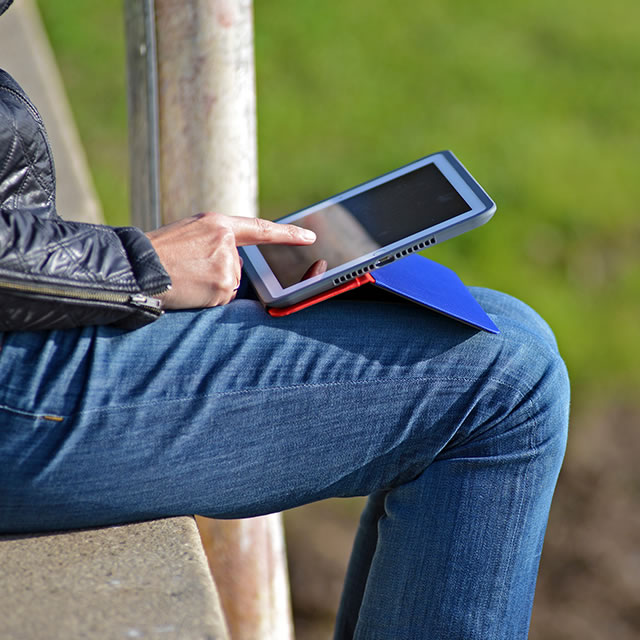
Logitech AnyAngle iPad case on the lap

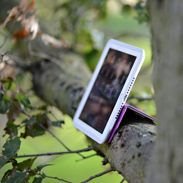
Logitech AnyAngle iPad case on the tree branch

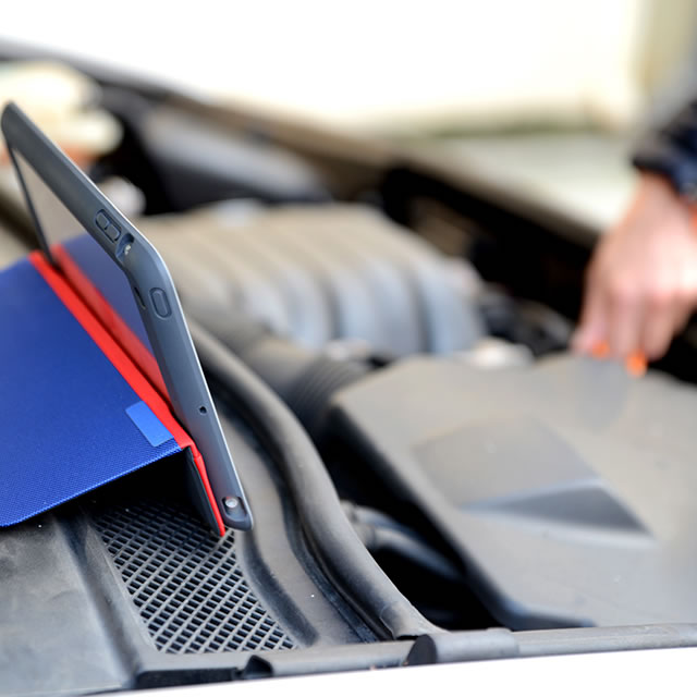
Logitech AnyAngle iPad case on the engine compartment

Looking beyond the constraints

Even though the iPad is a rare product that appeals across market segments, looking at younger users yields important insights. Today, most kids have grown up with smart phones and tablets. They are beyond the honeymoon phase in their relationship with the iPad. They appreciate convenience, but more importantly they chafe at constraints. Existing iPad cases prescribe certain interaction models. For now, most mainstream users may be okay with the friction these interaction models represent, but these teens are not. They resent that the user has to adapt to the case rather than the other way around. This insight pointed to an important problem and an opportunity that goes beyond this specific target group. How could we design a case that truly frees you to do whatever you want to do without locking you into a certain interaction model? And on a more fundamental level; how could we truly augment the interaction with the iPad?

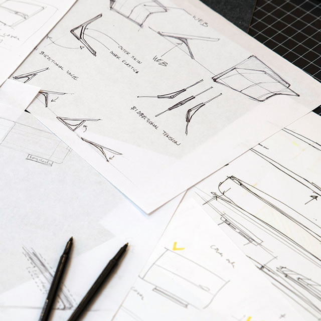
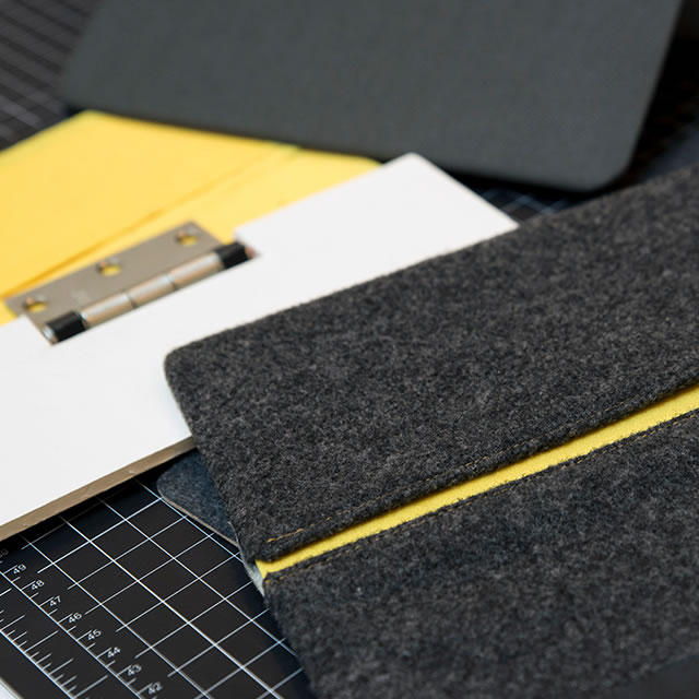
Logitech AnyAngle iPad case hinge sketches

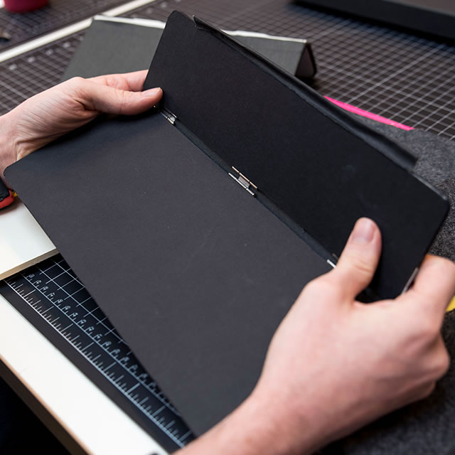
Logitech AnyAngle iPad case hinge prototype

Logitech AnyAngle iPad case fabric prototype

Logitech AnyAngle iPad case hinge positions

“…on a more fundamental level; how could we truly augment the interaction with the iPad?”

Logitech AnyAngle iPad case side view

Engineering simplicity

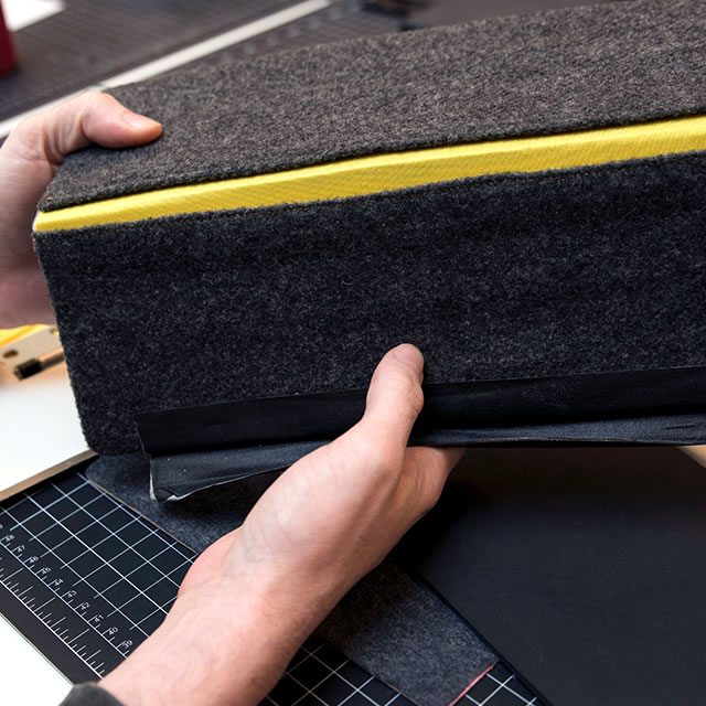
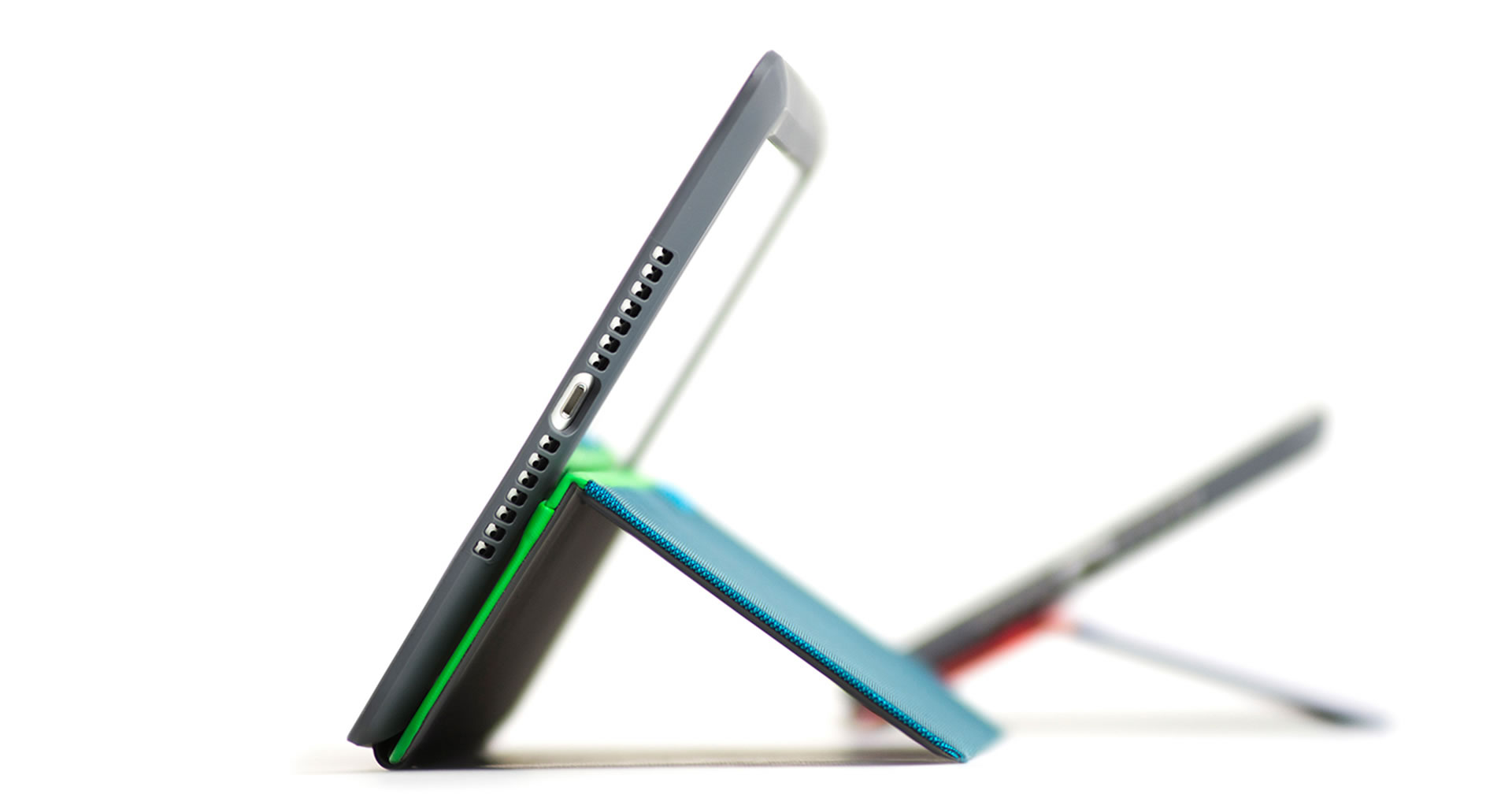
By focusing on augmenting the unconstrained simplicity of the iPad, the AnyAngle cover not only protects but makes the iPad even more effortless and useful. The design of the AnyAngle supports this with every detail. The elegant integration of the slim AnyAngle hinge allows the iPad to be placed at any angle from 70 degrees to 20 degrees. The invisible magnets integrated into the cover mean that the preferred angle stays in place when lifted, allowing the tablet and case to be moved with only one hand. No more flopping covers! The soft, dirt repellent two-way stretch fabric feels comfortable in your hand and on your lap and avoids creasing of the cover no matter how many times the cover is bent into low or high angles.

Two Logitech AnyAngle iPad cases materials detail

Logitech AnyAngle iPad case prototype materials

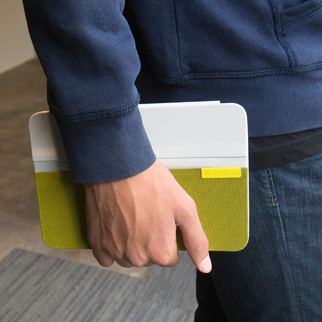
Yellow Logitech AnyAngle iPad case in hand

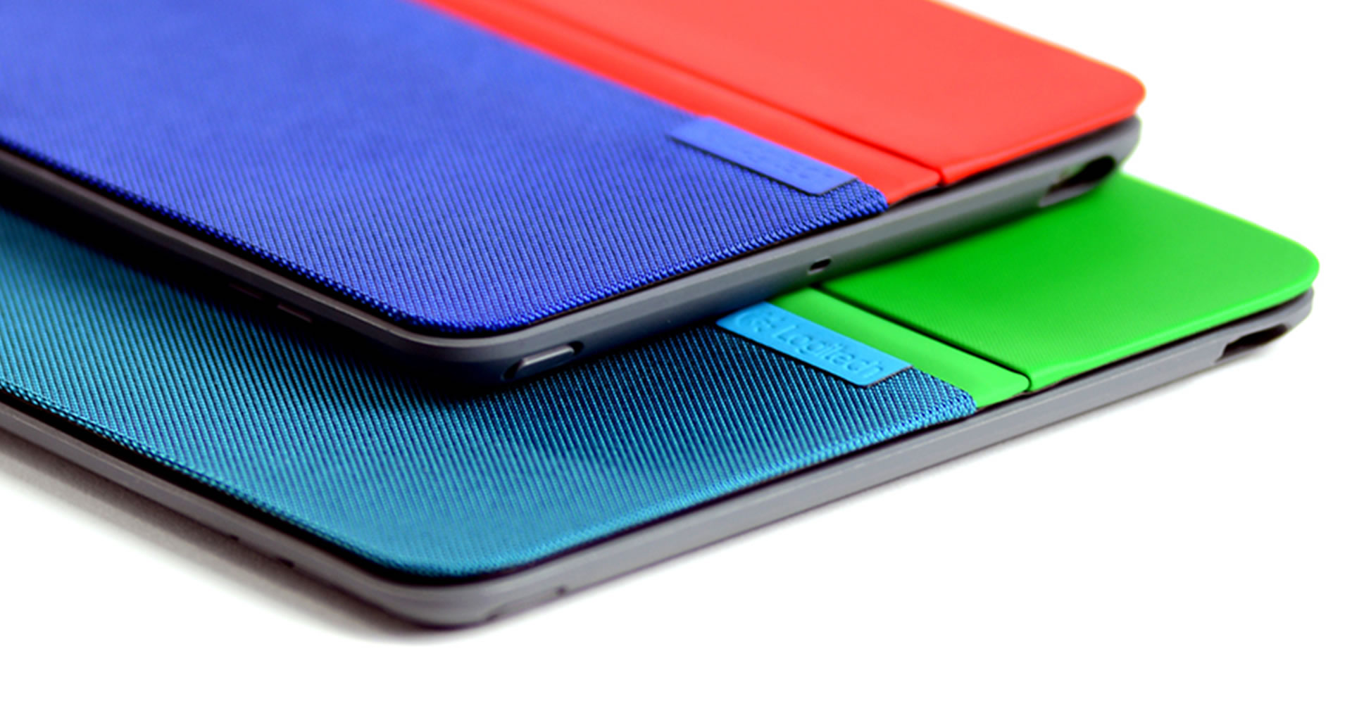
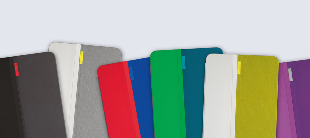
Logitech AnyAngle iPad case colors

Recognizing that iPad users are typically proud to own an Apple product, the back of the case provides needed stability while allowing the back of the iPad with the Apple logo to show through. NONOBJECT worked closely with the client engineering team all the way through production, spending time in the factory to ensure that the design intent would stay intact through production.

The elegant integration of the slim AnyAngle hinge allows the iPad to be placed at any angle from 70 degrees to 20 degrees.

Logitech AnyAngle iPad case different angles

At your desk, on your sofa, in your bed, on the move – AnyAngle is ready to go anywhere with you. Distilling protection to the essentials, the lightweight case with the clear back protects without adding bulk or heft. AnyAngle – a case that adapts to you, not the other way around.

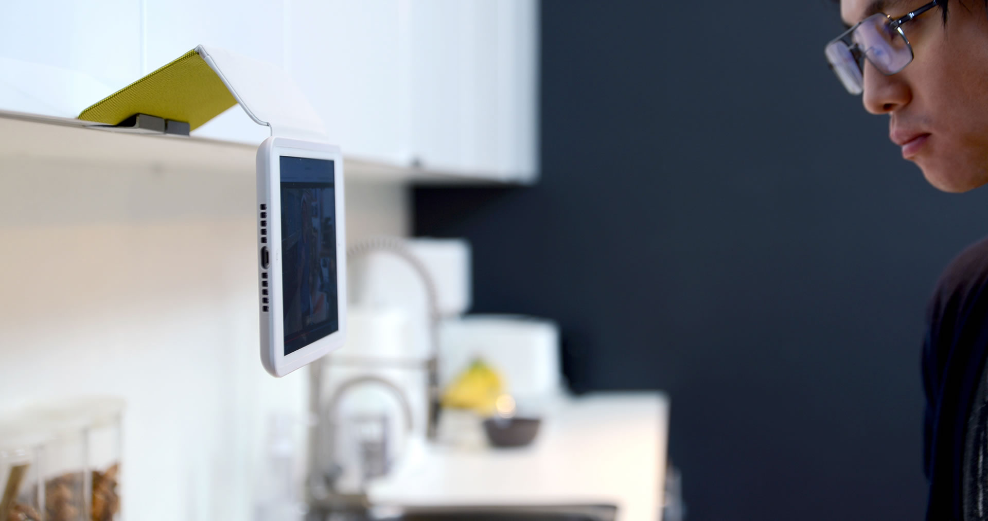
Logitech AnyAngle iPad case on the kitchen cabinet


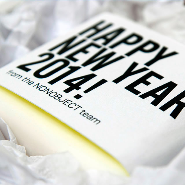
At NONOBJECT we see the customary holiday gift as an opportunity to engage beyond what corporate gifts typically do. It is a chance to experience the power of design and the sense of a positive, meaningful surprise it can provide.

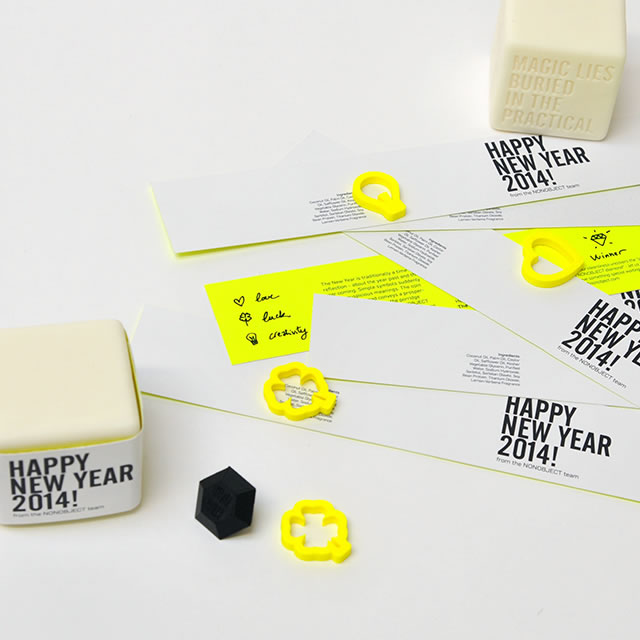
Many cultures welcome the New Year with games that attempt to predict the future. Simple symbols suddenly take on auspicious meanings. The coin hidden in the Serbian bread conveys a prosperous year, the almond in the Swedish rice porridge promises love, and the figurine in the traditional king cake signifies luck. And in the NONOBJECT world what’s hiding in the soap takes on special meaning.

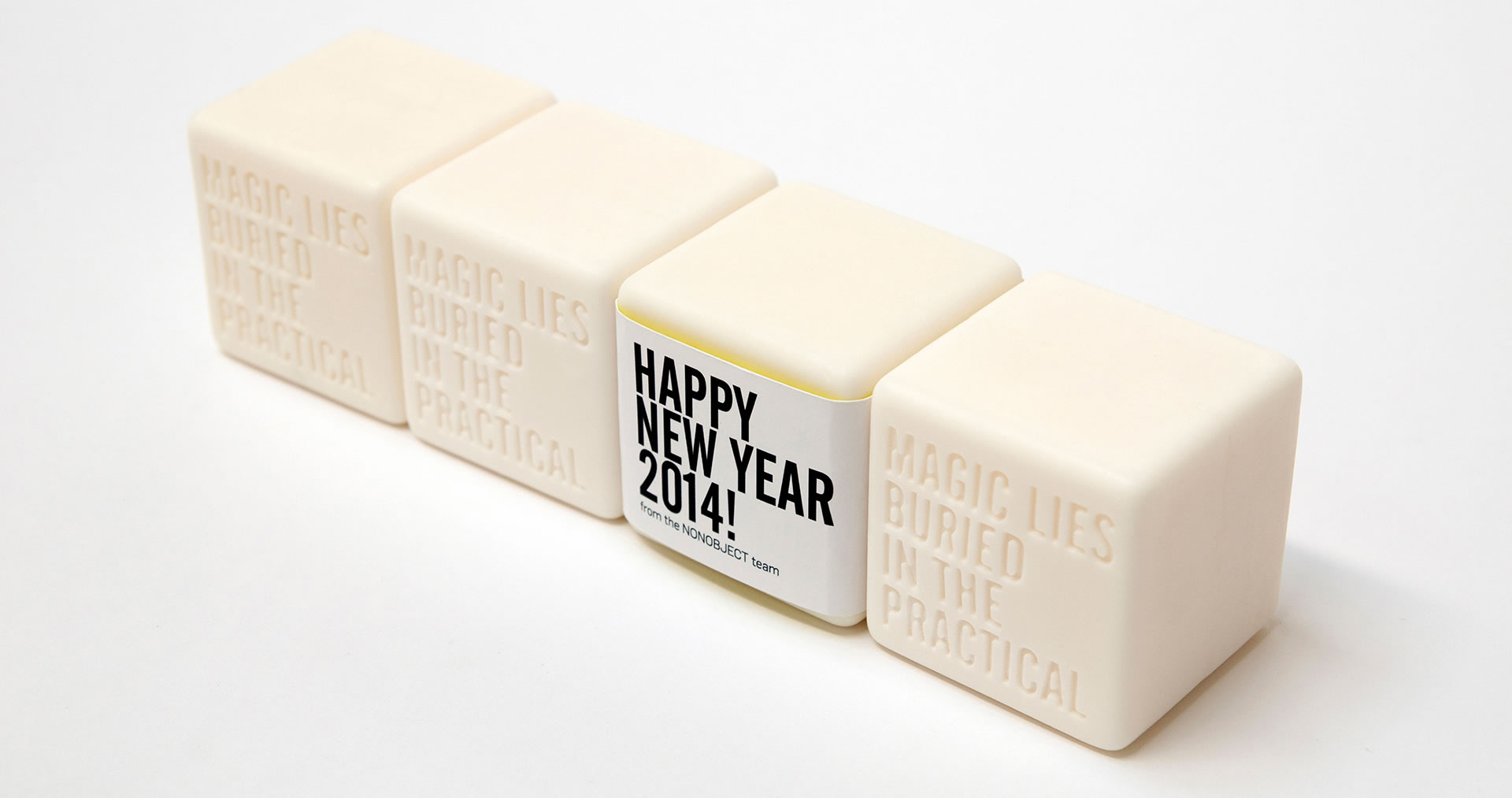
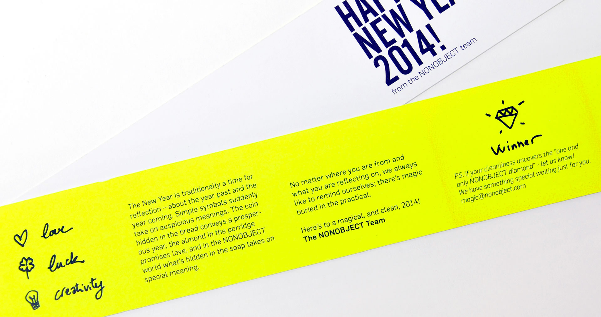
The simple, square block of soap arrives wrapped in a sleeve with a New Years message explaining that a symbol is hidden inside the soap. The sleeve includes graphical representations of each symbol – a heart, a light bulb and a four-leaf clover. And there is a fourth symbol – a diamond – that is only found in one soap, the finder of which can collect a special prize.

Four Nonobject soap corporate gifts Nonobject soap printed instructions on yellow paper

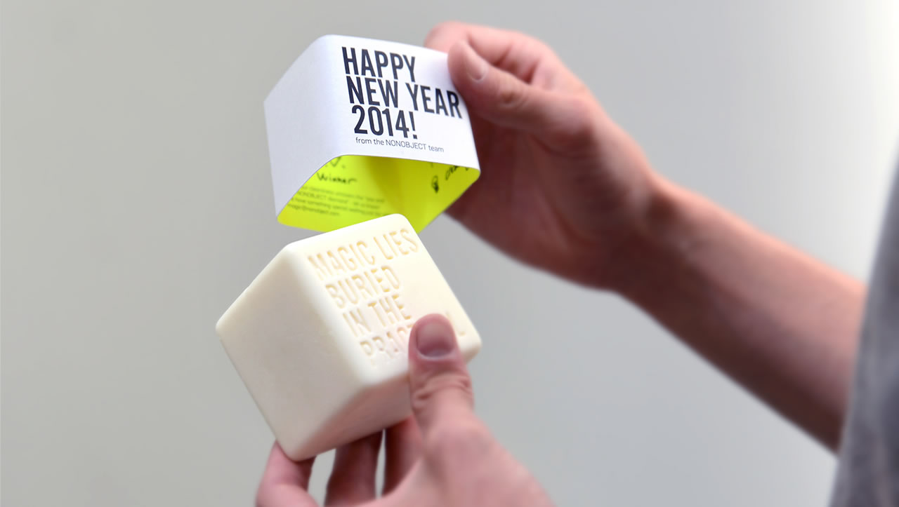
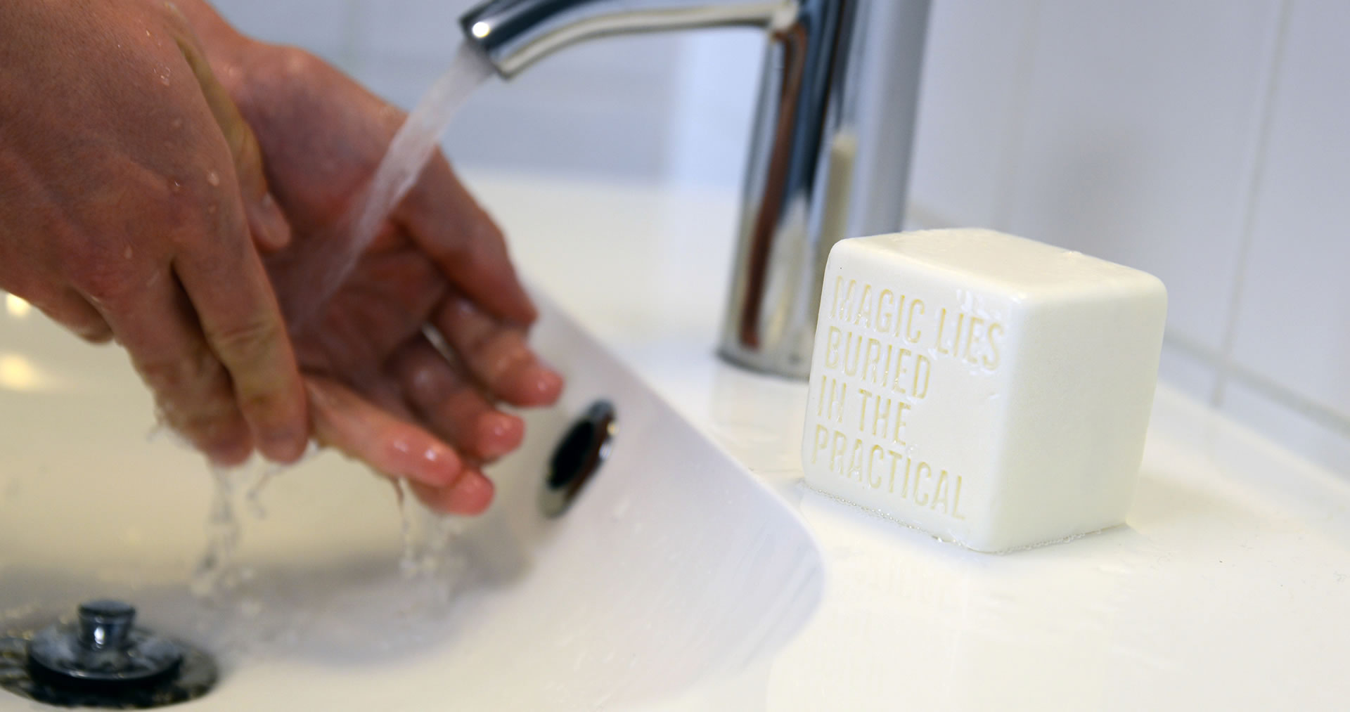
The glow of the electric yellow of the sleeve’s inside is subtly reflected on the soap, and as the recipient removes the sleeve, the engraved sentence “Magic lies buried in the practical” – a saying that captures a core aspect of the NONOBJECT philosophy – becomes visible on the soap. It is an everyday reminder that simple everyday things can become magical.

Nonobject soap taking off the printed instructions Nonobject soap and yellow hidden symbolsNonobject soap corporate gift greeting message

The engagement that we have seen from the NONOBJECT soap has gone beyond what we ever expected. We have received messages from near and far about people who wash their hands longer and more diligently than they ever had, who anticipate their hand washing with delight, and even those who decided that hand washing was simply too slow a way to discover their symbol, and therefore used a hacksaw to split the soap in two! We know the diamond winner is patient, because it is yet to be uncovered.

And in the NONOBJECT world what’s hiding in the soap takes on special meaning.

Nonobject soap corporate gift on the sink


Awards:

Red Dot Design Award

IDEA Finalist

Good Design Award

Interior Design Best of the Year Award

What we did

Experience Essence™

Insights

Product Design

Packaging

Name

Logo

Design for Manufacturing

Workspace and Office

As our lives become increasingly sedentary—sitting at our desks, in front of computers—we need to find ways to stay active that are compatible with this new lifestyle. Webble helps you find your feet.

As children, we were constantly told to sit still, as though from this discipline would come great rewards. In reality, sitting still has become the scourge of the modern age.

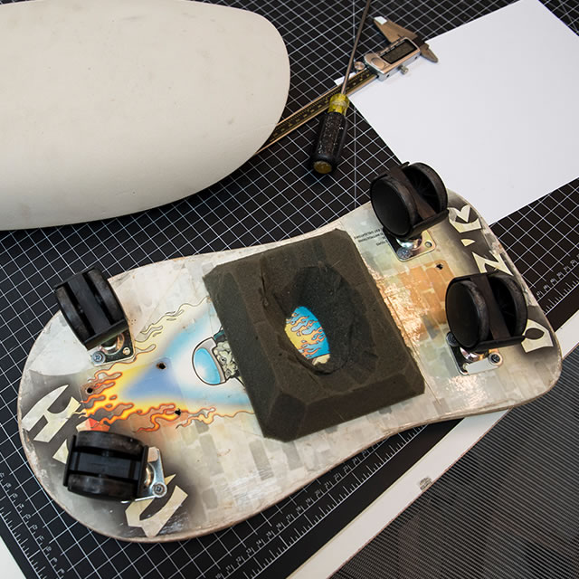
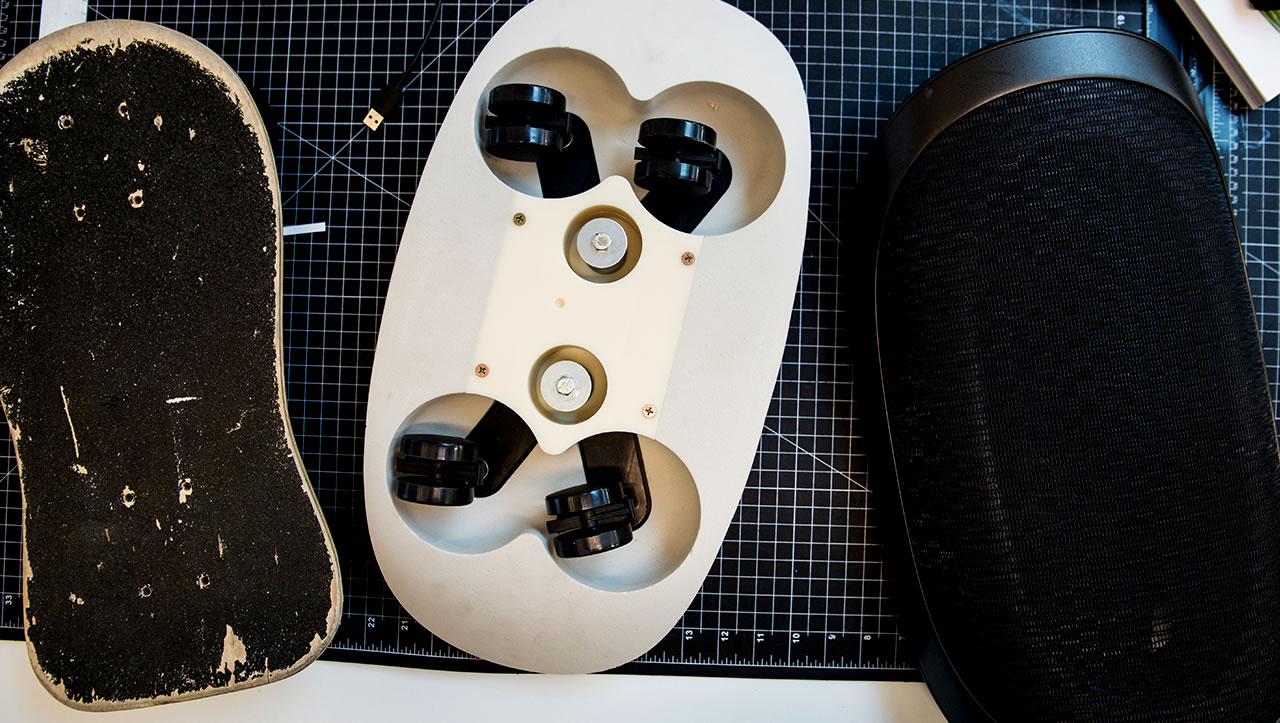
NONOBJECT’s research showed makeshift solutions under desks everywhere. Exploring this under-desk world, a range of inelegant solutions was uncovered, from skateboards, to rolls of paper and yoga mats, and even homemade boards with wheels. This exploration showed that movement was not only important, but was something people truly wanted.

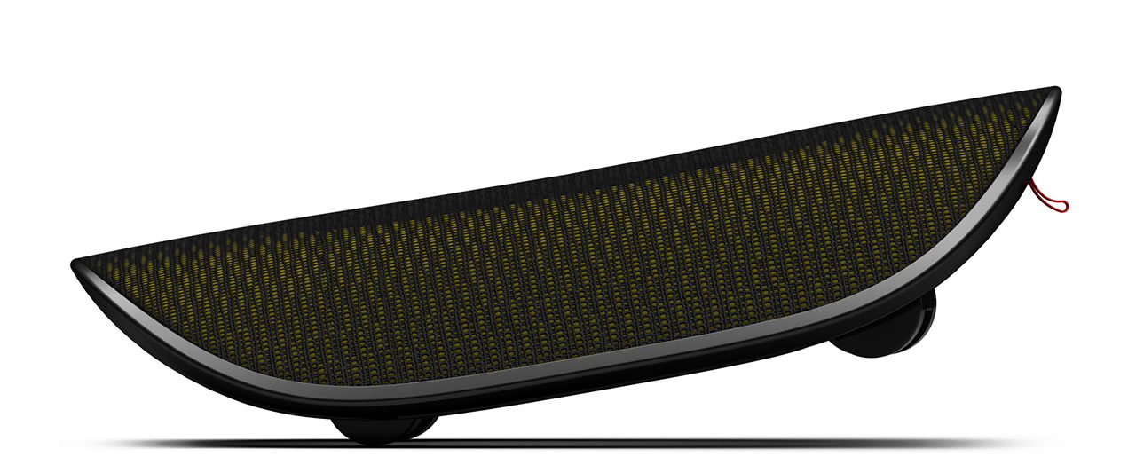
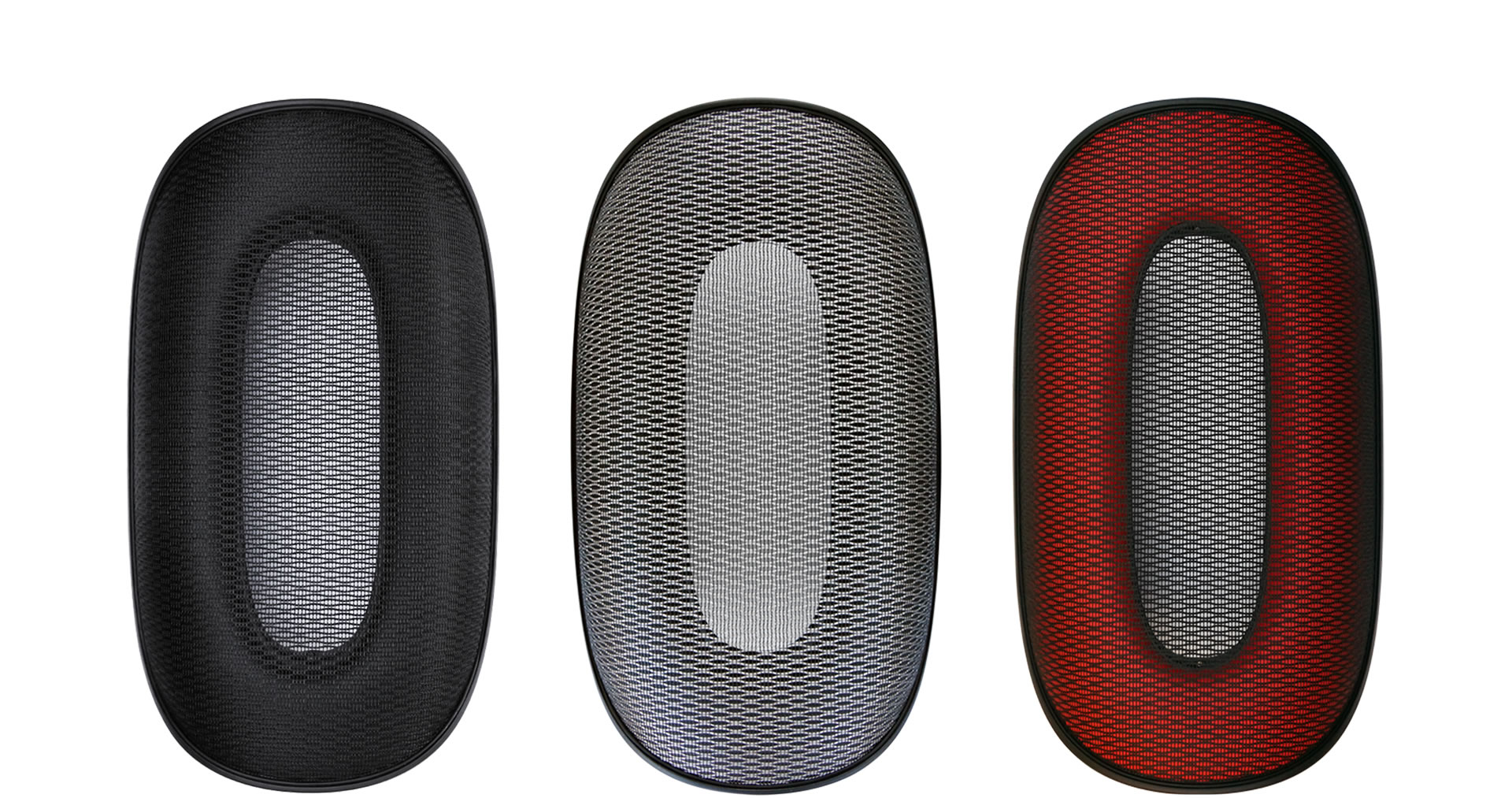
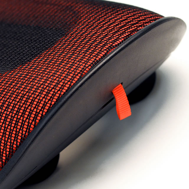
Designed as a sort of ‘pebble on wheels’, the Webble footrest consists of four multi-directional castors, and a main supporting body made from ABS and covered in an attractive, durable, high-tech mesh. The seed of the idea for the shape of Webble came from the sensation of a smooth featureless pebble. Imagine the kind of pebble you find in a riverbed; there’s no jagged lines – just smooth, soft edges, irresistible to step on. But when you put your feet on it, it moves.

Webble active footrest lifted on two wheels

Fun for feet

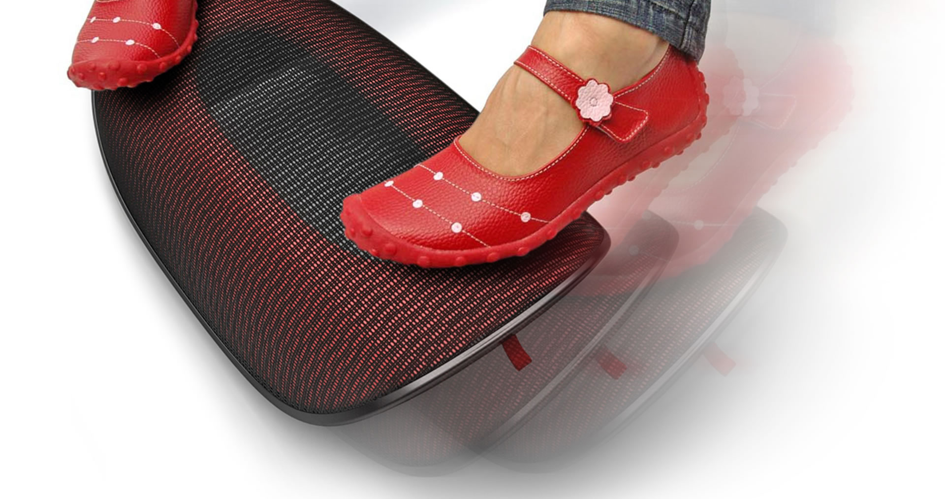
Webble isn’t just about movement from side-to-side. Its multi-directional castors mean it can move whichever way your feet desire. Much like a skateboard, the footrest can be tipped and twirled, further improving circulation through vertical movement of the feet and legs.

Red Webble active footrest in motion Webble active footrest in different colors

At home in the office

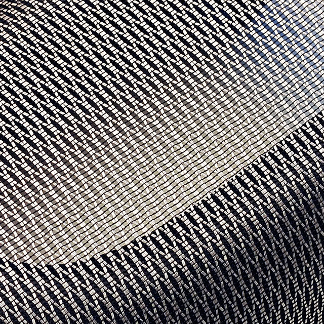
Webble have to feel at home in any office, no matter the aesthetic. The singular shape and the mesh fabric references classic pieces of office furniture design. Finding the right material for the mesh proved to be a challenge, however. The material had to be flexible, yet incredible durable to stand up to the daily wear of shoes resting and moving against the surface. There were only a few manufacturers that could do what was needed for the design. Fortunately for all the fidgety feet out there, a perfect source of the mesh was finally identified.

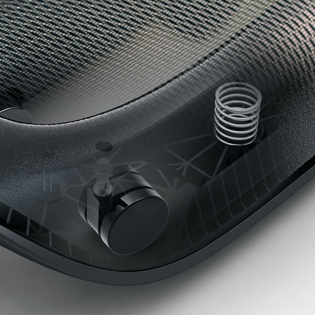
Webble active footrest prototypeWebble active footrest mechanical detailThree prototype stages of Webble active footrest

Safety and ergonomics were important considerations in the development of Webble. The trouble with skateboards and simple rolls is that they can easily become slip hazards. The Webble had to be designed to allow movement yet preventing users from slipping, or unintentionally skating across their offices. The solution was a spring-loaded suspension, so when you actually put a substantial weight on it, the castors retract, and rubber feet on the bottom contact the ground preventing movement. But even though you’re staying safely in place, you’re not sitting still. That’s the Webble way.

Red Webble active footrest pull tab Silver Webble active footrest mash material


What we did

Experience Essence™

Insights

Industrial Design

Materiality

Design for Engineering

The simplified, intuitive interface of the new DirecTV remote integrates the physical and on-screen user experience while maintaining legacy user needs.

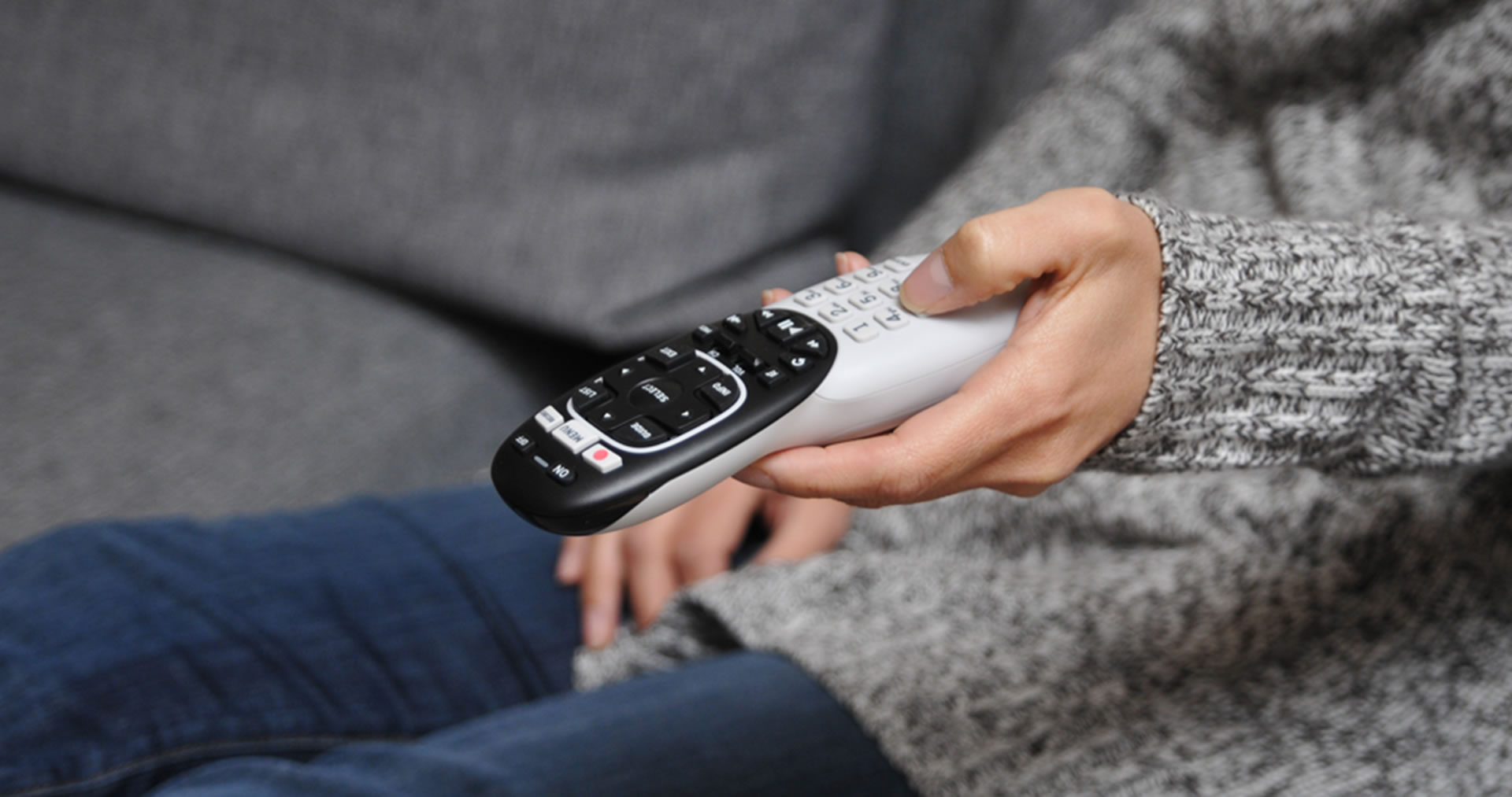
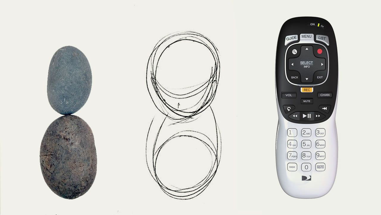
With a design inspired by the soft shapes of two interlocking pebbles, the DirecTV Genie remote is comfortable and perfectly balanced in your hand. Without your eyes leaving the screen, you can easily and confidently navigate all the functions of the DirecTV experience with the new Genie remote.

DirecTV users are used to the proprietary design of the remote that comes with the DirecTV service. But with an abundance of buttons, the traditional DirecTV remote could be overwhelming, even for seasoned users. Reducing the numbers of buttons and the perceived complexity of the remote was a critical objective in this project, but redesigning this memorized landscape was no easy task.

DirecTv remote control in hand

Heads up control

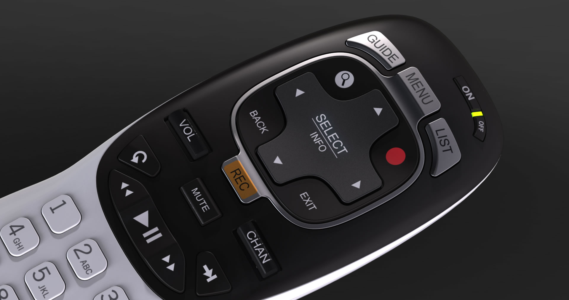
The success of a remote depends on achieving true heads up control, with the user being able to use the remote without ever taking the eyes of the screen. Each button had to be examined for its intent to understand its universal value across legacy DirecTV users. Then the tactile topography and the interrelationship between the buttons had to be carefully considered for a sensory experience that is easily understood and memorized. This had to be factored in with ergonomic considerations. Hand sizes are different, and it was important to find a design that felt comfortable no matter the size of your hand. And finally, manufacturing considerations were an important challenge for an item that has to be mass-produced at low cost, yet provide a satisfying sensory and frictionless experience on a daily basis.

DirecTv remote control buttons detail

Pebbles weathered on the beach

Inspired by the shapes of pebbles weathered into a rounded shape that rests gently in your hand, the shape of the remote is reminiscent of two different colored pebbles smoothly interconnected to form a whole.

DirecTv remote control design inspired by pebbles

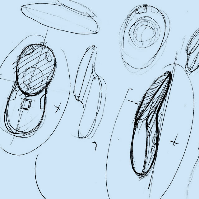
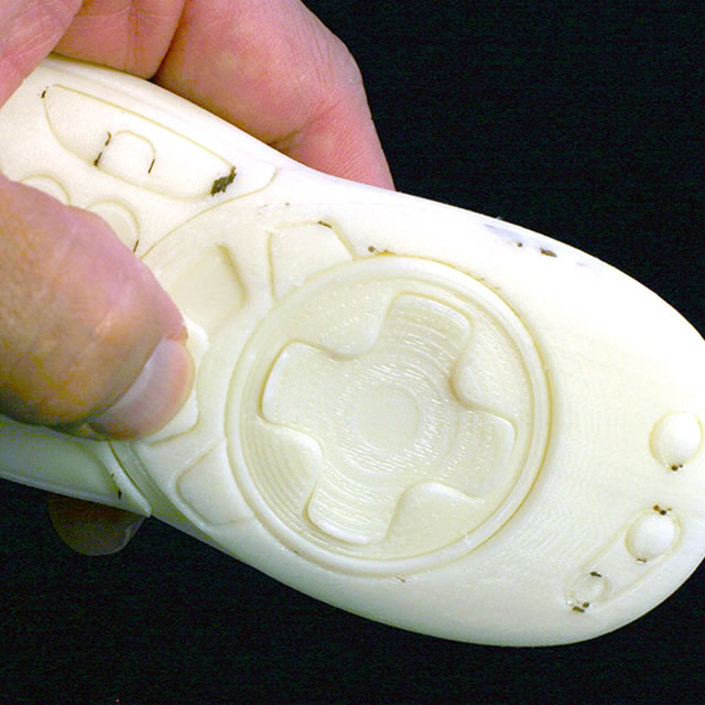
The soft waist of the double pebble geometry guides your grip so you immediately gravitate toward the central area of the remote, positioning your thumb in the critical area of control. The center of gravity rests in the lower part of your palm, so that the remote stays balanced for comfort and doesn’t fatigue you, even if you hold the remote for extended periods of time.

DirecTv remote control design sketchesDirecTv remote control 3D printed design prototype

The use of contrasting colors – black for the upper part with the key controls and grey for the lower part – immediately creates a sense of simplification in your mind and focuses your attention on the most important features while letting the less critical inputs for numbers and letters recede into the background.

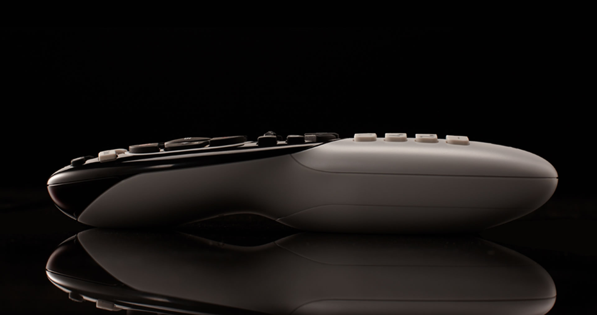
The gently curved shape of the remote and the contrasting color scheme contributes to the welcoming character of the remote and makes it feel like an approachable and inviting link to your entertainment experience rather than a barrier.

DirecTv remote control side view


Awards

Graphis Design Silver Award

What we did

Experience Essence™

Insights

Packaging

Design for Engineering

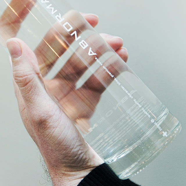
The neckless bottle, with its uncompromising design and innovative opening mechanism, has built strong brand equity for the premium Abnormal vodka.

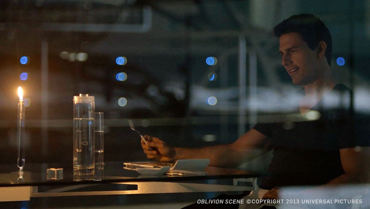
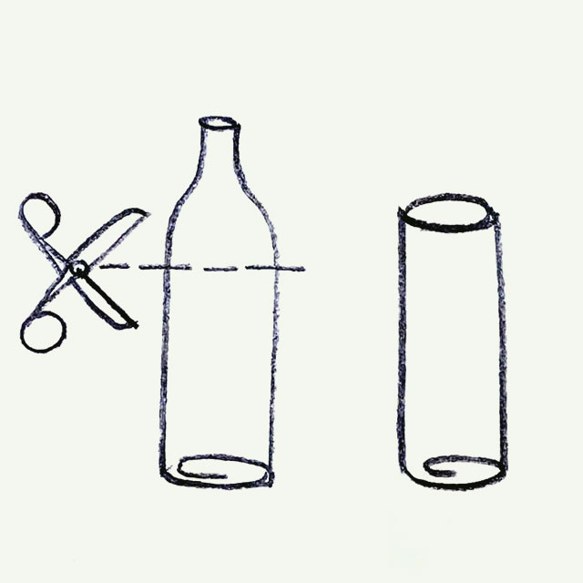
The Abnormal bottle is frequently lauded for its futuristic look. It was recently featured in the Tom Cruise movie Oblivion. The inspiration for the bottle came from the content itself – vodka, a strong, unconstrained, no compromise beverage. With all the technical advances that have happened over the centuries, in reality the actual bottle shape has changed very little. And no matter how sleek the bottle design is intended to be, production constraints dictate a distinct rim around the neck that interrupts the lines of any bottle or jar design.

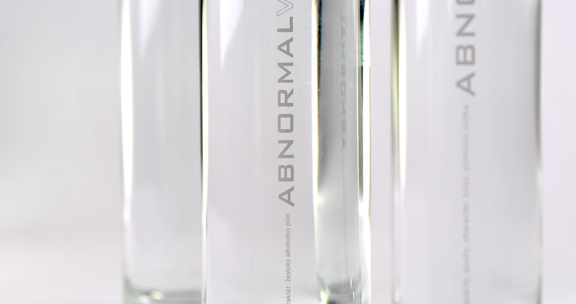
Abnormal vodka bottle label closeup

Traditional expertise to bring the future to the present

The innovative packaging design proved to be a challenge for traditional bottle manufacturers. But after an extensive search, a Slovenian manufacturer was identified. Experts of the precise production requirements of pharmaceutical glass, the manufacturer had one key asset – an older gentleman who had spent decades on the factory floor with deep expertise in glass blowing and molding.  His willingness to go beyond the tried and true helped make the neckless bottle a reality.

Abnormal vodka bottle design sketchAbnormal vodka bottle in hand

Designing inside out

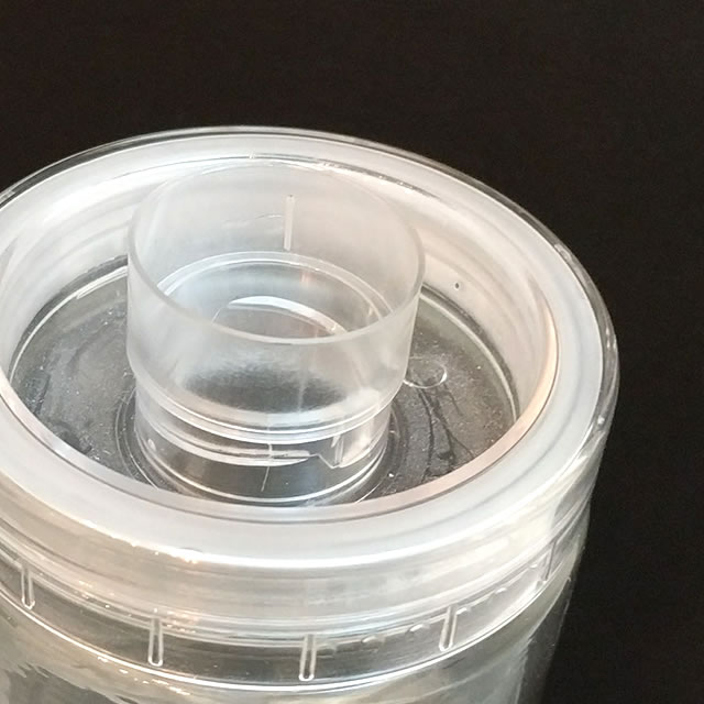
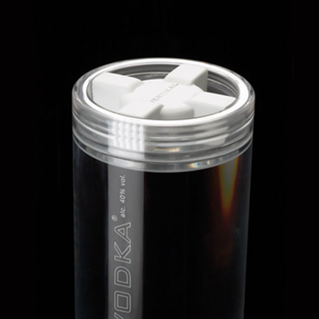
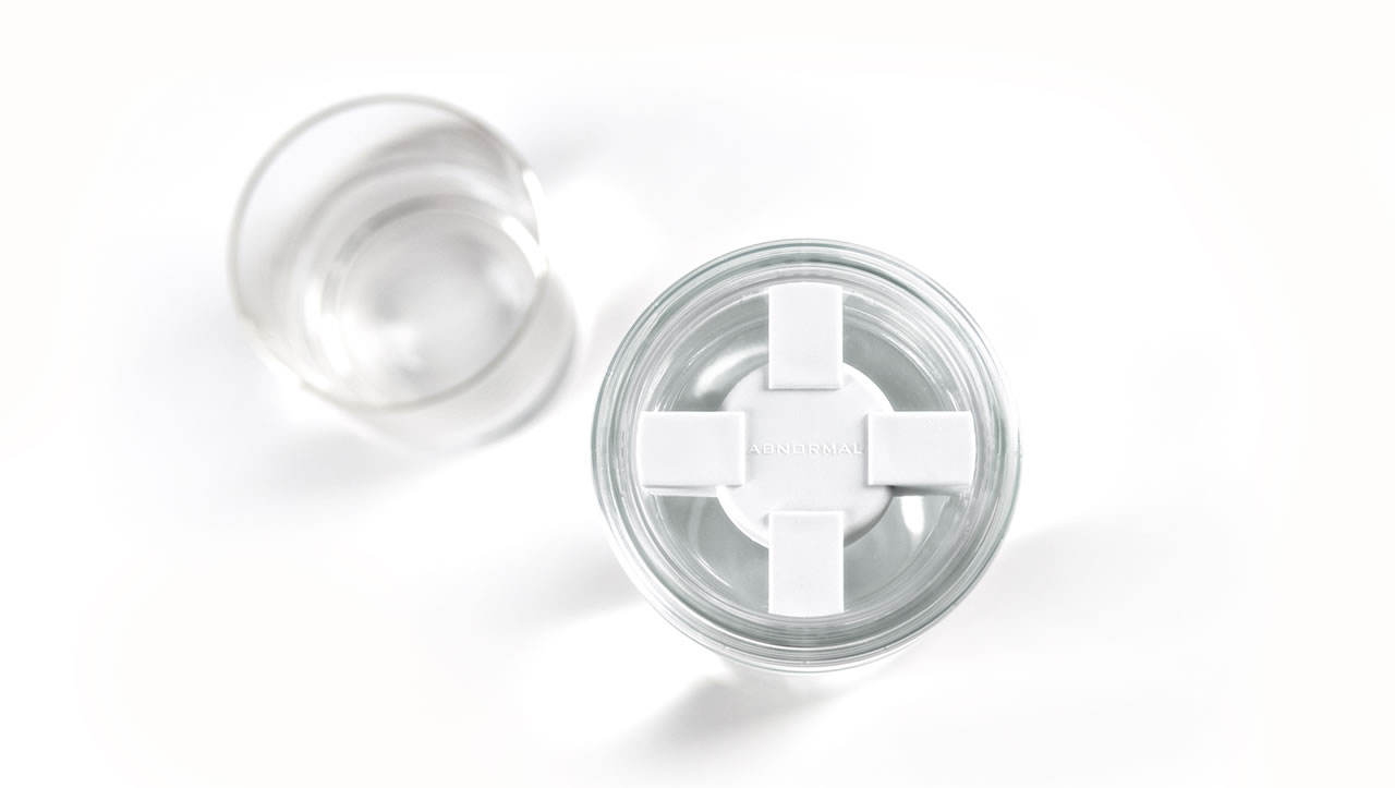
The bottle design of the Abormal vodka is not the only thing that breaks with tradition. The bottle closure consists of two parts; a clear cover with a sleek spout, and a cap.  When the distinctly cross-shaped cap is unscrewed the surprisingly smooth spout is revealed. The smoothness is achieved by placing the threads on the inside of the bottle opening.  The similarities of the graphically distinct cross-shaped screw cap and a valve handle is an intentional reference to keeping a powerful liquid contained.

Abnormal vodka bottle spout designAbnormal vodka bottle closure designAbnormal vodka bottle closure top view

The singularity of the design and its familiar unfamiliarity not only makes a striking statement as a drink container, but it also explains how a bottle designed a few years ago, using decade’s old expertise, ends up about a big Hollywood movie about the future.

Abnormal vodka bottle on the table with Tom Cruise


By Kevin Kilpatrick, Pritika Sekar and Branko Lukic

What will we do when virtual reality is a normal part of our daily lives? That day is coming quicker than we might realize and how we define it now will shape what it becomes in the future.

With virtual reality comes ‘mixed reality’ which has the potential to garner wider adoption than VR itself. Mixed reality utilizes VR technologies to place a digital layer over the physical world making it appear as part of the environment. As the technology improves and begins to play a major role in our lives, what this layer becomes will have a significant impact on the shape of our future. Making sure the impact is positive is a major responsibility for our generation.

Transforming the world around you

Currently virtual reality technology is moving faster than new content is being developed, but the content is what will make virtual and mixed reality part of our everyday lives. So we must ask ourselves, what can that content be and who should create it? We could present a ton of concepts for what this content might be; it’s not difficult to imagine floating interactive panels, virtual 3D teleconferences, virtual 360° movie theaters — a little googling can uncover countless other concepts — but we want to take a step back and explore something much more human.

If we broke down, for a moment, the barrier between the digital and ‘real’ worlds, and invited people to re-imagine their lives, what would they create? As inherently social creatures, humans look for ways to connect with others, to find communities and commonalities; moving these activities beyond a glass screen is the door that this new reality opens.

On the surface, we are exploring the intersection of social media and VR; not just connections between you and your friends, but a collaboration with everyone around you to transform the world through a digital layer on reality. However, if we go a level deeper, we are exploring what virtual and mixed reality content wants to organically become, through the hypothetical scenario that people, not just corporations, are the ones creating this transformed world. We’re not trying to cover all the aspects of getting this technology widely adopted, here we are more interested in exploring what people want to do with it once it is.

Say, for example, you put on a headset that allows you to see the world as you normally would. Now you’re given the ability to turn anything, a stick, a finger, or anything else, into a digital pen that allows you to create whatever you want — 2D, 3D, doesn’t matter. Doing this by yourself is interesting for a while. At first, you might draw squiggles in the air, maybe write out your name, but it’s when you can see what everyone else has made that these new abilities become truly engaging.

A new kind of social interaction

Let’s move past this initial adoption phase for a moment, past the novelty, and begin to look at what you might do once this becomes normalized. As humans, we naturally try to find ways to use tools to our advantage, and we’ve suddenly been given a blank canvas for creation. One of the more obvious ideas is to transform places with art, essentially virtual graffiti, but what else might you do?
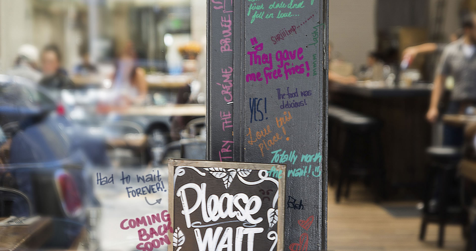
VR virtual grafitti impromptu review system

Imagine going to a restaurant and writing a review right next to the menu they placed outside. People tend to follow examples of others, so if people begin doing the same thing at other places, we now have an organically occurring review system. We could begin seeing guided tours of places we visit, information about train schedules, ways to get to the secret entrance of a club; the potential for a new kind of social interaction is immense.

We, as humans, are defining what this digital layer becomes and what it is ultimately used for, without developers forcing apps upon us. Graffiti that was once socially unacceptable is now celebrated as a standard of social communication.

The meaning of location

It’s the idea of placing content on location that would make this observational experiment so powerful. Context has the ability to imbue the things you create with instant meaning. When this content is experienced at the location in which it was created it inherits meaning that apps would have difficulty capturing.
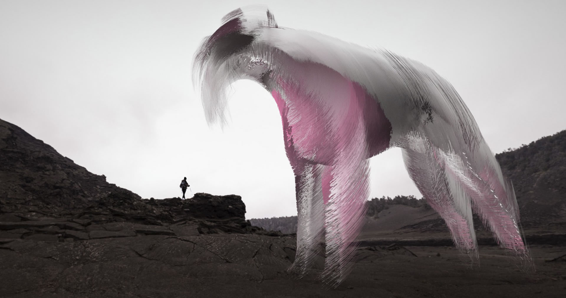
VR - content may give a place meaning that it never had

This virtual layer could also completely transform a place; the content may get meaning from the location, but it could happen the other way around too — the content may give a place meaning that it never had. Imagine people making travel plans to see some unknown place without any obvious importance, simply because what has been created in the virtual layer has attracted their attention. These are reactions that could only happen if the content was available at that unique location.

Capturing memories

What about the capturing of memories? Right now, they are two-dimensional photos and videos on a screen, but the power of immersion that VR offers will transform this into something much more meaningful, as though you are sharing a moment with the person who captured it. Let’s say that here too, the captured moments are placed on location for all to see, sort of like having Youtube videos placed where they were captured. This isn’t about seeing any video you want, this is about the organic transformation of a location by placing a user-made digital layer on reality.
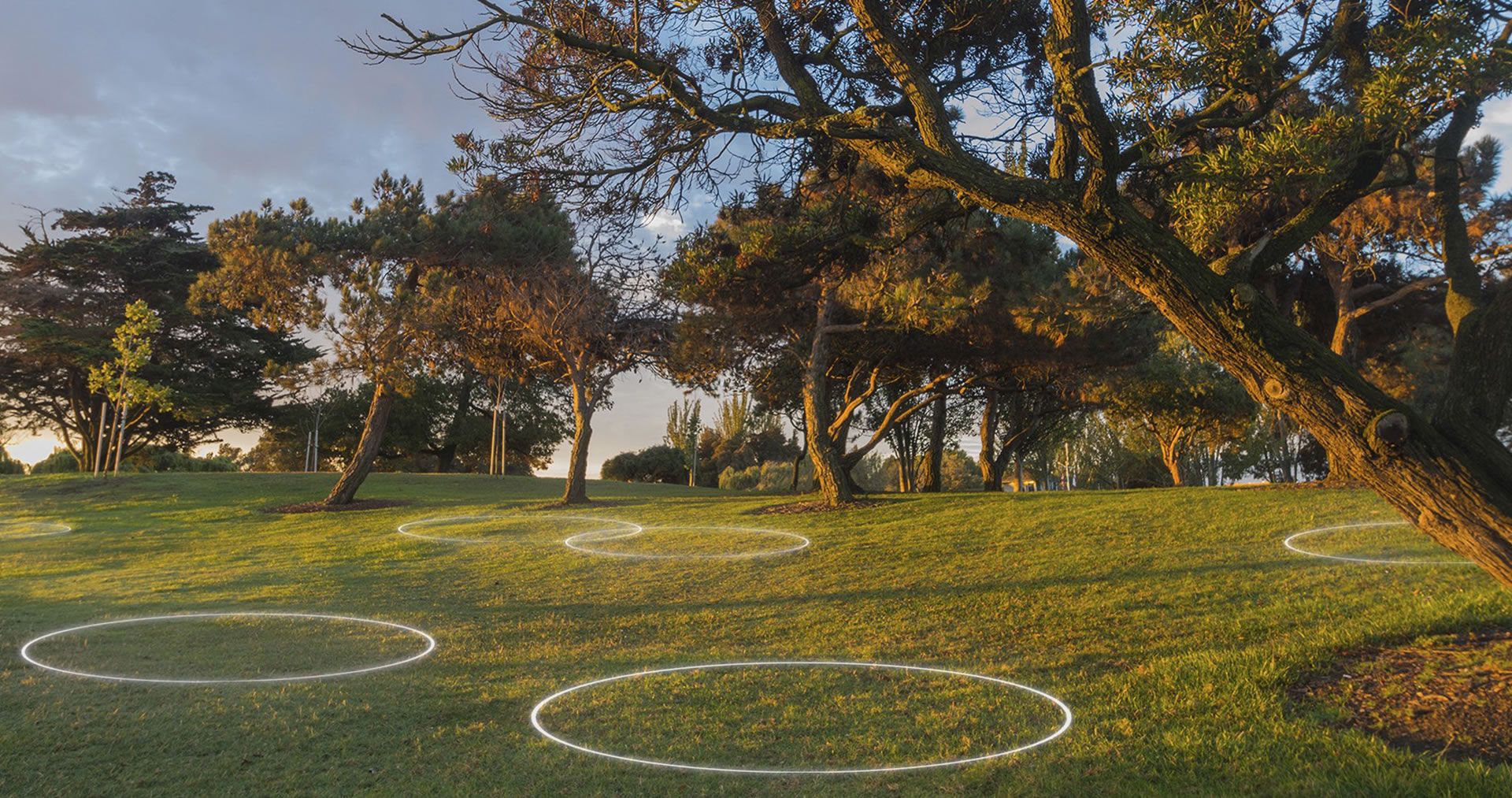
VR - the organic transformation of a location by placing a user-made digital layer on reality

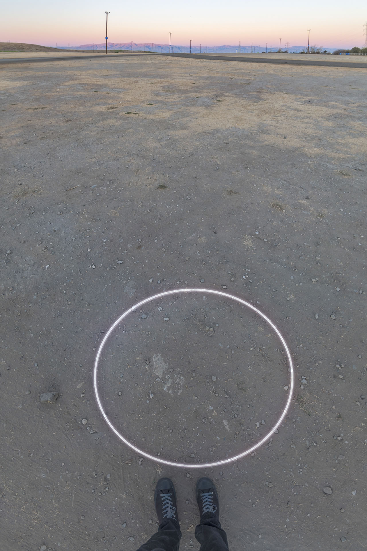
These experiences could be completely free of any standard thoughts of user interfaces. Imagine for a moment you go somewhere, maybe a place you have been before. You put on your headset and everything looks normal. But you look around and you see a circle on the ground. As you walk into the circle things around you shift — it’s later in the day, the clouds are different and you are standing next to someone you’ve never met. You’ve been transported back in time to a memory.

Viewing one of these moments could be as simple as walking into any circle that is on the ground in the digital layer. In a way, you have now entered that moment in time in which the content was captured. With the future promises of light-field technology and the realism you get from accurate depth capture, we could place this as an experience akin to time travel. Simply viewing a spherical video is a start, but it isn’t until this gets fully immersive depth that it delivers on its true potential.

What would people do once they had this capture technology? Sure, you’ll get a lot of cat and dog videos, but we could also begin to see people creating entirely new experiences — all without delving into the world of apps and user interfaces, what we call ‘appless experiences’. Imagine traveling to a city for the first time and being guided around by a local within the digital layer, an interaction most would never experience. We could also imagine reliving events — from public concerts to personal moments like proposals — right in the location that they happened, long after they have passed.

More connected to humans than technology

Then there are the devices themselves — currently emotionless inhuman plastic boxes, as one might expect from early iterations of emerging technologies. What could they be in a few years’ time? Considering the potential place these devices will have in our lives, they are in desperate need of a shift from tech experiment to something that’s familiar, warm, and more connected to the human than technology. Simply thinking of the technology as a ‘soft-goods’ object — instead of a hard plastic box strapped awkwardly to our bodies — would be a step in the right direction. We could imagine this to be a beanie, a scarf, or any other soft and familiar wearable.
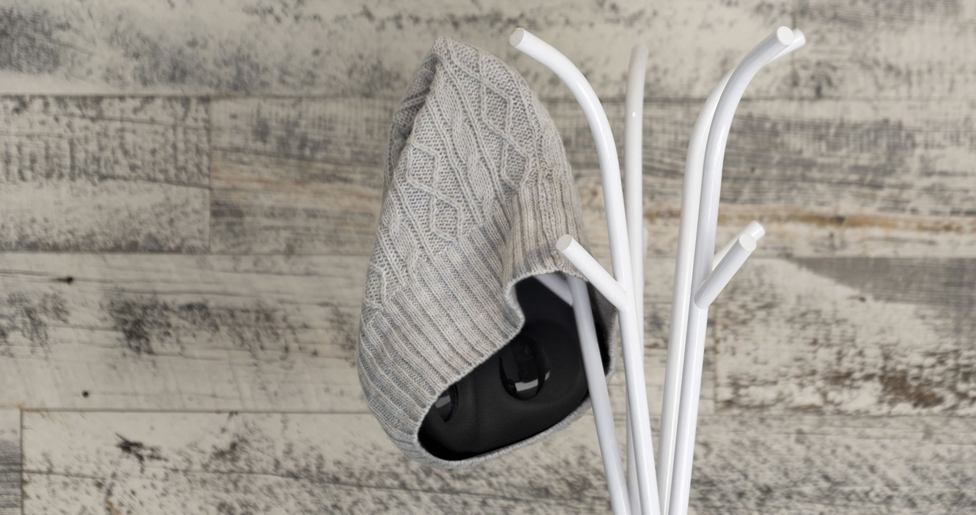
VR beanie - more connected to the human than technology

We also need to look at how these devices would actually be used, where they would be used, and why. If the future of VR borrows the habits we have established with our mobile devices, perhaps a majority of VR use is done as short bursts of consumption; this would ask for a device that is quick to deploy and easy to put away, without needing to be tethered to your phone or even a computer. Perhaps thinking of this an object as more of a portable device is more meaningful; something that’s allowed to develop a patina, a personality, and an emotional significance for its owner; something more akin to a Zippo lighter or an Altoids tin than some sleek technological contraption. This approach could allow these devices to gain more social acceptance as they begin to be used in public, not just through the familiarity of the form, but also by removing the perception that you are trying to cut yourself off from the world.
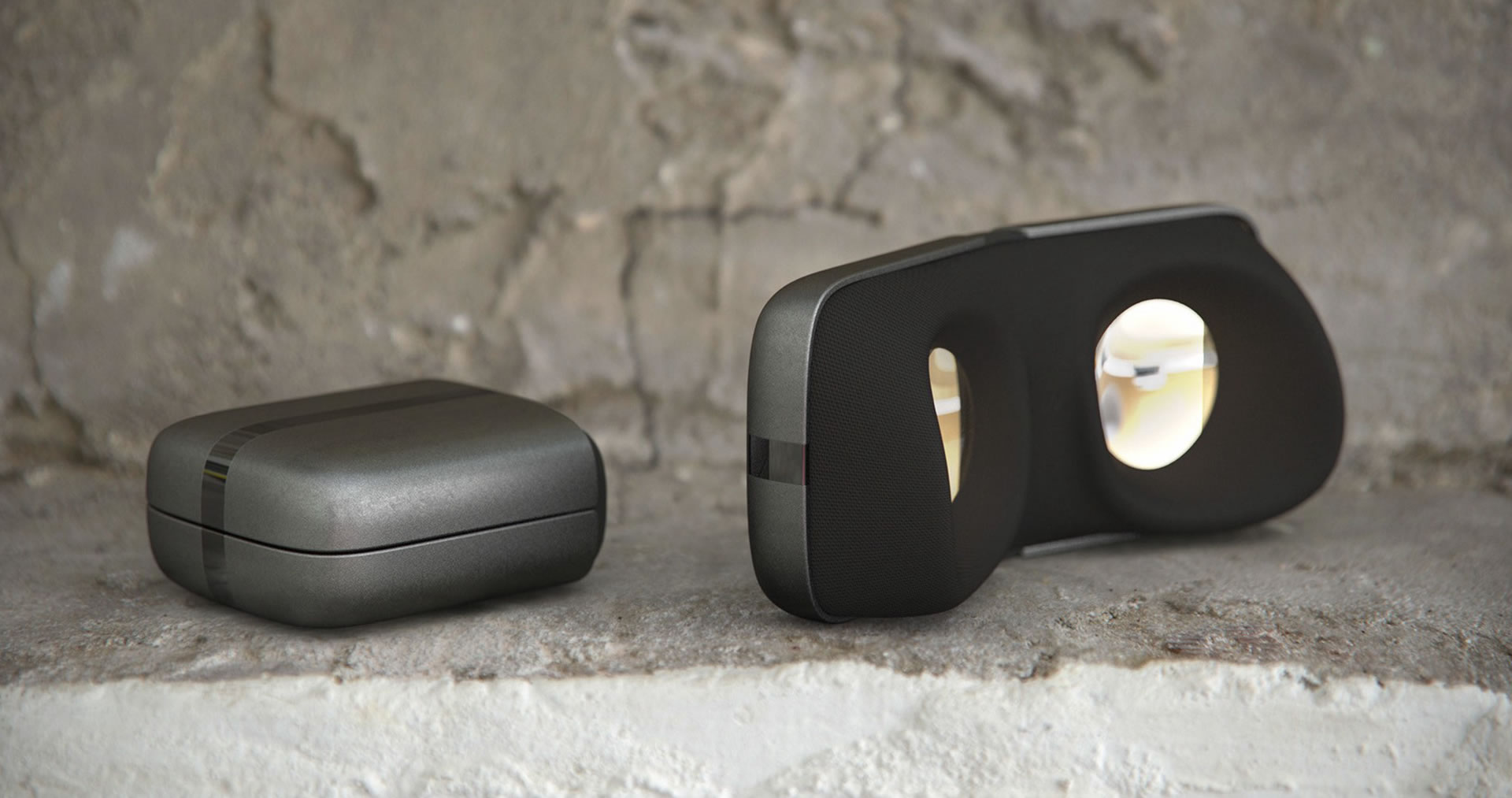
Foldable VR device that is quick to deploy and easy to put away

With a new type of content to capture also comes a need for a new type of capture device. Once we can capture quality 3D imagery of a space in time, gone is the need for composition of images. Imagine simply having a bracelet and holding your arm up whenever you wanted to capture your surroundings. This isn’t to say that these capture devices will or even should become wearables, but rather that we can create “post technological” solutions that are more human, both in the devices themselves and the content it captures. We perceive the world in a specific way, and if these devices can perceive the world in the same way, our emotional connection with the content and the creators of that content will be amplified in ways we’ve never imagined.
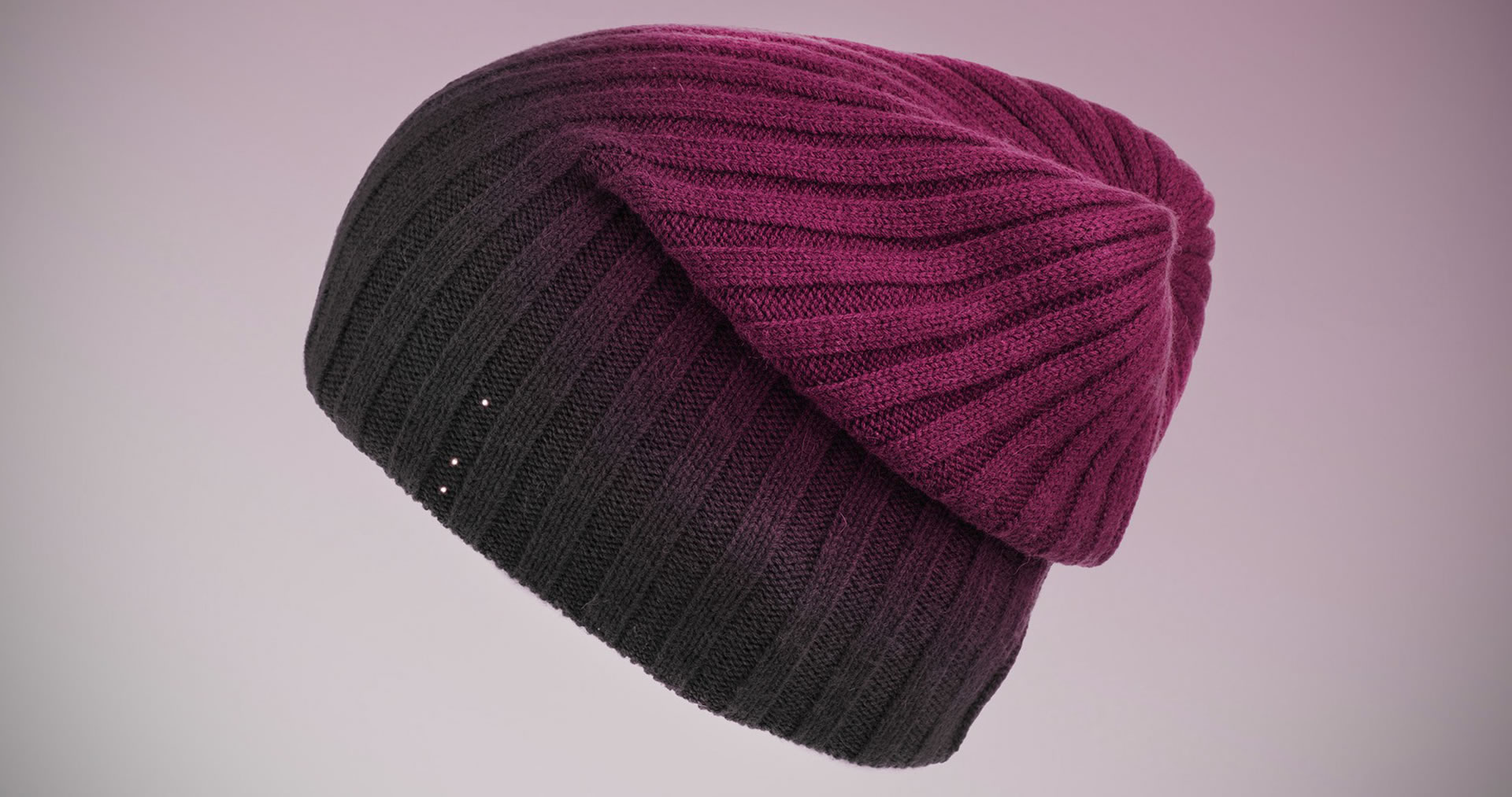
VR purple beanie - “post technological” solutions that are more human

Social interactions to redefine the digital world

We are defining this world right now. We need to understand it from not just a technological level, but from a human level. This technology will forever change our perception of the world, it will be another fundamental shift in social interaction. Getting started in the right direction is imperative for our future. But how do we know what the right direction is?
Designing simple, powerful creative tools to interact with the world on this new layer, we can naturally explore our new dimension, and better understand what to do with it and the role it plays in our lives. By starting with the inherently human, with what is common to us all, we can take this organically evolving interactive world and allow it to inform and shape the technology, not the other way around.
VR - captured moments placed on location


Awards

iF Product Design Gold Award

iF Product Design Award Product Family

Pentawards Silver

Good Design Award

What we did

Experience Essence™

Insights

Industrial Design

Materiality

Design Language

Packaging

Art

Design for Manufacturing

Turning existing convention on its head, the UE Roll is small enough to fit in your hand yet loud enough to power a party anywhere.

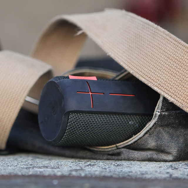
Following successful collaborations on the UE Boom and the UE Megaboom, Ultimate Ears again turned to NONOBJECT, this time to design the most adventurous portable Bluetooth speaker ever, the UE Roll. Continuing the DNA of the UE Boom and Megaboom, the front of the UE Roll speaker is instantly recognizable with its iconic oversized ‘plus’ and ‘minus’ buttons. But the small size of the speaker and the portability vision for the UE Roll presented steep design challenges. And when adding excellent sound quality and acoustic performance requirements, the design challenges at first seemed almost insurmountable.

Designing an acoustic breakthrough

The portability requirements were directly at odds with the acoustic requirements. But ultimately, the slim, hemispherical shape that NONOBJECT conceived was an acoustic breakthrough that delivered on the idea of the powerful 360 sound that all the speakers in the Ultimate Ears portfolio deliver.

Orange UE Roll mobile speaker with surfersResponsible vs a wild child


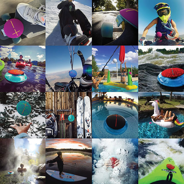
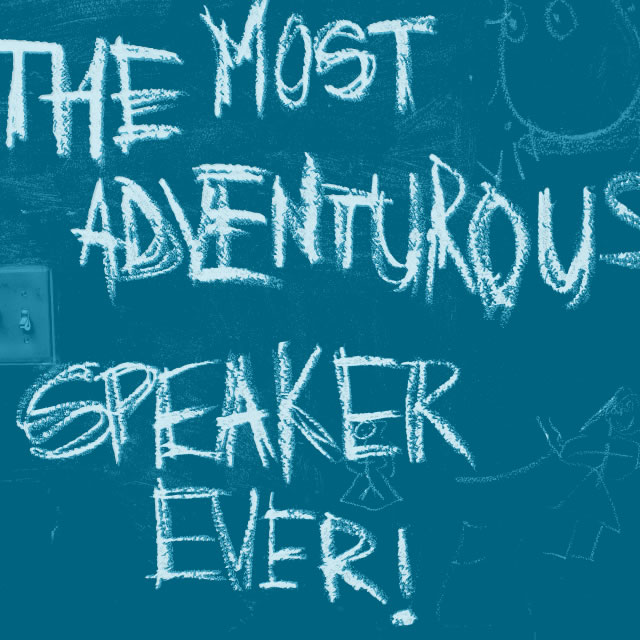
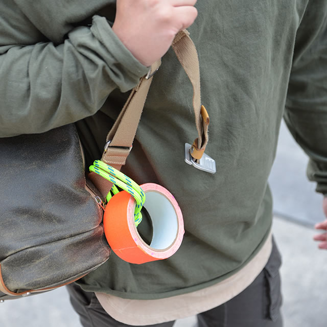
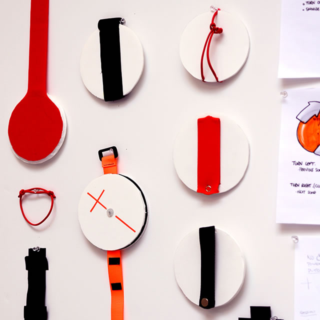
UE Roll speaker duct tape rapid prototypeUE Roll mobile speaker in action Instagram photosThe most adventurous speaker text on the wallUE Roll speaker duct tape rapid prototype on backpack

Amazing 360 sound

The shape allows all the necessary acoustic components to be positioned optimally inside in an incredibly compact envelope. When placed face up on any surface, the user can enjoy amazing 360 sound, without the speaker vibrating or traveling on the surface.

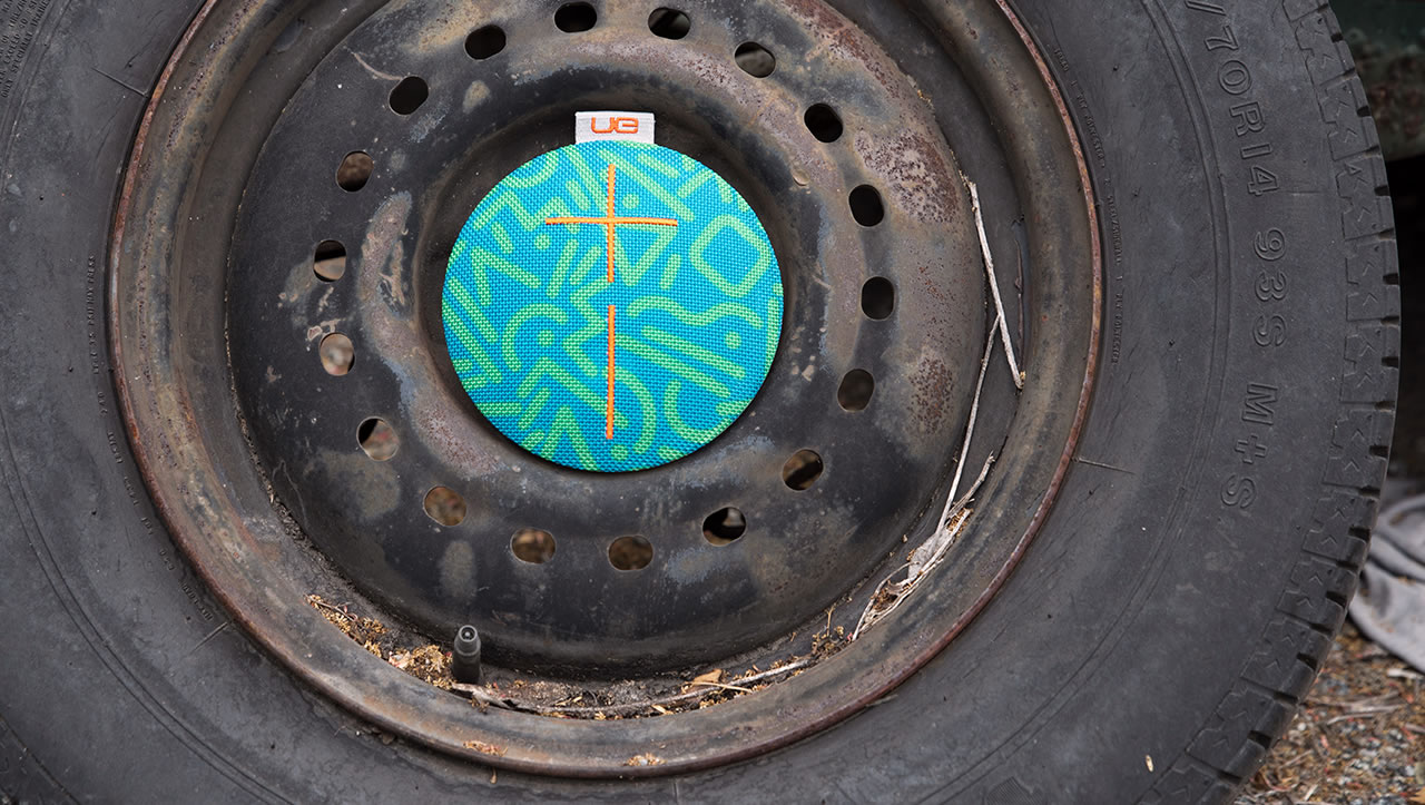
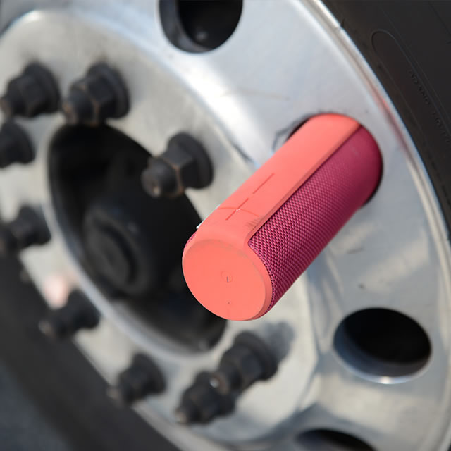
UE Roll mobile speaker design modelsUE Roll mobile speaker design sketchesUE Roll mobile speaker with a truck wheel

an acoustic breakthrough that delivered on the idea of the powerful 360 sound in new way

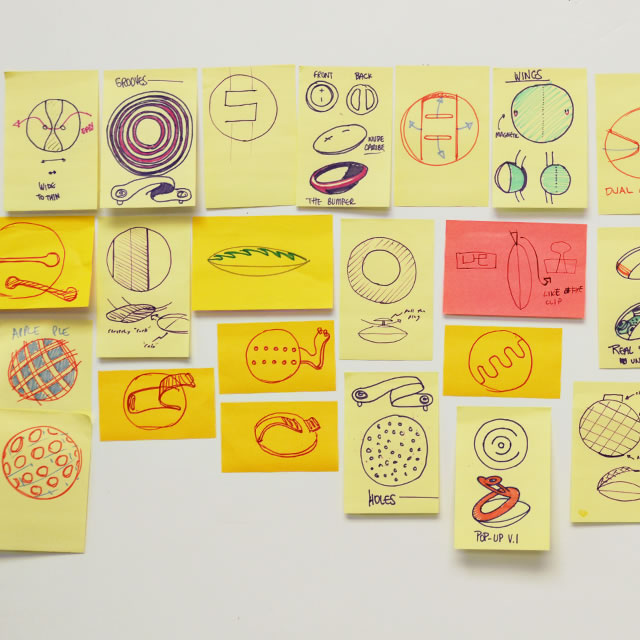
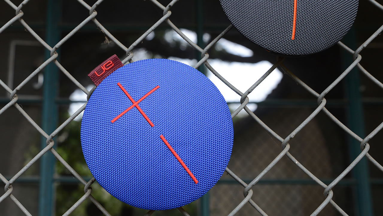
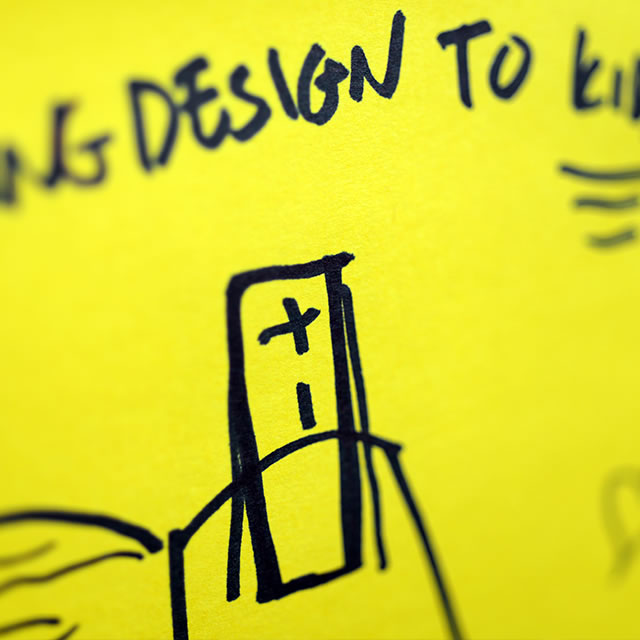
UE Roll mobile speaker design sketches on postit notesBlue UE Roll mobile speaker on a barbed wire fence

The most advanced materials

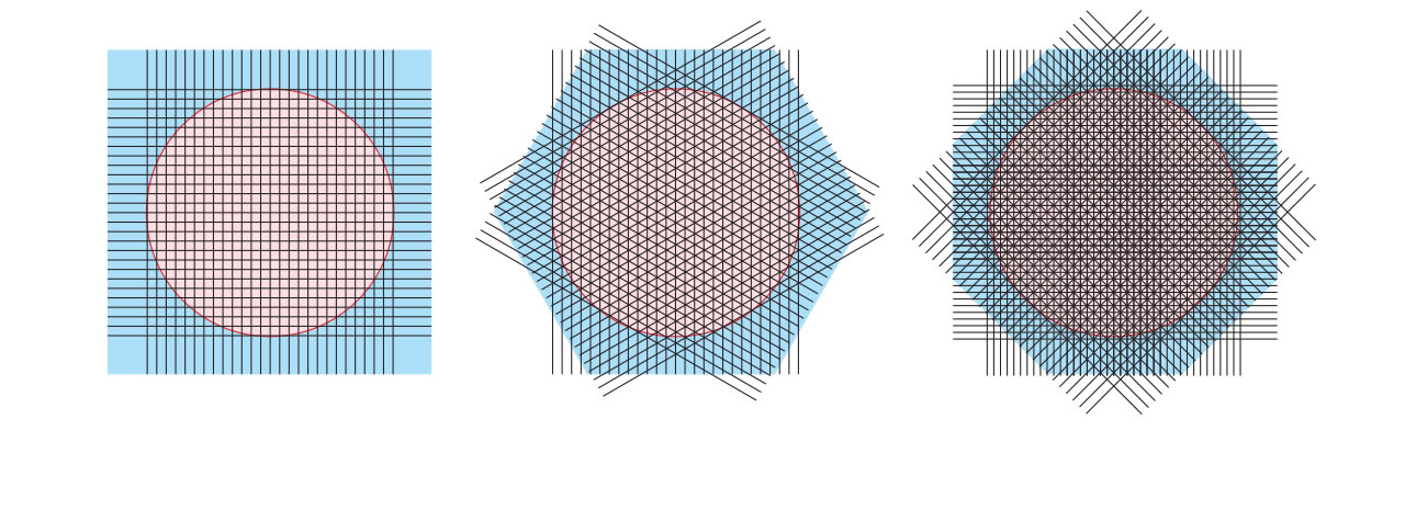
Shunning the throwaway nature of consumer electronics, the UE Roll—as with all speakers from Ultimate Ears—only gets better with age.  Small and portable, the UE Roll will be held in your hands, put in pockets, shoved in bags, attached to outdoor objects, and exposed to dirt and grime on a daily basis. Therefore, the materials were carefully selected to not only make the surfaces beautiful and approachable, but also to make the speaker much more durable. The acoustic skin on the front of the speaker is a custom weave produced by one of the most advanced fabric manufacturers in the world. It is the most durable, acoustically transparent material we could find and lives up to the promise of a life-proof product. The TPSiV elastomer on the backside is also custom developed. This elastomer is soft to the touch but wears like iron. It shows and maintains vibrant colors beautifully and is completely washable.
Just as with UE Boom and UE Megaboom, over time, the speaker will develop a beautiful patina, unique to each user. And if patina is not your thing, the UE Roll can easily be kept immaculate with a quick dunk in water.

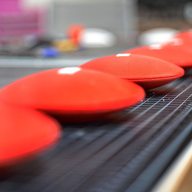
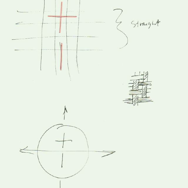
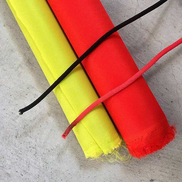
UE Roll mobile speaker fabric designUE Roll mobile speaker prototypesUE Roll mobile speaker acoustic skin materials

the acoustic skin is a custom-weave from one of the most advanced fabric manufacturers in the world

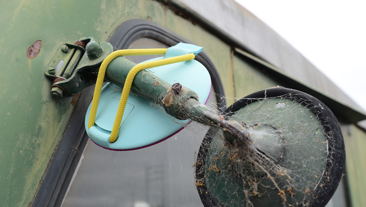
Waterproof Blue UE Roll mobile speaker on a snorkelBlue UE Roll mobile speaker strapped to a rear view mirror

This bluetooth speaker is so honest about what it should do and what it should look like. Form and function reinforce each other in perfect unison. Material use is extraordinarily smart, as is its detailing. Not only does it very cleverly coordinate with the users behavior, it positively exudes kindness, youth, freshness, fun and good vibrations. This product sends out a message, it communicates an outstanding design.

The iF Award Jury 2016 for UE Roll iF Gold Award

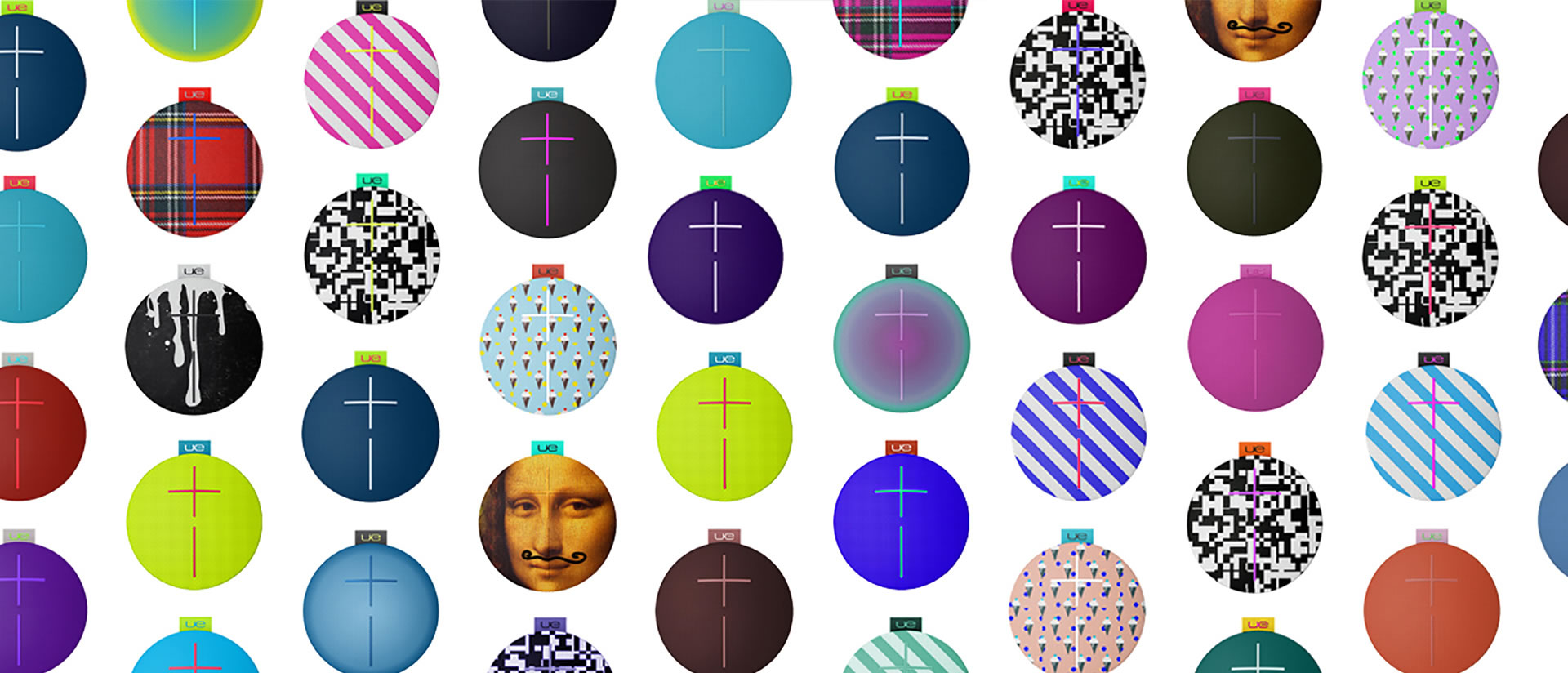
UE Roll mobile speakers fabric patterns and prints

UE Roll mobile speaker on an arm

Not only is the physical appearance of the UE Roll designed for a long life. The acoustic and digital capabilities of the product can also be updated seamlessly through the UE Roll app, further extending the life of the product.

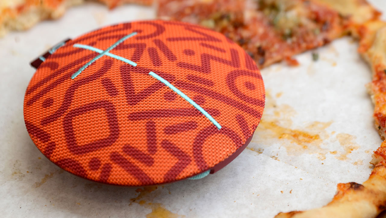
Orange UE Roll mobile speaker in a pizza box

The butcher shop inspiration

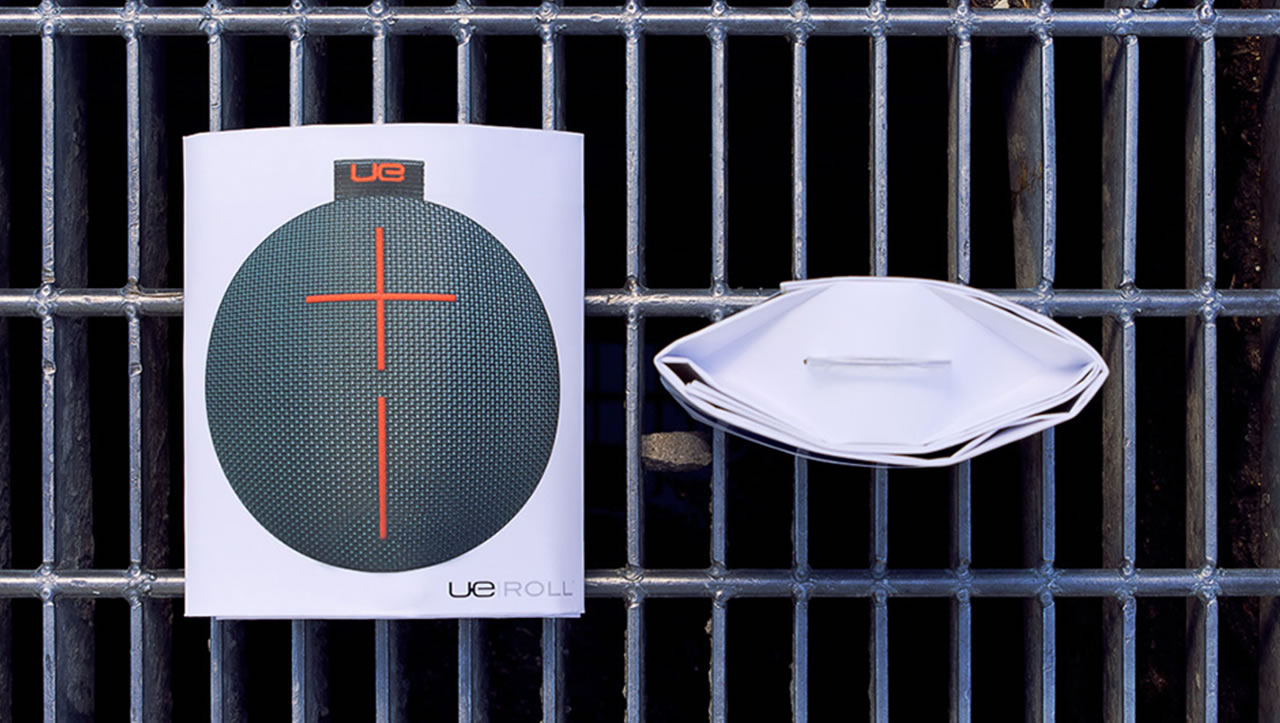
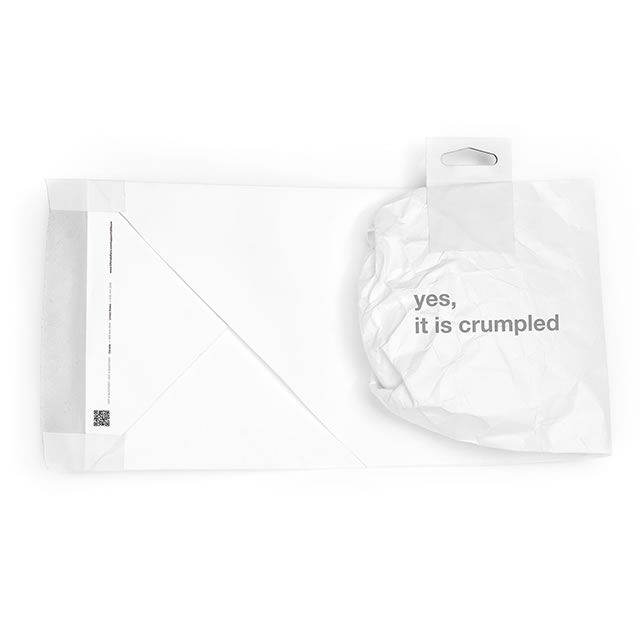
The idea of sustainability extends to the packaging of the UE Roll. Going against the prevailing trend in packaging for consumer electronics, the UE Roll packaging is minimal, consisting primarily of a recyclable piece of paper folded beautifully to protect and showcase the product.

UE Roll mobile speaker packaging on a drainage grate

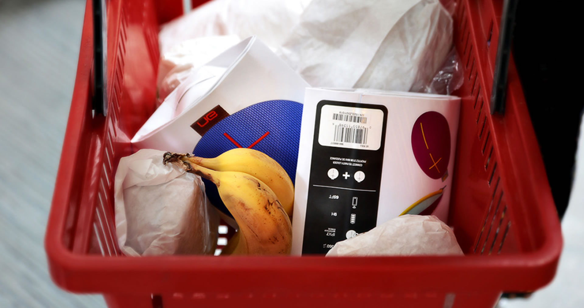
The idea for the packaging of the UE Roll was driven by the thought of the perfectly imperfect packaging. At first glance, the packaging appears perfect on the shelf, a true brand vehicle, carrying all brand attributes of its family and clearly conveying critical product attributes. But at a closer look, it does so much more. While other members of the UE family are packaged in cylindrical boxes, the UE Roll is not one to be confined in a box. In fact, its packaging has more in common with a slab of meat in a butcher shop than a typical consumer electronics product.

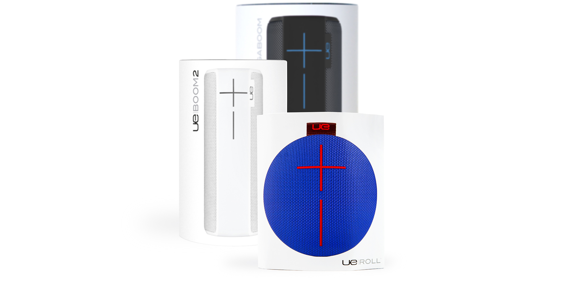
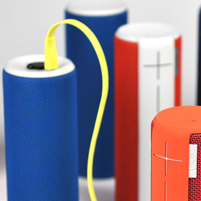
UE portable speakers packaging familyUE Roll portable speaker packaging in a shopping basket

has more in common with a slab of meat in a butcher shop than a typical consumer electronics product

UE Roll portable speaker packaging prototype

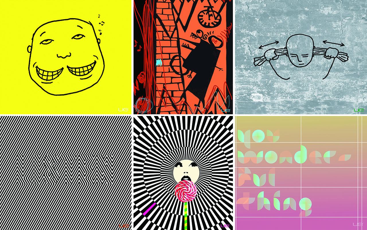
the inside of the paper is printed with a commissioned piece of art – a different one for each product color

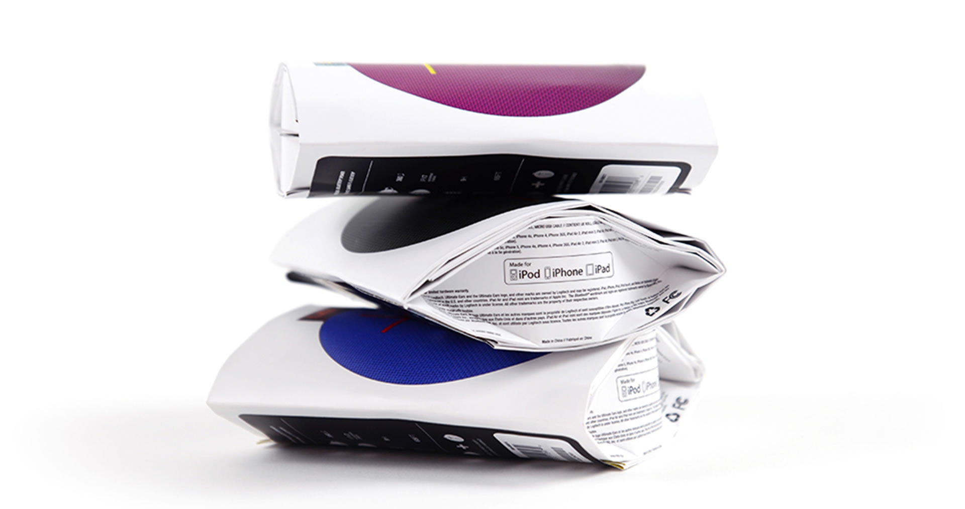
UE Roll portable speaker packaging stacked

The oval packaging is simply the product wrapped in a single sheet of paper, There are no trays or small boxes for accessories, no plastic sleeves for protection – just the simple sheet of paper wrapped such that it beautifully reveals the product, leaving you with no waste and no hassle – just you and your music ready to go. And the inside of the paper is printed with a commissioned piece of art – a different one for each product color – with images that are as non-conformist as the product itself.

UE Roll portable speaker packaging posters

The result of the perfectly imperfect packaging is a truly unique way of packaging a product in the consumer electronics category. Challenging established industry norms and pushing the boundaries the packaging conveys the essence of the the UE Roll while being extremely cost-efficient and sustainable.

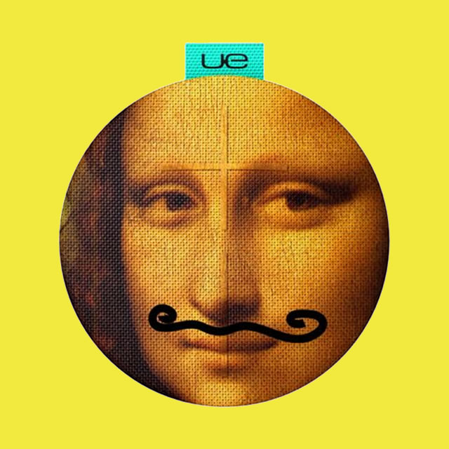
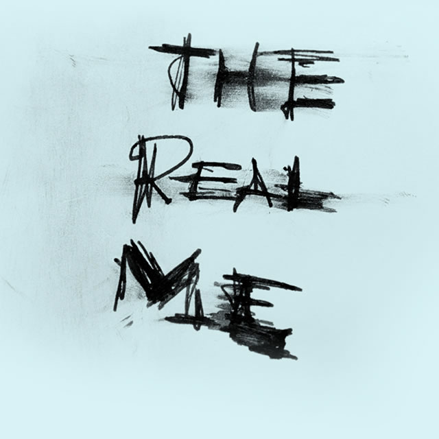
UE Roll portable speaker with Mona Lisa print The Real Me scribble on UE Roll portable speaker packaging


Awards

iF Product Design Gold Award

Red Dot Design Award

Red Dot Packaging Award

IDSA Gold Award

Good Design Award

iF Product Design Award

iF Product Design Award Product Family

What we did

Experience Essence™

Insights

Industrial Design

Materiality

Packaging

Logo

Iconography

Design for Manufacturing

The UE Boom and the UE Megaboom launched Ultimate Ears into a top player in the portable speaker market, winning accolades every year since launch as the best portable speakers to buy.

The Ultimate Ears family of speakers ushered in Logitech’s focus on design. It all started with the UE Boom. Hailed by Charlotte Johs, General Manager of UE Ultimate Ears, as “the very first Logi-inspired piece of tech”, the UE Boom is Logitech’s best selling product in all categories. Delivering triple digit sales growth, the UE Boom launched Logitech’s Ultimate Ears brand into the top brand for mobile speakers around the world.

And the speaker, with it’s innovative choice of materials, iconic interface and 360 design, ushered in a new paradigm in the portable speaker market, with a rush of fabric covered round speakers with prominent plus and minus interfaces quickly following suit. The release of the UE Megaboom further solidified Ultimate Ear’s presence in the portable speaker market.

Musical instruments and their timeless appeal and emotional relevance in our lives were an important inspiration in the development of the UE Boom wireless speaker. Just like an instrument beckons you to reach out and touch it, the universally simple and timeless shape of the UE Boom feels enticingly approachable. And just like the sound of an instrument fills an entire room, the UE Boom is a fully omni-directional speaker where the user is always in the space of possibility.

Ultimate Ears’ Boom is the best all around portable Bluetooth speaker you can buy. With the new Megaboom speaker, UE takes that superb design and makes it bigger, tougher, and perhaps, even better.

Ultimate Ears Boom: The Speaker Jambox Wants to Be

The cylindrical speaker is one of the absolute best-sounding, best-designed portable Bluetooth soundsystems, a product category unfortunately overpopulated by awful, bromidic barf machines.

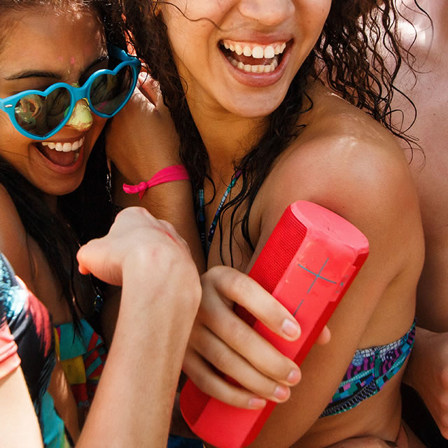
Purple water resistant UE Megaboom mobile speaker and laughing girls

From plastic and metal to acoustic skin

With no mechanical details that distract, the UE Boom is covered in a soft, yet wear and water resistant fabric that feels warm and comfortable in your hand. Moving beyond the plastic and metal normally associated with speakers was a deliberate design choice, and revolutionary at the time. Rather than a cold artificial surface, the fabric functions as an acoustic skin that not only makes the surface beautiful and approachable, but also makes the speaker much more durable.
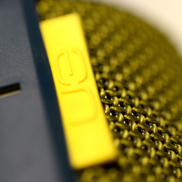
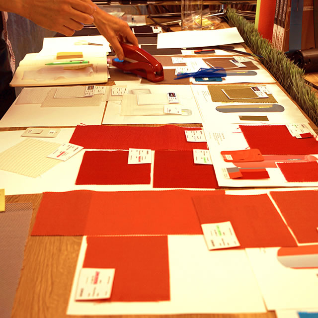
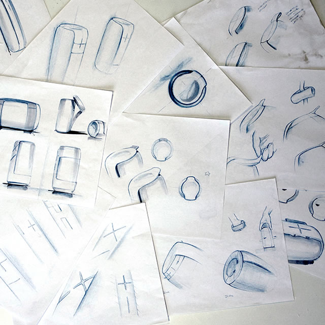
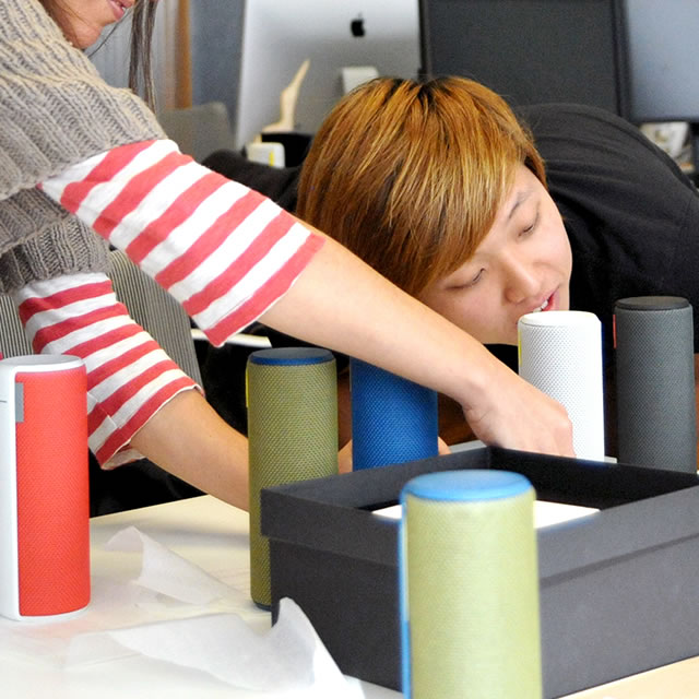
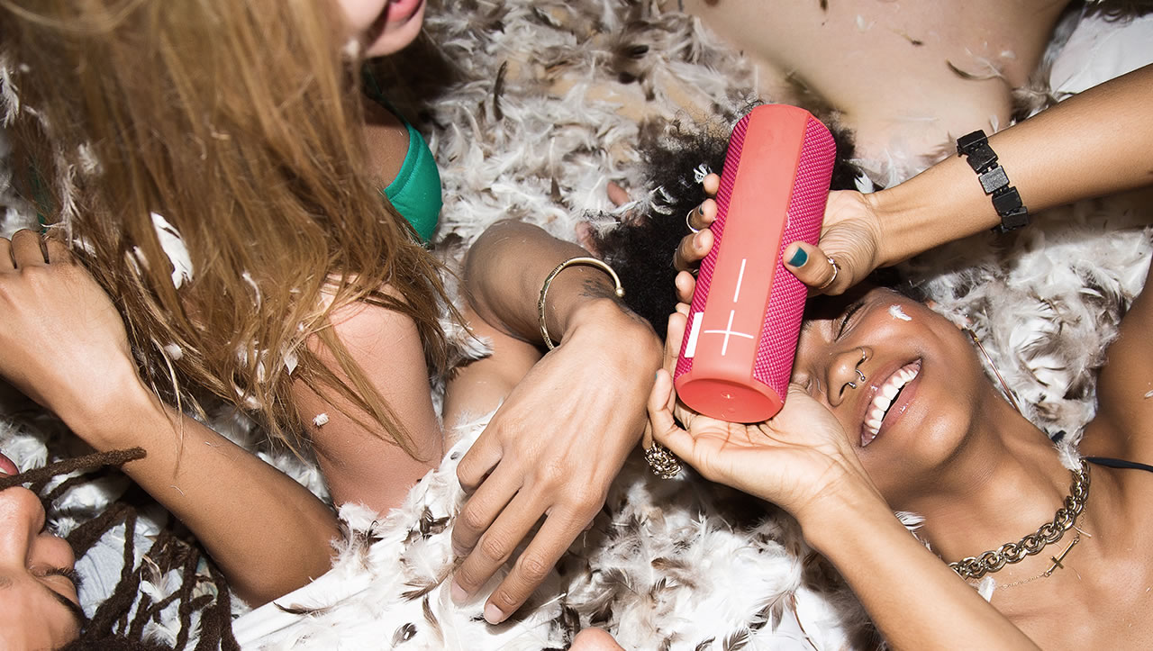
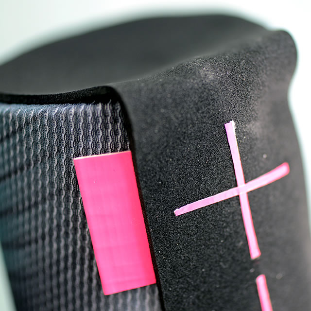
UE Boom portable speaker yellow logo tagUE Boom porttable speaker materialsUE Boom portable speaker design sketchesUE Boom portable speaker model design reviewPink UE Boom portable speaker at a pillow fight

In a speaker, the essence of the music is the sound that comes out. Distilling this essence down to its core, the simple and graphically prominent plus and minus signs of the UE Boom user interface is refreshingly simple and easy to use.The attention to simple and intuitive details extends to the UE Boom charging solution. The cable, with its clean, flat shape, avoids tangles and twists, and rolls up cleanly for easy storage. Both the cable and the charger elicit a smile with their unusual color.

UE Boom portable speaker design prototype UE Boom portable speaker sketch

The attention to simple and intuitive details extends to the UE Boom charging solution. The cable, with its clean, flat shape, avoids tangles and twists, and rolls up cleanly for easy storage. Both the cable and the charger elicit a smile with their unusual color.

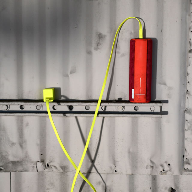
UE Boom portable speaker yellow charging cable UE Boom portable speaker upside down charging

The UE MegaBoom

The UE MEGABOOM extends the true mobility established by UE Boom into a market where this level of bass is only found in speakers twice the size. Showcasing the power of emotional relevance, the UE MEGABOOM became one of Logitech’s best-selling products already in its first quarter on the market.

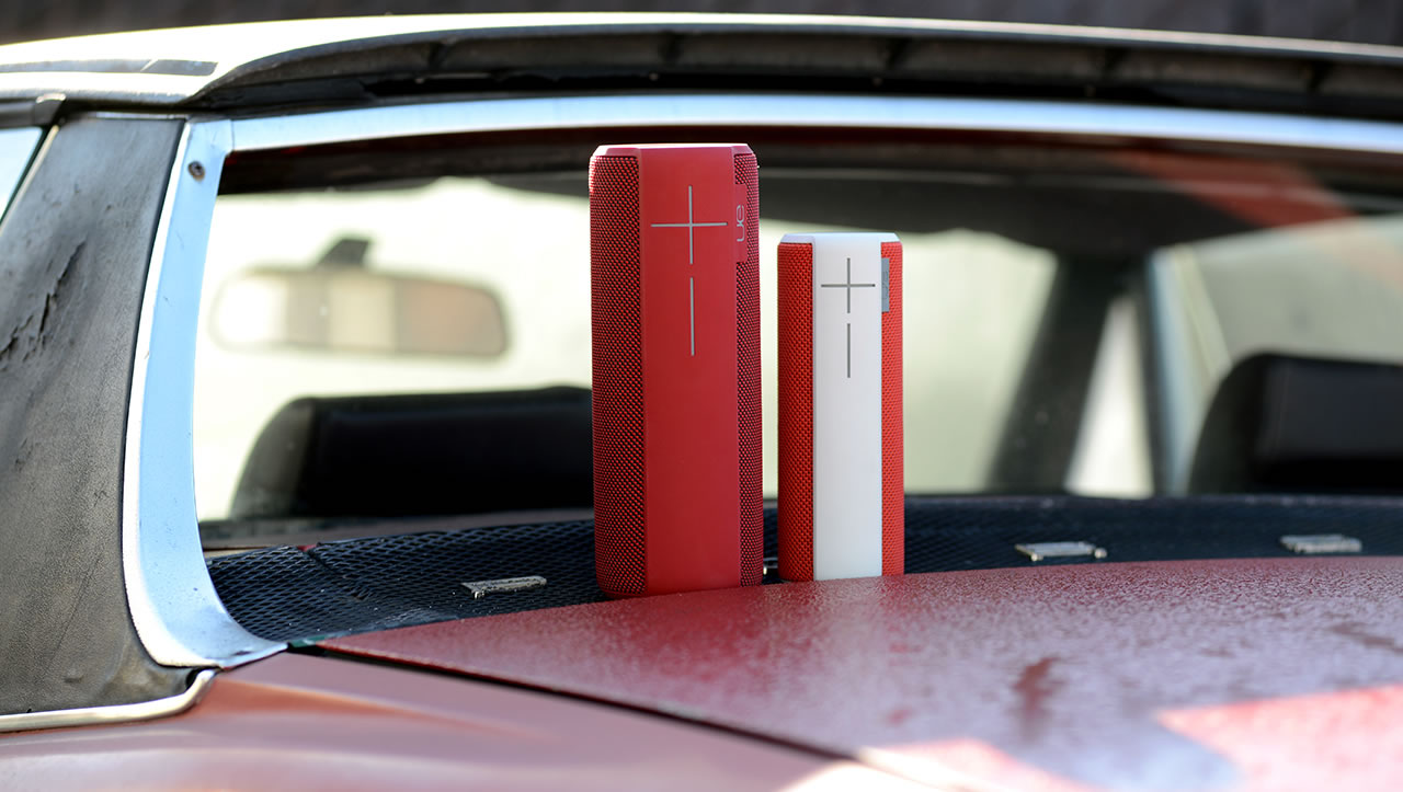
UE Boom and Megaboom mobile speakers on the car

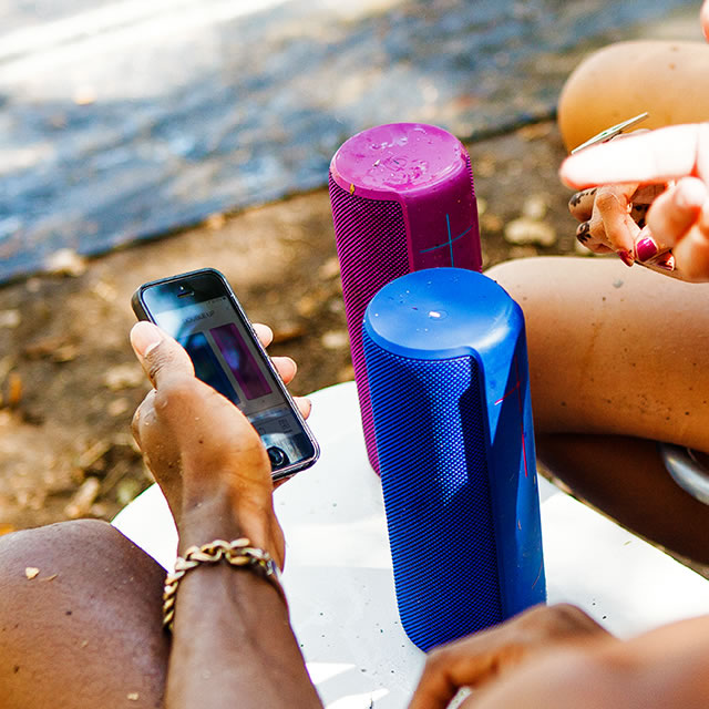
Blue and purple UE Megaboom mobile speakers with phone app

the UE MEGABOOM became one of Logitech’s best-selling products already in its first quarter on the market

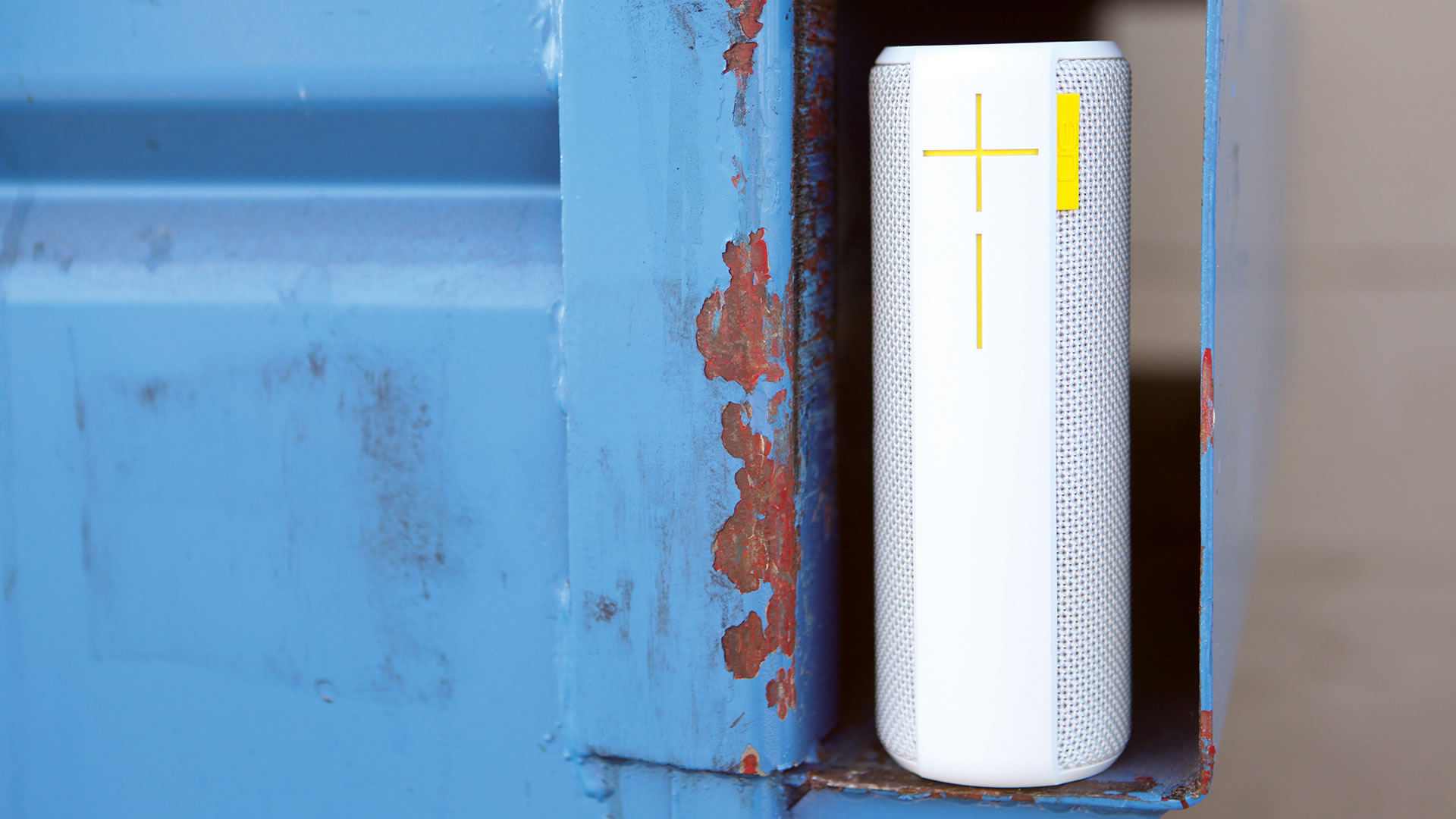
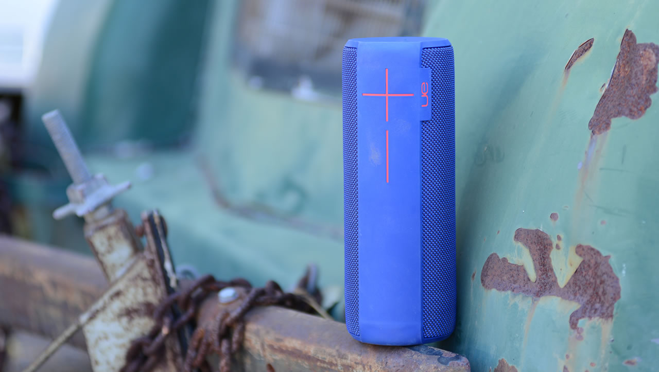
Blue UE Megaboom mobile speaker on a rusty bumper

Mobilizing big sound

The market for bigger Bluetooth speakers is defined by mostly black or grey plastic speakers that, with few exceptions, are remarkably boxy with big footprints that don’t encourage mobility. And they feel far from life-proof. But there is a reason for the bulk and boxiness. Producing big sound with deep bass is difficult. Producing sound that can fill a room even more so. It requires space around the speaker components, and if there is not enough of that the sound quality will be poor and the speaker will vibrate or even travel when placed on a hard surface. The challenge then was to design a fully portable speaker with amazing bass.

Purple waterproof UE Megaboom mobile speaker splashingUE Boom and UE Megaboom mobile speakers design sketchesPurple UE Megaboom mobile speaker in the snow

No compromise required

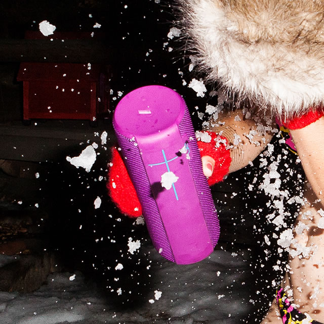
And the UE MEGABOOM delivers. Despite its powerful sound, the speaker fits comfortably in your hand. Lifting it, you realize it is surprisingly light. Just like its sister product, the UE Boom, this speaker is covered in a life proof acoustic skin designed to withstand the toughest conditions while acquiring beautiful patina that is unique to each user. And if patina is not for you, the waterproof (IPX7) speaker can easily be kept immaculate with a rinse under the faucet.
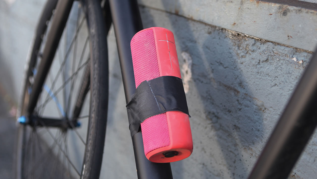
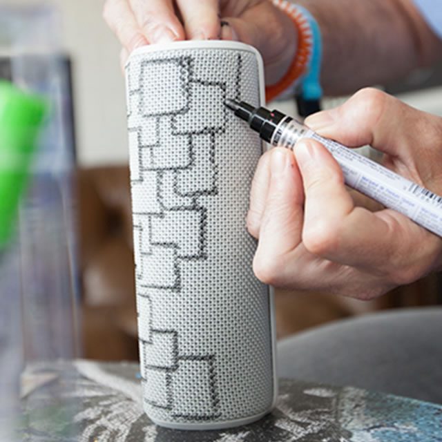
Pink UE Boom portable speaker taped to a bicycle Black UE Boom portable speaker in a bag Drawing with markers on a white UE Boom portable speaker

Of all the products in the category, this is without question the best.

Wired

Blue UE Boom portable speaker at a party

Pink UE Boom portable speaker in the wheel Red UE Boom portable speaker at a beach party

Transcending the typical product cycle and market segments

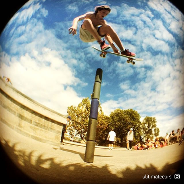
Contrary to most speakers, the UE Boom and UE Megaboom are not designed to be precious objects that passively entertain. They are at the center of the action – meant to be passed around, tossed, grabbed, going with you anywhere. In the same way that time will make a favorite instrument acquire beautiful patina that makes it feel more unique and personally relevant, the UE Boom and UE Megaboom are speakers designed to transcend the typical product cycles and traditional market segments. Simply put, they are speakers for you.

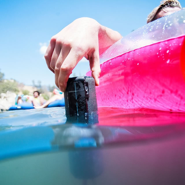
Blue UE Boom portable speaker in a cup holderBlack waterproof UE Boom portable speaker in water

Packaging that makes a difference

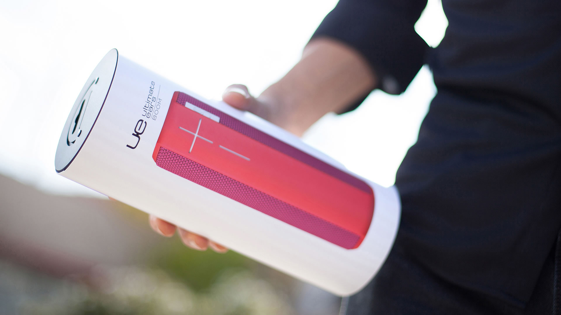
Electronics stores today are dominated by rectangular boxes with bold graphics highlighting the latest features. The packaging for the UE Boom is the opposite of that.

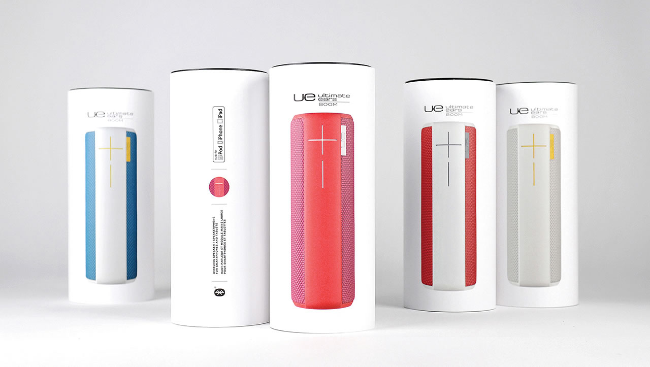
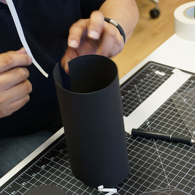
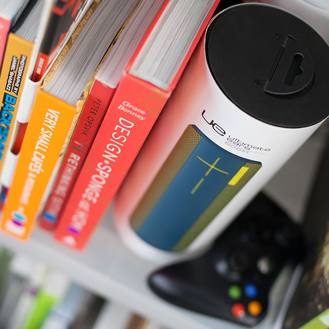
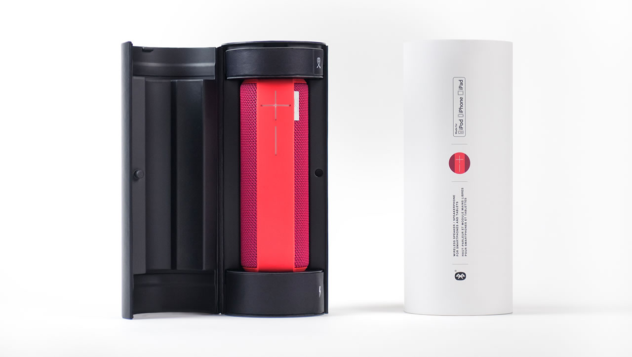
UE Boom portable speaker packaging boxes

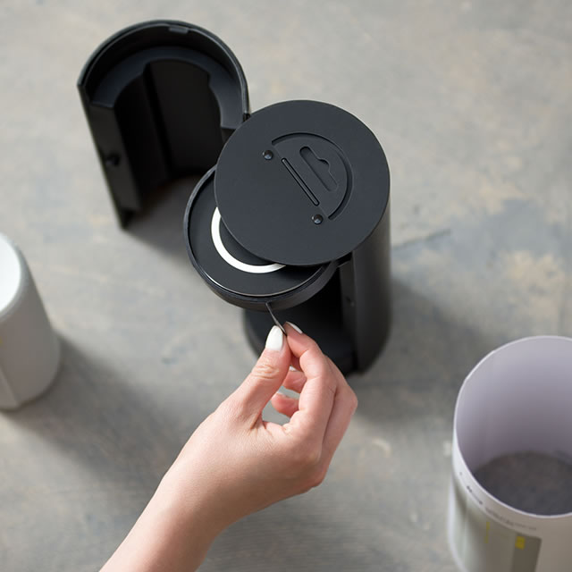
The cylindrical shape, reflecting the essence of the product, immediately stands out. The minimal graphics, focused only on the essentials, provide unusual clarity. Removing the recyclable paper sleeve reveals a sleek reusable case where the structure and iconography provide a carefully choreographed out-of-box experience. Opening the case, the product is displayed front and center, pre-charged and ready to enjoy – no distracting plastic wrap to remove before use. Original icons highlight the location of the product accessories, easily accessible with the gentle pull of a tab.

UE Boom portable speaker packaging prototypingUE Boom portable speaker packaging on shelfUE Boom portable speaker packaging sleeve off and box open

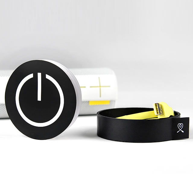
Keeping with the simplicity and the intuitive interface of the product, the Quick Start Guide is purposely minimal. The graphically bold power button on the cover captures the essence of the guide – it’s all about pressing power to play.

Ultimately, the UE Boom packaging, with its sequential unveiling of the product and its accessories, makes the often frustrating chore of unboxing a product a joyful, positive and memorable experience. And within six months of launch, the UE Boom was selected as the Top Gift in Apple stores.

UE Boom portable speaker packaging compartment pull tabUE Boom portable speaker packaging cable compartment and a quick start guide

UE Boom portable speaker packaging in hand


Awards

Red Dot Award

What we did

Experience Essence™

Insights

Wireframes

Visual Design

Brand Identity

The new user interface of Trufa’s cloud app makes big data feel accessible and actionable.

Leveraging big data for better decision making and higher productivity is the realm of big players such as SAP and Oracle. Enter Trufa, a startup with a cloud application that quickly helps decision makers in medium to large businesses understand what drives performance.

But the power of Trufa’s application is that it is not just diagnostic, it actually allows businesses to run simulations to understand the impact of operational improvements. But handling and interpreting big data can be complex and can easily feel overwhelming, even to the most financially savvy.  Understanding the importance of design in making the application a success, Trufa approached NONOBJECT. The design challenge was to the make Trufa’s sophisticated and powerful app feel approachable, intuitive and actionable for any level decision maker.

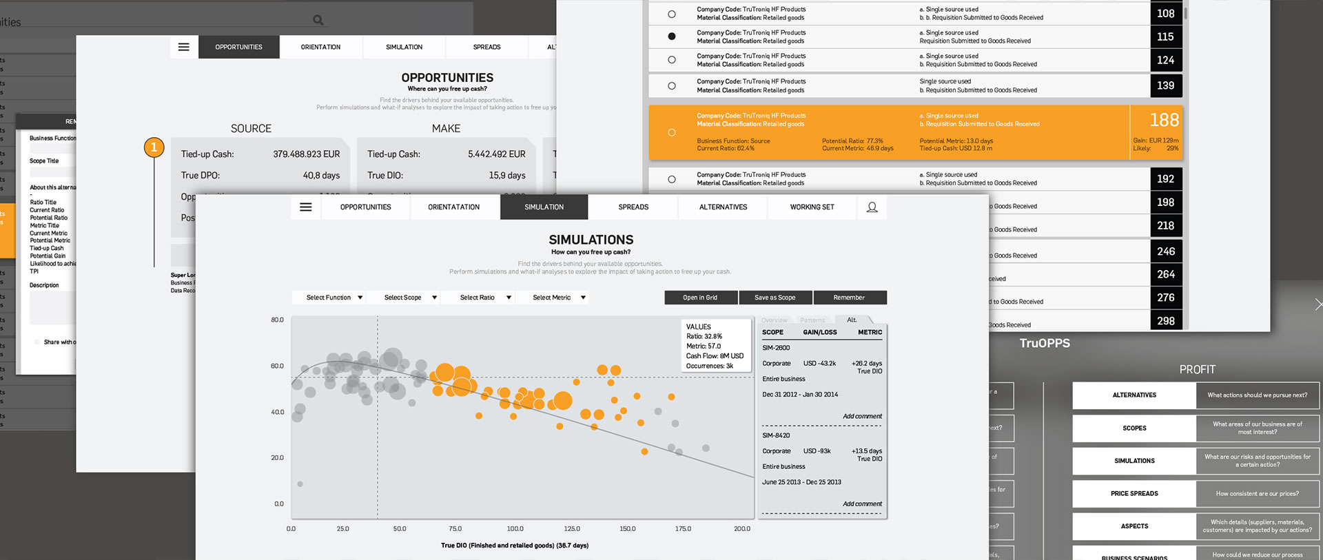
Trufa cloud app multiple screens

NONOBJECT’S design expertise combined with our sophisticated algorithms resulted in an incredibly powerful update that will enable finance and operations teams to optimize processes and reach the Efficient Business Frontier.

Gauthier Vasseur, Trufa Vice President Marketing

With a subdued color scheme with bursts of orange to guide the user to action, the app is focused on identifying drivers for operational efficiency. At the top of each screen, a simple question and brief description define the opportunities for answers that can be found below. The seemingly simple and understated design leaves the focus on the possibilities in the data.

Trufa cloud app colors

The sleek, simple and innovative user interface powerfully displays the strength of Trufa’s predictive analytics.

Gauthier Vasseur, Trufa Vice President Marketing

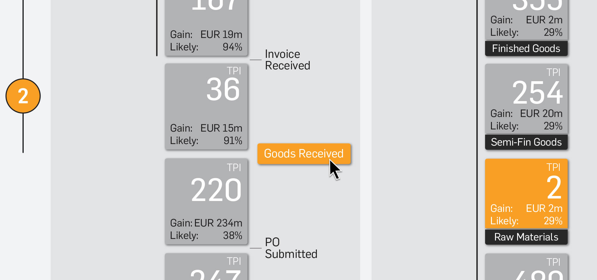
Trufa cloud app level two zoom


Awards

Fastco Innovation by Design Award Finalist

What we did

Experience Essence™

Insights

Industrial Design

Materiality

Digital Integration

Proof of Concept

Environments

AirCom Pacific’s new airplane seat actually makes you look forward to traveling economy.

Tackling the inflight entertainment experience from a new angle, the company’s vision entails in-flight high speed broadband for content, gaming and shopping. AirCom Pacific had the technical capabilities, but wanted to offer a completely new economy class seat that included entertainment, comfort and a positive sense of seclusion in a space often associated with boredom, discomfort and a lack of privacy.

A massive undertaking spanning technology, ergonomics, mechanics, aesthetics and user interface, these economy class seats provide a completely new experience that far surpasses in-flight expectations.

Entertainment at ease

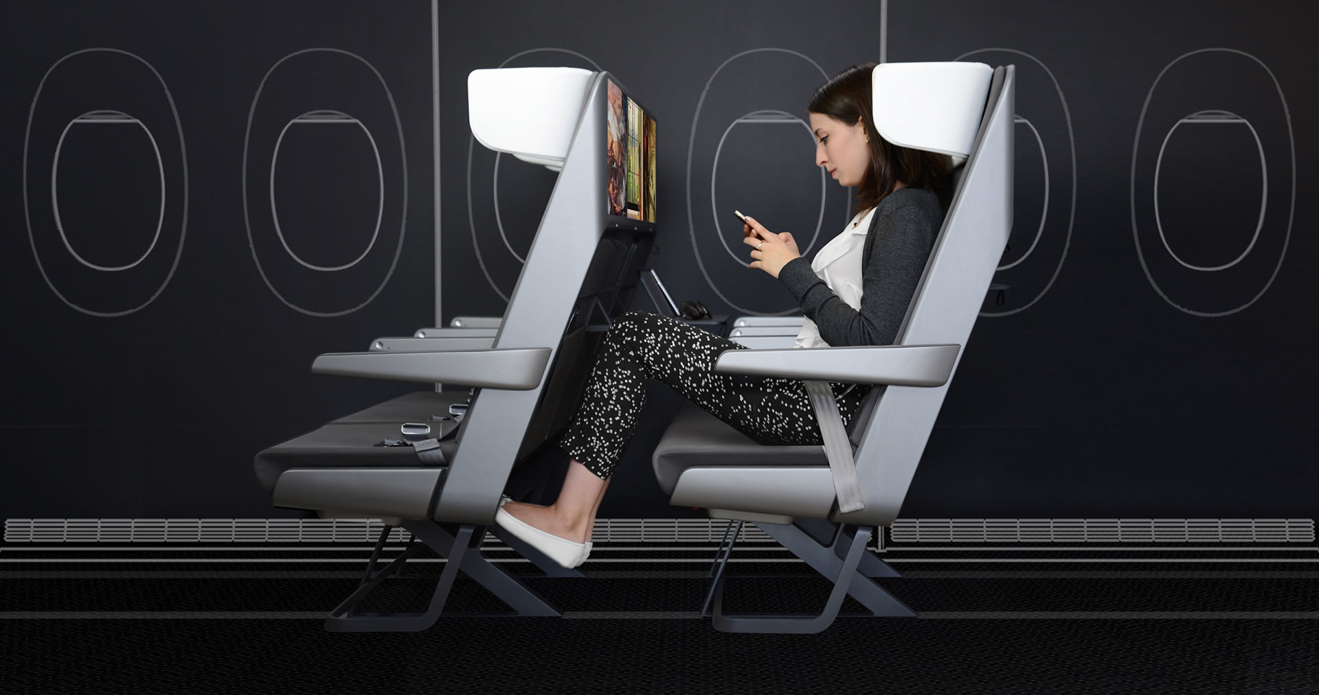
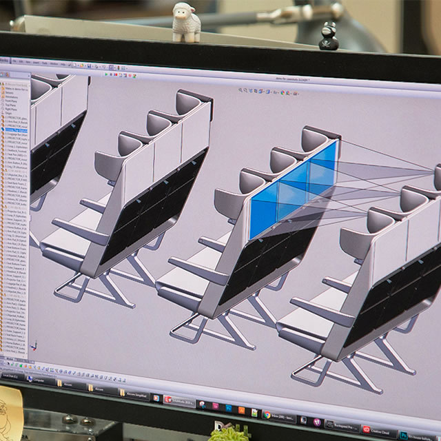
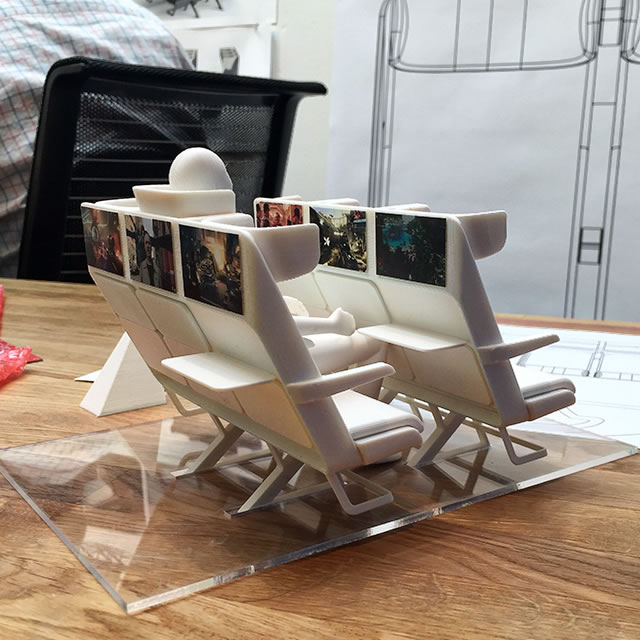
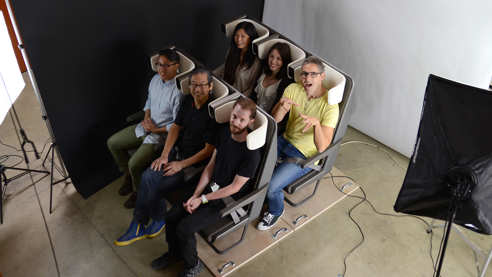
Approaching the seats, you will first notice their harmonious appearance. Each three-seat configuration is wrapped by a single band. The band is covered in a high-tech material, incredibly durable but so refined that it functions as the screen for the short-throw projectors integrated into the seats. The band seamlessly wraps around the entire seat configuration to also function as a footrest once you are seated – appreciated by anyone who has ever tried to desperately rest their feet on the edge of a seat pocket or the armrest of the seat in front.
AirCom Pacific airplane seats footrest

Each three-seat configuration is wrapped by a single band, covered in a durable but refined high-tech material that functions as the screen for the short-throw projectors integrated into the seats.

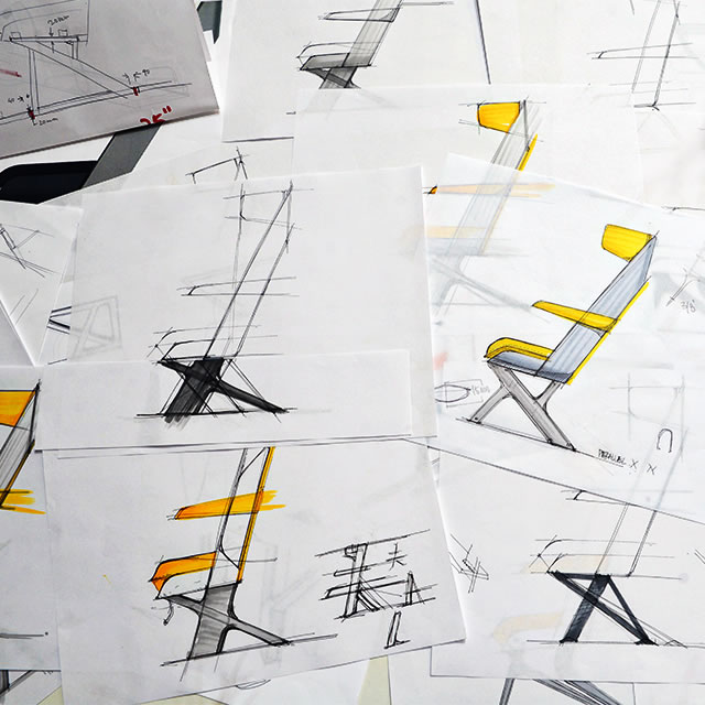
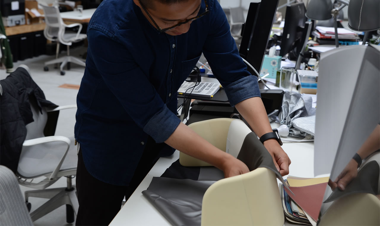
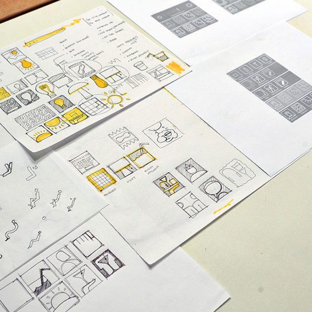
AirCom Pacific airplane seats sketchAirCom Pacific airplane seats CAD

Comfort and privacy

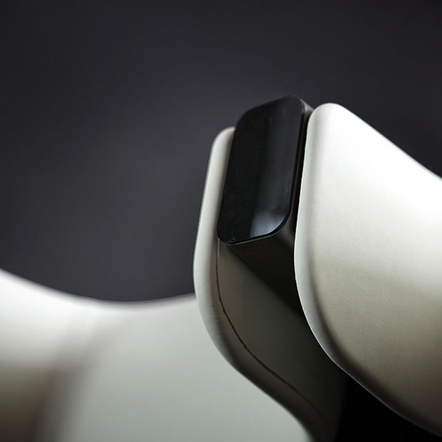
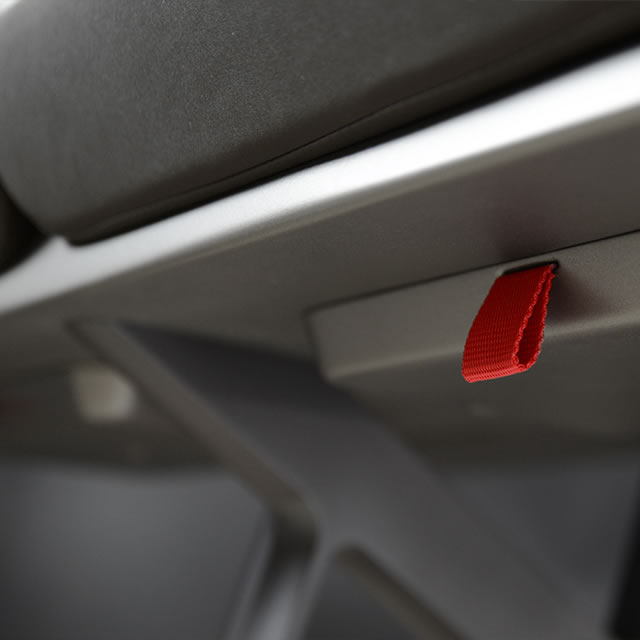
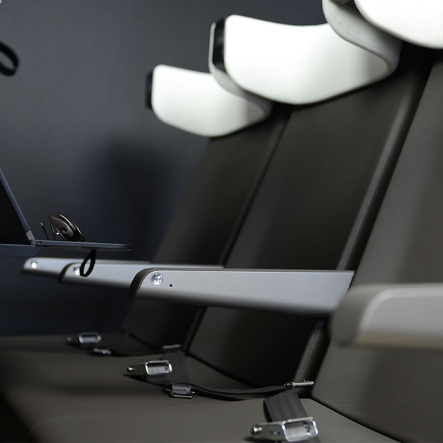
The attention to detail extends to the clean lines of the seat support frame, its profile reminiscent of an A, and easily accessible flotation device pocket. The signature headrests, simultaneously futuristic and familiar, provide unprecedented comfort and a welcome sense of privacy.

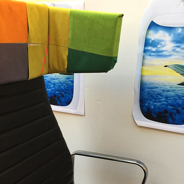
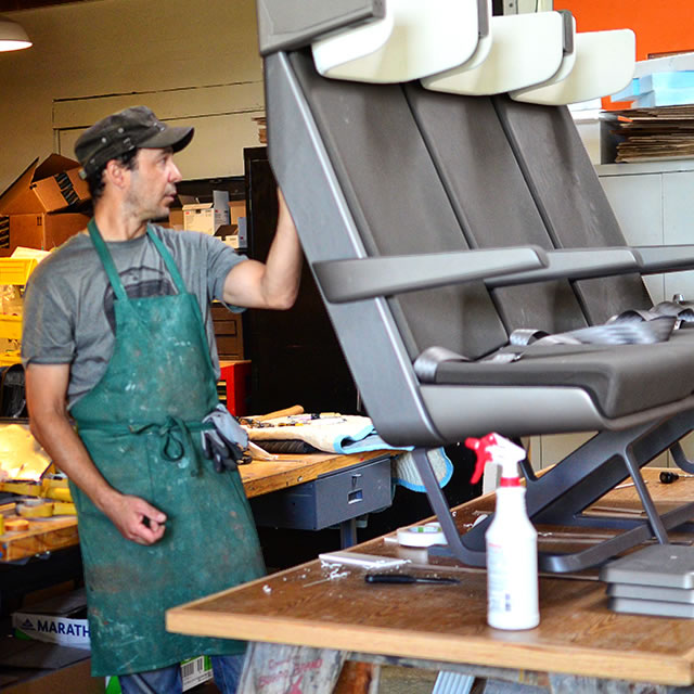
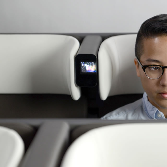
AirCom Pacific airplane seat short-throw projector AirCom Pacific airplane seat pull tab design AirCom Pacific airplane seat prototype AirCom Pacific airplane seats design modelAirCom Pacific airplane seats armrest design AirCom Pacific airplane seat headrest design AirCom Pacific airplane seats materiality

Rethinking the table

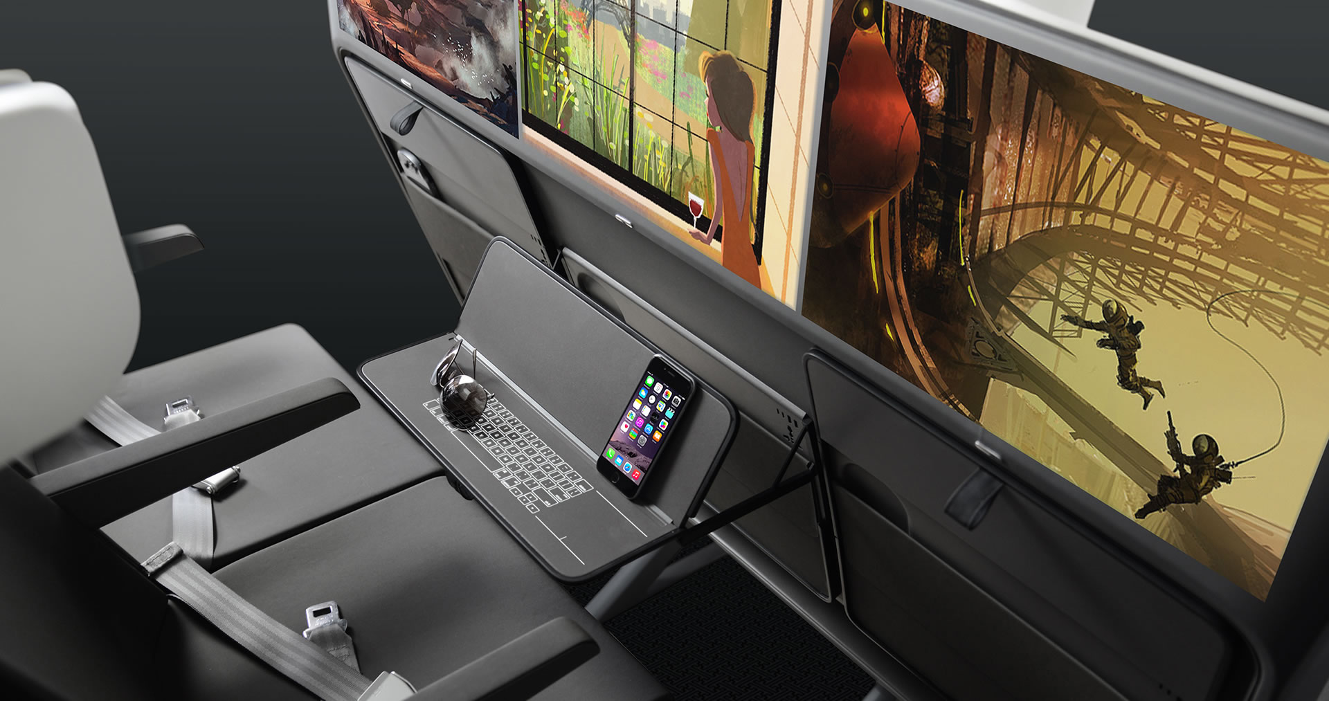
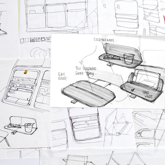
Sliding into the seat, the first sensation is how spacious yet private it feels despite being an economy class seat. The table features an innovative and intuitive configuration. In cocktail mode, the table partly unfolds and stays slightly elevated, leaving you with space to move around or get in or out of your seat. Unfolding the table you will notice that you can keep the back part of the table tilted to support your tablet in the perfect viewing position. The table also folds completely horizontal to maximize your surface area.

AirCom Pacific airplane seats folding table design

AirCom Pacific airlie seat folding table prototype

The table features innovative and intuitive configurations, from cocktail mode, to tablet mode to flat mode.

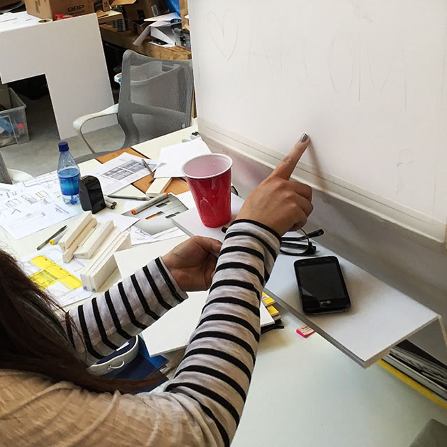
AirCom Pacific airplane seats folding table sketchAirCom Pacific airplane seats 3D printed model

All at your fingertips

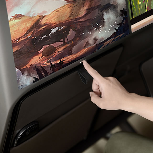
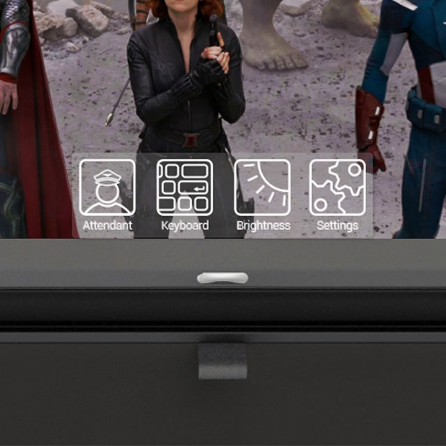
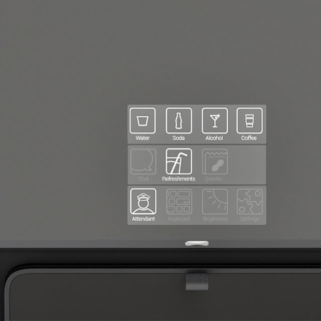
Pressing the button above the table will showcase a screen menu. Beyond the typical items for an in-flight menu, this menu allows you to access amazing inflight content. To make the most of your browsing experience, the totally smooth table features a backlit integrated keyboard –invisible when you don’t need it, easily usable when you do.

AirCom Pacific airplane seats screen menu buttonAirCom Pacific airplane seats digital in-flight menuAirCom Pacific airplane seats UI sketchAircom Pacific airplane seats screen UI icons

Reclining during mealtimes?

If you want to completely relax, press the button on your armrest to recline. Instead of simply angling the seatback backwards, the AirCom Pacific seats pivot the seat and the back together, so that instead of sliding forward, you are angled comfortably into a reclining position. The result is that the outer shell of the seatback remains in the same position, without encroaching on the space of the passenger behind you. If you want to stay comfortably reclined through mealtimes you can, without the flight attendants having to prompt you to sit upright.

Combining the future of in-flight technology with a completely new seat design creates what has seemingly been impossible before – a beautifully relaxing and entertaining in-flight experience in economy class.

AirCom Pacific airplane seats for an entertaining in-flight experience

Showcasing the design

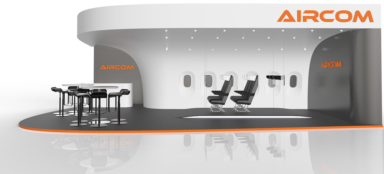
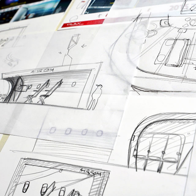
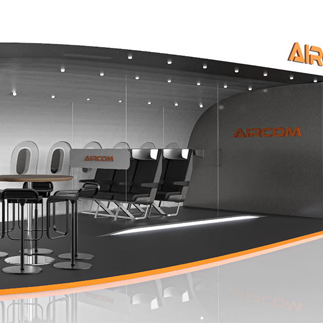
The seats were first showcased to the world at the International Paris Air Show in a booth designed by NONOBJECT. Making the most of the allotted floor area, the booth design immerses prospects and booth visitors in an in-flight environment. The open design simultaneously allows for demonstrations of the seats details and projection capabilities, while also providing space for business discussions and private conversations.

AirCom Pacific airplane seats trade show booth designAirCom Pacific airplane seats trade show booth design sketchAirCom Pacific airplane seats trade show booth design